Industry Craft > Art Direction
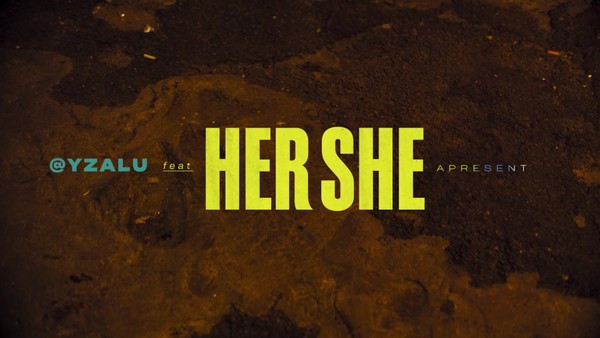
HERSHE
BETC HAVAS SAO PAULO / HERSHEY'S / 2020
Awards:
Overview
Credits
Overview
Cultural / Context information for the jury
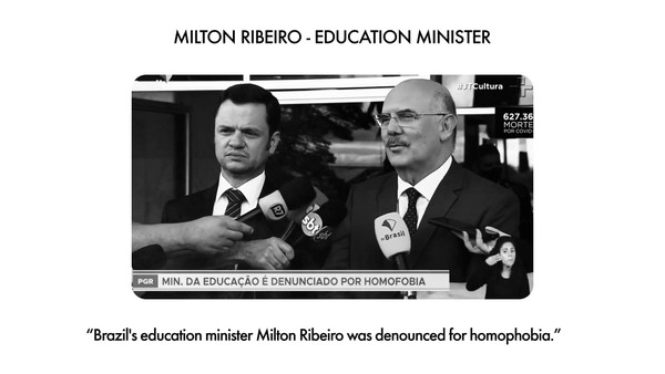
Hersheys has a very recent history in the Brazilian chocolate market and a media budget that, in 2019, represented 4% of the first place’s investment. In Brazil, International Women's Day traditionally uses chocolate as a celebration, but with the lack of opportunity for women, there was nothing to celebrate. Hershey’s needed to be remembered amongst much more consolidated brands and with bigger investments. More than that, the brand wanted to enter the conversation in a positive way, increasing emotional connection with our main target: female. And if chocolate is the partner of women in difficult times, the unfavorable context of yet another International Women's Day without much progress to celebrate was placed as a great connector between these women and Hershey's. How to get into this conversation in a proprietary way? How can Hershey’s be remembered and help give women more visibility? The answer was in Hersheys' own name.
Translation. Provide a full English translation of any text.
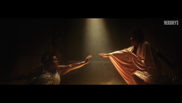
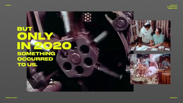
For years Hershey’s has been changing its packaging. But only in 2020 something occurred to us. Her. She. Noticed? For International Women's Day, we made the strongest change ever. We turned real packaging into a canvas, and invited artists to showcase their work: two graphic artists, two writers and two musicians. In each pack, the artist's @ invited the audience to know more about her. But these are not commemorative packages. They're an exhibition. Each woman created something from scratch specifically for the “Her” and “She” wrappers.
In few days limited edition was sold out at supermarkets. We also opened our social networks to invite all women to participate. The response was huge: illustrators, writers, singers, dancers and many more shared their work in order to be featured in the HerShe Gallery, using the hashtags #HerShe and #HerSheGallery. A large virtual exhibition became a visibility platform for more than 60 different artists on the brand's Instagram. In 1 week we’ve had: 1 billion total impressions; US$300,000.00 in earned media; A limited edition sold out; And best of all: 100% positive feeling.
HerShe. Showcasing female talent, one bar at a time.
Tell the jury about the art direction.
Hershey’s turned their own packaging into an art exhibition inviting six women to display their work in the “Her” and “She” wrappers. Taking part of the logo out of a package may seem crazy, but respecting the color code and fonts as a whole, the identity is still present. In each pack, the artist's username (@) invited the audience to know more about her and, for the two musicians, a QR Code led people to their Youtube channel. Since the main focus of the campaign was showcasing the artists and their work, the art direction had few type elements and a background referring to the packaging material.
More Entries from Packaging Design in Industry Craft
24 items