Design > Brand-building
SQUARESPACE BRANDING
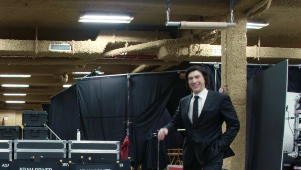
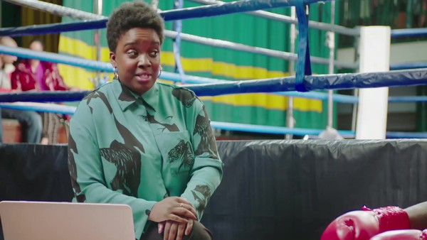
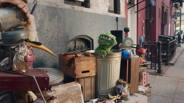
SQUARESPACE, New York / SQUARESPACE / 2019

Overview
Credits
Overview
Background
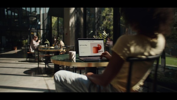
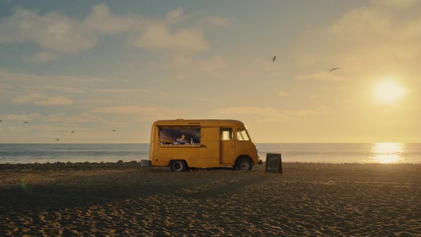
Squarespace is one of very few technology companies that can truly call NYC home. As we began to rethink our brand identity, we knew we needed to find a way to make New York a bigger part of the story. We began with an entirely new brand typeface, entitled Clarkson, to function as a bedrock for the majority of the work. From there, we built a kinetic identity system where motion is used to dimensionalize our name and reinforce the two syllables in Squarespace.
Describe the creative idea
After 15 years, we realized that we needed to unify our brand across a variety of touch points. We wanted to stop using typefaces that felt common and overused and instead create something that fit the brand and product. Additionally, we realized that creating methodology around how the brand moves was an opportunity for additional impact.
After over a year of research and development, we thought it would make sense to give meaning to the name Squarespace. We have since developed generative motion that can be applied in a variety of ways. Clarkson, the newly developed typeface has been instrumental in pulling many desperate pieces together.
Describe the execution
Since the introduction of the new system, we have been able to create unity throughout our .com all the way through to the CMS on the backend. We have been able to adopt a consistent look across our brand communications, as well. Given this was a wholistic brand refresh, we have leveraged all main channels to launch it.
List the results
For years, Squarespace has provided a key service for it's customers by giving them the tools to help fulfill their dreams. We as a brand look at ourselves as being there for the entrepreneur.
Since the relaunch we have seen a uptick in brand recognition and consistency.
More Entries from Rebrand / Refresh of an Existing Brand in Design
24 items

More Entries from SQUARESPACE
24 items