Industry Craft > Art Direction
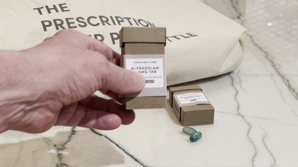
THE PRESCRIPTION PAPER PILL BOTTLE
SAATCHI & SAATCHI WELLNESS, New York / TIKKUN OLAM MAKERS: TOM / 2021
Awards:
Overview
Credits
Overview
Cultural / Context information for the jury
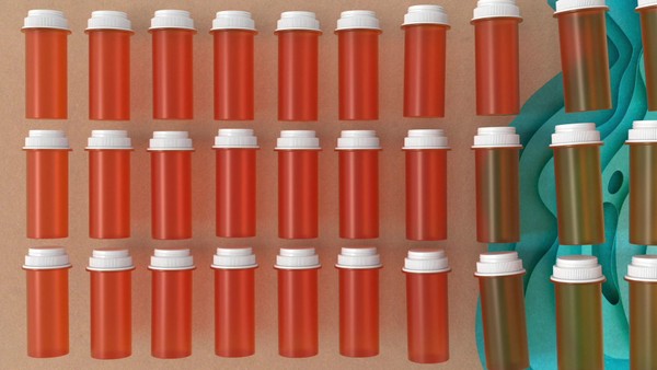
Prescription pill bottles in the US are typically made of polypropylene and recyclable polyethylene plastic. But because of their small size, 90% of them are never recycled.
The problem lies in the metal sorting device used at neighborhood recycling stations. Smaller items the size of pill bottles slip through the holes in the devices; they are rejected then sent to dumps.
This means prescription pill bottles end up sitting in landfills and ocean dumps—taking decades to degrade. Billions of plastic microparticles end up languishing and polluting our planet.
Understandably packaging experts are concerned. But most are cautious about the lack of recycling infrastructure for medical packaging materials once they’re at the end of their lifecycle.
Given the limitations of recycling, packaging manufacturers must look to innovative design and compostable materials to reduce the 2,800 to 3,500 tons of plastic packaging and plastic product waste generated in the US daily.
Translation. Provide a full English translation of any text.
All communications are in English.
Tell the jury about the art direction.
The Prescription Paper Pill Bottle isn’t just an eco-friendly container for prescribed medications; it’s also a brand helping transform a plastic world into a 100% compostable new world.
• The Vision: Welcome to a land where porous textures rule. And matte finishes feel right at home. Sure, plastic is still around. But not for long
• Imagery: Whether illustration or photography, our imagery embodies authenticity, simplicity, and truth. It invites, never intrudes
• Palette: Earthy, eggshell hues, and natural textures, the palette is so green, some say it’s brown
• Type: We use the geometric sans font called Sofia Pro. Elegant, friendly, and contemporary, it dares the modernism and harmony of curves.
• Consistency: It’s essential to be reliable and beautifully bare. Just like the bottle design, our look and feel are always good for the planet, right down to the glue
More Entries from Packaging Design in Industry Craft
24 items

More Entries from SAATCHI & SAATCHI WELLNESS
24 items