Industry Craft > Typography
YOUR WAY, WAY BETTER
JONES KNOWLES RITCHIE, New York / BURGER KING / 2021
Awards:
Overview
Credits
Overview
Cultural / Context information for the jury
Burger King has spent years removing preservatives, coloring and flavors from artificial sources out of their food… but you’d never know it. Because before you bite into a Whopper, you see off-the-shelf type that screams convenience, not craveability. Our challenge was to express Burger King’s bold, flavorful, irreverent personality in a typeface, without sacrificing ‘Have it Your Way’.
Translation. Provide a full English translation of any text.
N/A
Tell the jury about the typography.
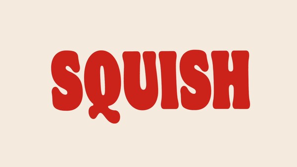
Burger King values craveability in all things, even our type.
Partnering with Colophon Foundry, Burger King's new bespoke font family uses two soft and juicy Serifs and one flared Sans-serif to bring cohesion to the larger design system — evoking the soft juiciness of Burger King's flame-grilled menu.
Flame Bold is elevated for key phrases by custom ligatures, swashes and handcrafted wordmarks for core products. Flame Bold is also a limited variable font, retaining optimized proportions when stretched.
Flame, Flame Bold and Flame Sans are all designed to create a mouthwatering experience, before customers take their first bite.
More Entries from Brand & Communications Design in Industry Craft
24 items

More Entries from JONES KNOWLES RITCHIE
24 items