Design > Corporate or Brand Identity
HOUSE OF CARDS IDENTITY
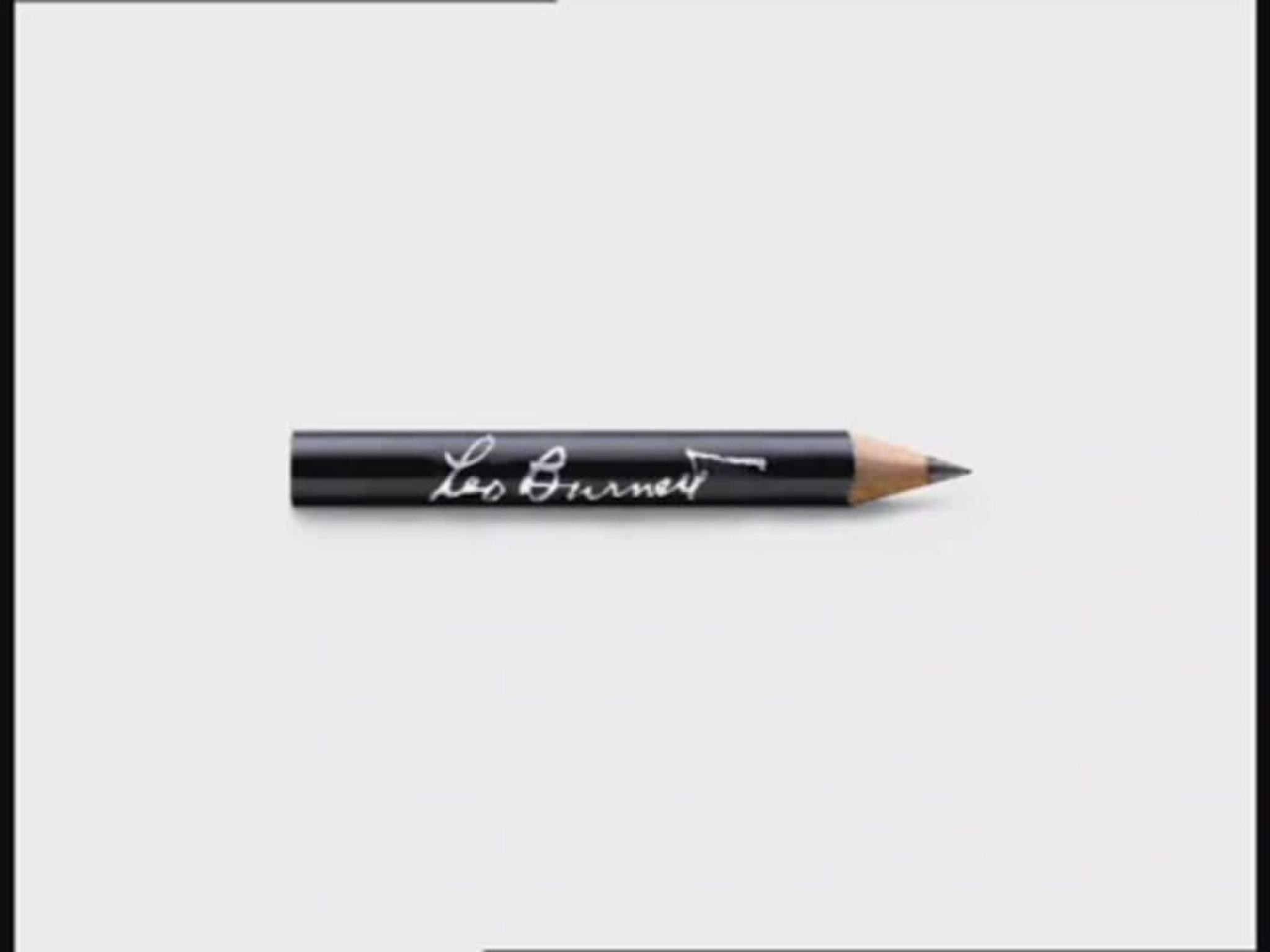
LEO BURNETT, London / SHELTER / 2010
Awards:
Overview
Credits
Overview
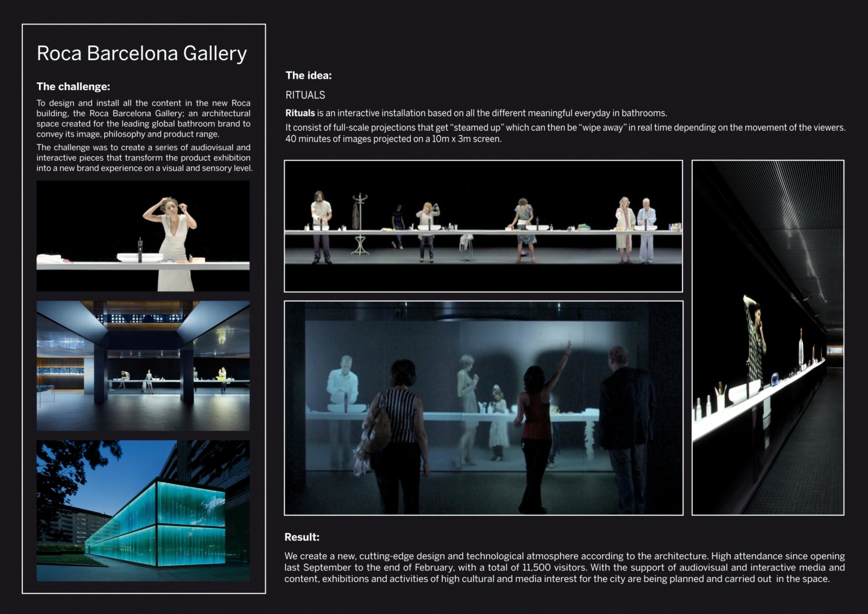
BriefExplanation
The Shelter House of Cards ad campaign was designed to raise awareness (and funding) of housing crisis facing the UK in the wake of the economic crash.
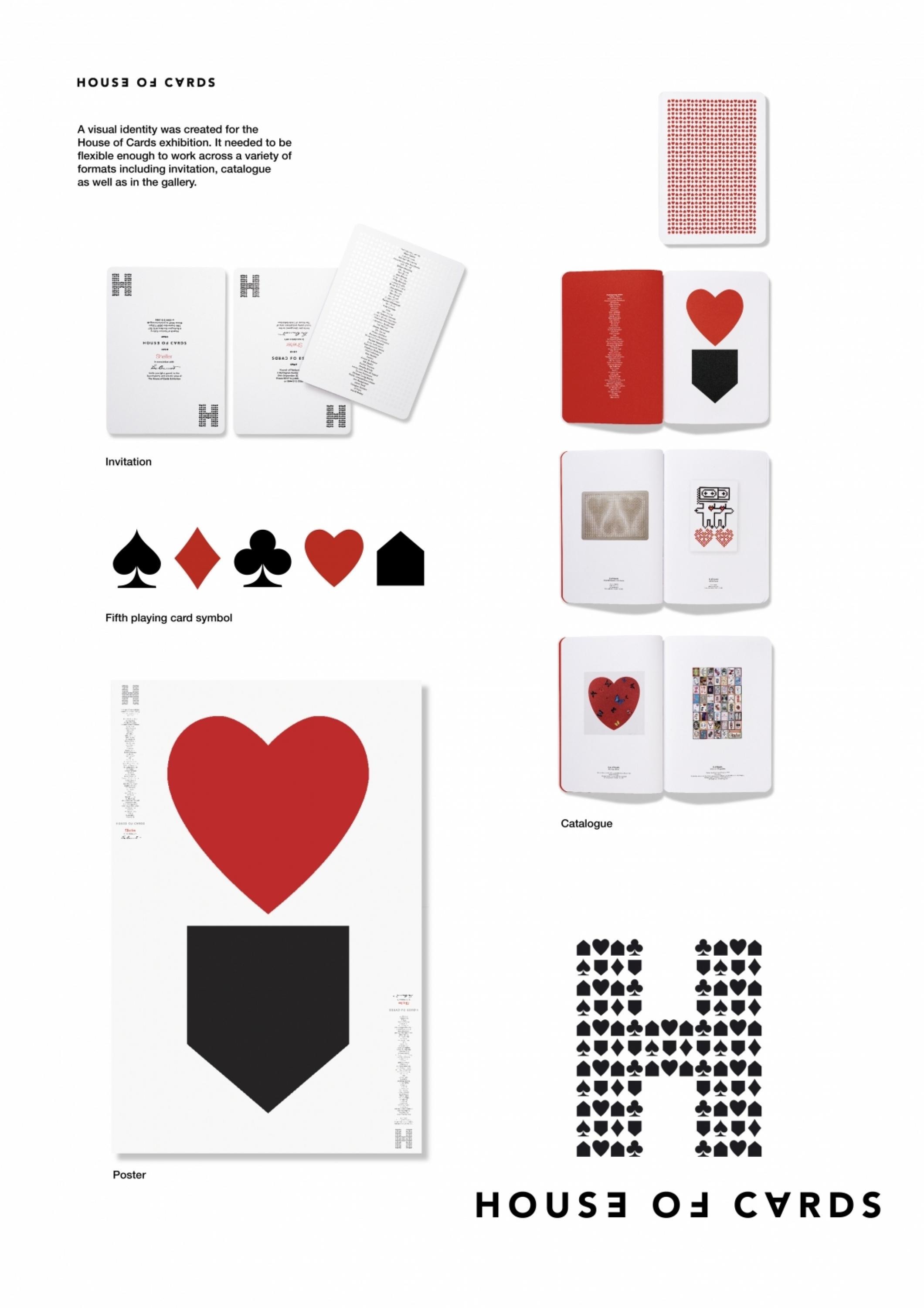
A key component of this campaign was the House of Cards Exhibition, which consisted of the ultimate deck of cards designed by 52 leading artists.As part of this project there was a need to create an identity.
ClientBriefOrObjective
We needed an identity that could be applied to a variety of applications such as the signage; the brochure; the private view invitation; the online gallery; and the packaging for the limited edition packs of cards.At the same time we needed the identity to feel connected to the Shelter brand as well as reflect the aspirations for the project, in which several of the world’s leading artists, photographers and designers were participating.
Effectiveness
The exhibition was a huge success – thousands visited it in person and hundreds of thousands visited it online.
Harrods liked the cards so much they requested exclusivity and in total the auction and the sale of the cards raised over £150,000.Overall the campaign led to a 1600% increase in the number of online discussions on homelessness issue and helped secure several new government initiatives to prevent repossession
Execution
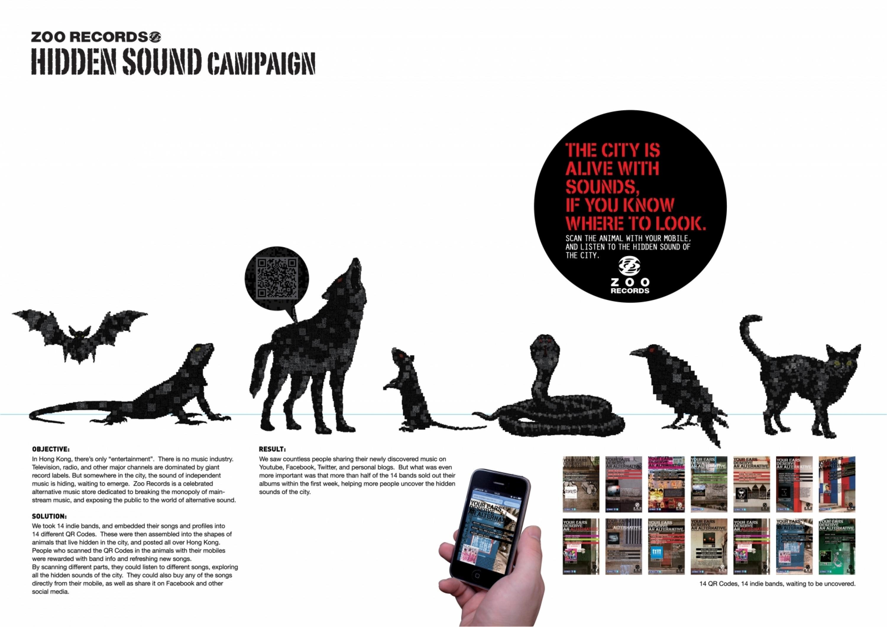
The mark was borne from the simple idea of creating a 5th playing card symbol – a House.
These symbols were combined to form an H representing the ‘House’.
The symbols were used right side up and upside down to support the cascading image of houses collapsing.
A logotype was developed to work independently and with the mark. Having certain characters twisted / set upside down reflected the cascading idea as well as playing into the ambigram nature of cards and Avenir was used for it’s simplicity, directness and modernity.The black and red palette was a reference to both playing cards and the Shelter brand.
More Entries from Small Scale Corporate Identity Schemes in Design
24 items


More Entries from LEO BURNETT
24 items