Design > Brand-building
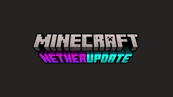
MINECRAFT
BOLD SCANDINAVIA/ NOA, Stockholm / MINECRAFT / 2022

Overview
Credits
Overview
Background
From a game to a franchise brand.
Since its creation in 2009, Minecraft has rapidly grown to become one of the world’s best-selling and most popular games with over 132 million players each month. Ten years after its humble beginnings, Minecraft had outgrown the world of gaming – it’s a global phenomenon, and an entertainment franchise of similar complexity as Lego or Disney. During this process, the brand around the Minecraft games and experiences had started to feel fragmented and without clear direction.
Describe the creative idea
Simplify to Amplify.
We wanted to create a brand identity for the whole franchise that was just as exciting as the game itself. An identity that people love to play with.
During our collaboration with the client team, we have created a complex yet playful identity for the whole franchise – a design system and philosophy that brings together all the many parts of the Minecraft universe, from games to services, tv shows, festivals, events, toys and partnerships. Rolled-out across all digital and physical touchpoints.
Describe the execution
One grid to rule them all.
Just like in the game, the new design system is built around a simple pixel grid. It’s the foundation of the new Minecraft design system and sits beneath every single asset of the brand, from logotypes and typography, to layouts and images. The rigorous use of the pixel grid allows us to create a brand that feels like a natural extension of the game – it is based on exactly the same resolution as the game (16x16).
The pixel grid can be populated with so-called blocks. Blocks can be logos, typography, images, characters and items and colours. The blocks can be combined in many ways for endless creative freedom. With our pixel grid and blocks, we can build unique variations for all parts of the franchise and its audiences. An easy-to-use, intuitive design system that feels as diverse and open-ended as the game itself.
List the results
This extensive effort has always been about respectfully nurturing the legacy of Minecraft’s brand identity. Our motto in this work is to simplify and amplify Minecraft’s visual language into a cohesive and durable system as the Minecraft franchise now expand into the future.
More Entries from Rebrand / Refresh of an Existing Brand in Design
24 items
More Entries from BOLD SCANDINAVIA/ NOA
4 items