Design > Brand-building
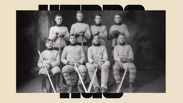
WE HOCKEY
MULLENLOWE U.S. , Los Angeles / ARIZONA COYOTES / 2022
Awards:
Overview
Credits
Overview
Background
The Arizona Coyotes needed to articulate their vision and ambition: To be a future-proof hockey team. As the NHL’s youngest team, located in the desert, and with no legacy baggage holding them back, our task was to give The Coyotes a new, modern edge that mirrored the big bets they’re taking on diversity, inclusion, and culture. From diverse leadership hires to a robust youth hockey presence, it was time to push this initiative from inside the franchise to the ice.
The Arizona Coyotes rebrand is an invitation to a more inclusive vision of the NHL, all launched through a design-led brand refresh.
Describe the creative idea
We democratized the sport of hockey, opening doors to anyone and everyone, by focusing on one key word:
“WE”
Hockey for all.
Hockey, The Coyotes way.
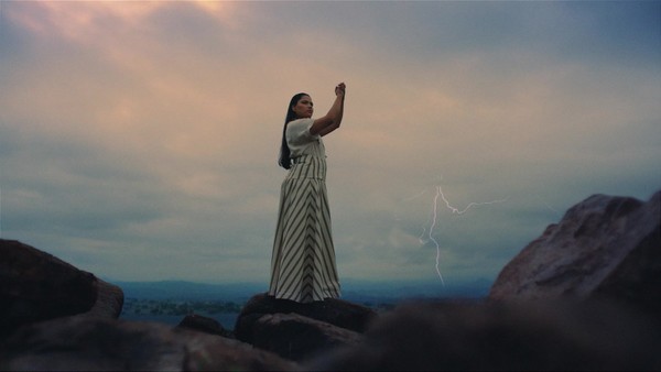
We looked closely at the past cultural barriers that might have kept people away from hockey, and embraced the place and people the team needed to represent.
With diversity as a North Star, this work brought the state’s community and culture to the forefront of each unique element. Presenting new and unexpected faces, colors and themes in the outward representation of the team and the brand.
Describe the execution
The complete redesign started with the team’s logo and colors. We brought the beloved Kachina logo back to the forefront in a palette informed directly by colors found in the Arizona landscape and the broad spectrum of communities who call AZ home. The Kachina mask itself became an element that we used to quickly and graphically invite Arizonans, and the broader Southwest, to be a part of the team.
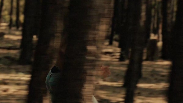
The top-to-bottom redesign worked in tandem with films and photography used across a multitude of channels, serving as a tribute to the diversity of its people and the place. Shot on location across Arizona, the work featured real Arizonans from across the spectrum, bringing new and unexpected faces into the outward representation of the team and brand. No criteria. No casting call. Just real people, languages, beliefs, genders, and backgrounds, presenting a new vision of hockey as it should be.
List the results
The rebrand of the Arizona Coyotes successfully expressed the team’s vision for a more diverse and inclusive era for Hockey.
The new design system garnered 64 pieces of earned media coverage with a combined audience of 908M, sparking conversation around the need of a more diverse NHL.
Game ticket sales for the season surpassed sales goals of $25M by 4.7%.
The Kachina limited edition of 10,000 jerseys sold out online in the first three days of launch.
Website traffic experienced the highest social growth in the past five seasons.
The online films received 4.39M online views and in social media reached 96.5M with 31.3K engagements and 4.82K shares, driving home the message of inclusion and reinforcing the notion that hockey is for all.
More Entries from Rebrand / Refresh of an Existing Brand in Design
24 items
More Entries from MULLENLOWE U.S.
24 items