Design > Brand-building
RIO CARNAVAL - NEW BRAND
TATIL DESIGNING IDEAS, Rio De Janeiro / RIO CARNAVAL / 2022
Awards:
Overview
Credits
Overview
Background
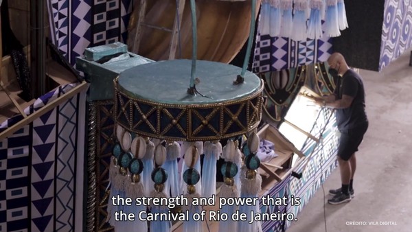
The invitation was irresistible; and the challenge, huge. Imagine coming up with a symbol that conveyed the contagious energy from the greatest show on Earth.
That would be able to represent the creative and achieving force that is the samba community as a whole, but that could also embrace each school that is part of this story. And there was only one way to do all of this: together with them. We listened to both the professionals and lovers of the Rio Carnival – this meant over seven thousand people involved.
So, if we had to choose only one symbol to represent the carnival of the samba schools, what would it be?
Describe the creative idea
The flag, or the canopy, as the masters call it, was consensus, the symbol of the origin of everything. We went to the city of samba, expanded our team, took on several trials and took a deep dive in order to understand what is behind this icon. We studied the movement, the trace it produces, and the magic it transmits.
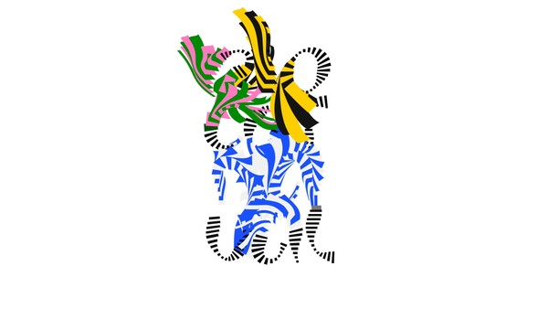
We understood that this brand could not be static, it should be alive and vibrant. We took inspiration from the twirling of the flag bearer, the samba hosts and the ‘bahianas’, the black and white pattern of the Copacabana sidewalk, the paced chiming.
Just like the people who participate in the Carnival parade, we made the brand ‘dance’ samba, reacting to the tambourine and the snare drum.
Describe the execution
The visual identity is generative and programmable. The starting point is a logotype inspired by the biggest symbol in the party – the Samba School Flag. The logo can dance with music, swing with touch or explode in color.
Studying the movements of Selminha Sorriso, the icon flag-bearer for Beija-Flor we turned our findings into something visual in a perfect beat of analog and digital technologies.
The design has to live in all touch points thinkable, from big outdoor advertising to motion and livery. The color explosions from the logo itself were extracted in order to create interesting shapes and patterns for the communication, turning into products, clothing and pretty much any application needed. Each samba school color pattern can be used individually or in tandem to promote the event itself.
List the results
Carnival is back after 2 years of hiatus. And its brand was very well received by the samba community and is contributing to the renewal of people's vision in general in relation to carnival, rescuing the joy after so much nostalgia that Brazilians felt.
This is the 1st edition of a brand that will be perennial and that translates the greatest show on earth, in addition to having the responsibility of translating the 12 samba schools of the special group of Rio de Janeiro and taking to Brazil and the world the creative force and potent that only our people have.
More Entries from Creation of a New Brand Identity in Design
24 items
More Entries from TATIL DESIGNING IDEAS
3 items