Design > Comprehensive Branding Programs
VERILY
GOOGLE BRAND STUDIO, San Francisco / ALPHABET / 2016
Overview
Credits
Overview
CampaignDescription
We wanted to convey not just a new company identity, but a true shift in thinking and approach to individual health and wellness. What can we learn when our health data can paint a picture of not just parts of, but our whole lives? How can we depict the constantly shifting data while still elevating the humanity of the whole person? We broke the idea into clear, functioning parts, each with its own role.
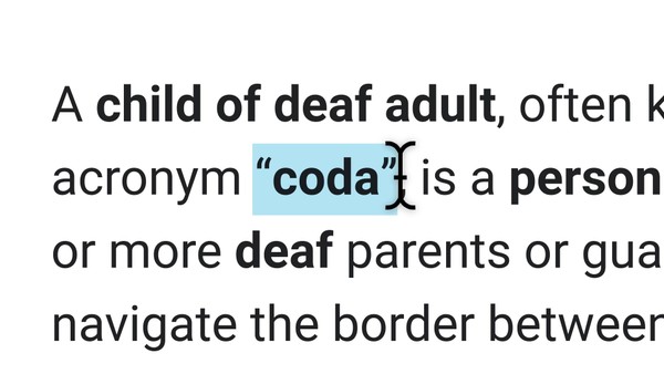
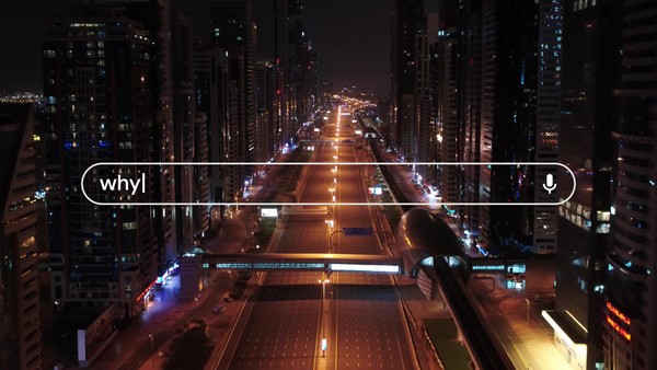
We used the older word Verily to bring intelligence and gravitas, so the design had to have a very up-to-date, modern feel. To reflect the always-evolving, living, and technological nature of the company, we created a constantly shifting code-and-animation system that’s “alive.” Building a system that retains its identity while adapting let us nod to the Google heritage, but also gave the team the flexibility to make communications relevant for all their solutions areas and applications.
Execution
We applied the new identity to Verily's website, created a mission video and printed collateral. The company launched 07/12/2015 to an overwhelmingly positive response.
Within the first hour of Verily’s launch, the news of this new Alphabet company had sparked over a million conversations. That number continues to grow, with positive social and worldwide press reactions growing daily.
Outcome
Verily was covered in every major news outlet and the story trended on social channels with more than a million mentions. Coverage focused on the ambitious mission, the planned projects, and the company’s vision for the future. Employees loved the identity and Verily jackets. Industry partners were enthusiastic, with a Johnson & Johnson / Verily joint venture (Verb) being announced the next day.
Strategy
Nailing the name came first, and only one word felt exactly right. Verily. On older word, but immediately relevant in its new context: delivering results with truth, certainty, and confidence. The design is a code and animation system that moves, breathes, and adapts to reflect not only shifting points of data, but human individuality as well. At once precise and playful, the brand captures the spirit and the vision of the company and its mission.
Synopsis
Google Life Sciences was about to become independent. New name, new logo, new brand. The company needed an independent name and identity that worked well for potential business partners, potential employees, medical professionals, and the general public. The brand needed to communicate empowering everyone by creating a true picture of human health, amplified by the power of technology. It had to reflect the gravity and intelligence of the group’s mission, be digital savvy in a category that’s typically static, and cover all their areas of health, solutions, and partnerships.
More Entries from Creation of a new Brand Identity: Consumer / Corporate in Design
24 items
More Entries from GOOGLE BRAND STUDIO
24 items
