Media > Culture & Context
NEVER STAND STILL
DESIGN ARMY, Washington / HONG KONG BALLET / 2019
Overview
Credits
Overview
Why is this work relevant for Media?
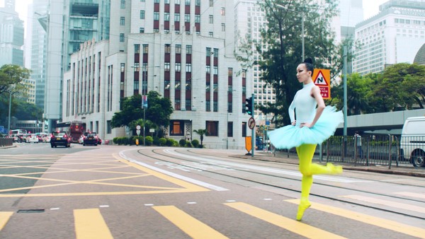
The “Never Stand Still” brand campaign was focused on brand photography driven by art direction. The campaign was distributed via poster ads spread all over the MTR stations in Hong Kong.
Background
Hong Kong Ballet, one of Asia’s premier dance companies, was undergoing a major transformation under the leadership of a new artistic director, Septime Webre. We were approached to develop a brand campaign that would reach a new audience and change the perception that ballet was only for the elite. There were three challenges we faced: membership was dwindling, brand language was inconsistent, and Hong Kong Ballet, while a prestigious national company, felt small and regional. Our goal was to establish a new visual identity and brand look encompassing the spirit and revolutionary vision of Webre while maintaining the integrity of the art form and the Hong Kong Ballet.
Describe the creative idea/insights
There were three challenges we faced: membership was dwindling, brand language was inconsistent, and Hong Kong Ballet, while a prestigious national company, felt small and regional. Our goal was to establish a new visual identity and brand look encompassing the spirit and revolutionary vision of Webre while maintaining the integrity of the art form and the Hong Kong Ballet. Our intent was to change the perception of ballet by showing the artistry and energy of dance. We used art direction to reinterpret dance and establish a sense of modern Hong Kong while highlighting the key elements of Hong Kong Ballet so their new vision could shine through.
Describe the strategy
Storytelling without words drove our thinking and process, propelling us to develop brand visuals that focused on the beauty and elegance of ballet, the grace and strength of the dancers, and the mix of ultra-modern and traditional architecture of Hong Kong. We were driven to open ballet up to everyone, making it an exciting form of live entertainment that was accessible to everyone across demographics. Additionally, we looked to inspire pride and drive awareness around the art and culture in Hong Kong. Hence, we looked to create a strong, identifiable visual language that could belong to no one but the Hong Kong Ballet.
Describe the execution
A rich color palette was developed using the iconic colors of Hong Kong, lush China red, and cool jade and mint greens. Iconic landmark locations, both modern and historic were selected as a backdrop for the gravity defying movement of the dancers speaking to the merging of old and new; tradition and innovation; and art form and architecture. Every detail from wardrobe (using street clothes) to hair and makeup were thoughtfully created to perfect a formula to spark the imagination and inspire generations old and young.
List the results
The results were tremendous with respect to building audiences and building buzz about the company. Growth in the Hong Kong Ballet family club membership, subscription, and general ticket sales can be attributed to the campaign.
Please tell us about the brand in relation to the locality or market where the product/service is distributed
Hong Kong Ballet, one of Asia’s premier dance companies, was undergoing a major transformation under the leadership of a new artistic director, Septime Webre. We were approached to develop a brand campaign to reach new audiences and change the perception that ballet was only for the elite.
More Entries from Local Brand in Media
24 items
More Entries from DESIGN ARMY
18 items