Design > Brand-building
THE ICELANDIC NATIONAL TEAM
BRANDENBURG, Reykjavik / FOOTBALL ASSOCIATION OF ICELAND / 2021


Overview
Credits
Overview
Background
For the last decade the Icelandic football teams have gained both momentum and success, qualifying for both the men’s end women’s Euros and becoming the smallest nation ever to qualify for the World Cup. With a strong team spirit and support of the whole nation, these spectacular achievements have attracted attention around the world.
The old badge, dating back to 1996 , was composed of the initials of the Football Association of Iceland (KSÍ) along with a ball and Icelandic flag. As our teams progressed, the straightforward ball-and-flag approach fell short, disconnected to the country’s image and the team’s spirit.
A new badge was needed that could harness the team’s momentum and create new merchandise opportunities for the FA of Iceland
Describe the creative idea
Go from a generic ball-and-flag FA badge to a unique and modern identity, rooted in Iceland’s culture and heritage. To go beyond the football pitch we would need a compelling story that would connect with the nation and turn foreign spectators to supporters
Icelanders are storytellers at heart and the new crest honours that tradition with the old story of our Landvættir, the guardian spirits of Iceland, which dates back to the first settlers. Together the four mythical creatures, a giant, bull, eagle and dragon, protect the island and have been shield bearers on Iceland’s Coat of Arms since 1918. All with their own different attributes and their own territory to watch over, they are the ideal symbol for a team spirit needed for our national teams - a passionate symbol of unity, which amplifies our strengths, history and spirit.
Target audience are Icelanders and football fans around the world.
Describe the execution
Unlike the Iceland’s Coat of Arms the FA crest interweaves the creatures into one whole to further emphasise the unity. They can also stand together as individual icons which provides newfound range of merchandise and flexibility.
By tradition, team logos are framed within a shield, a tradition from a time when knights carried coats of arms. Iceland breaks from that convention to better celebrate it’s own heritage and culture.
With a new crest, patterns, updated palette and bespoke typeface the identity fully adapts to any of the FA touchpoints, with a distinctive and forward thinking approach. F.x. team kit, national stadium, press rooms, SoMe outlets and various merchandise.
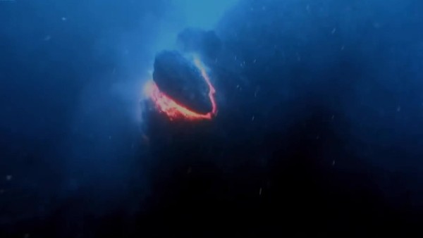
A film was released on the launch day, which told the story of Iceland, guarded by supernatural spirits, with a history that has shaped generations of football players.
Followed up with a landing page where the approach and implementation was further explained.
List the results
The FA enters a new chapter with an identity that finally amplifies the teams values and connects with the Icelandic nation, where the old badge fell short. To help prove that point, people are now getting the crest tattooed, first time ever in the FA history.
8.135.570 organic social media reach (+4410%),
2.31M total Tweet impressions,
36.000.000 non social media reach,
and
$0 Media spend.
With wildly positive reactions, Iceland has now gained thousands of new supporters all over the world. And as a side effect Iceland as a destination gained valuable awareness and interest.
More Entries from Rebrand / Refresh of an Existing Brand in Design
24 items
More Entries from BRANDENBURG
8 items
