Design > Communication Design
VISIBLE: OUT ON TELEVISION ANTENNAE POSTER
APPLE TV+, Culver City / APPLE TV+ / 2020
Overview
Credits
Overview
Background
Beyond entertainment, representation has the capacity to change minds. Historically, television programming largely underrepresented the LGBTQ+ community. Now, as more and more people might understand what it means to be queer thanks to increasing representation on television, it’s even more important to remember the obstacles and battles it took to get here over decades of invisibility, hostility and hardship. And that seeing a piece someone meaningfully represented in media can enable deeper understanding for individuals and the broader audience alike. Visible is a beautiful series about the LGBTQ experience as depicted on television across several decades. It covers the reality TV, news interviews and footage of riots and protests, sitcoms and dramas that all lay down another paving stone on the path to visibility. The series involves a number of extremely powerful interviews from iconic television talent that saw their own stories and lives reflected –or not reflected– on TV.
Describe the creative idea
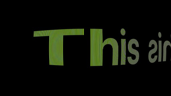
As a series to promote, it proved immensely challenging because of all the contractual restriction as to what we could use to market the series. And as one of the first unscripted series to land on Apple TV+, it carried the additional weight of establishing an approach to creating artwork for documentary content. We needed to create something iconic yet familiar, modern yet retro, and serious in tone but lively in spirit.
Describe the execution
The final creative was inspired by the ever iconic rabbit ears from TVs of old. It provided an instantly recognizable design element that removed the need to try and license photography or pull clips from the show – all of which would have proven prohibitively complicated from a legal perspective. Instead, we built a simple and iconic canvas that contrast perfectly with the modern approach to the title treatment. The rainbow spectrum of colors across the sub-title were inspired by the LGBTQ flag as well as the color bars from testing patterns on TVs from the late 80s and early 90s. The result was a bold and understated piece art that proved the perfect canvas to promote the series and established a creative approach for documentary marketing artwork at Apple TV+.
List the results
The posters drove viewership, fostered social conversation, and was widely used across multiple teams to effectively market the show across paid, owned and earned channels.
More Entries from Posters in Design
24 items
More Entries from APPLE TV+
24 items