Design > Corporate or Brand Identity
BRANDING SID LEE
SID LEE, Montreal / SID LEE / 2009
Awards:
Overview
Credits
Overview
BriefExplanation
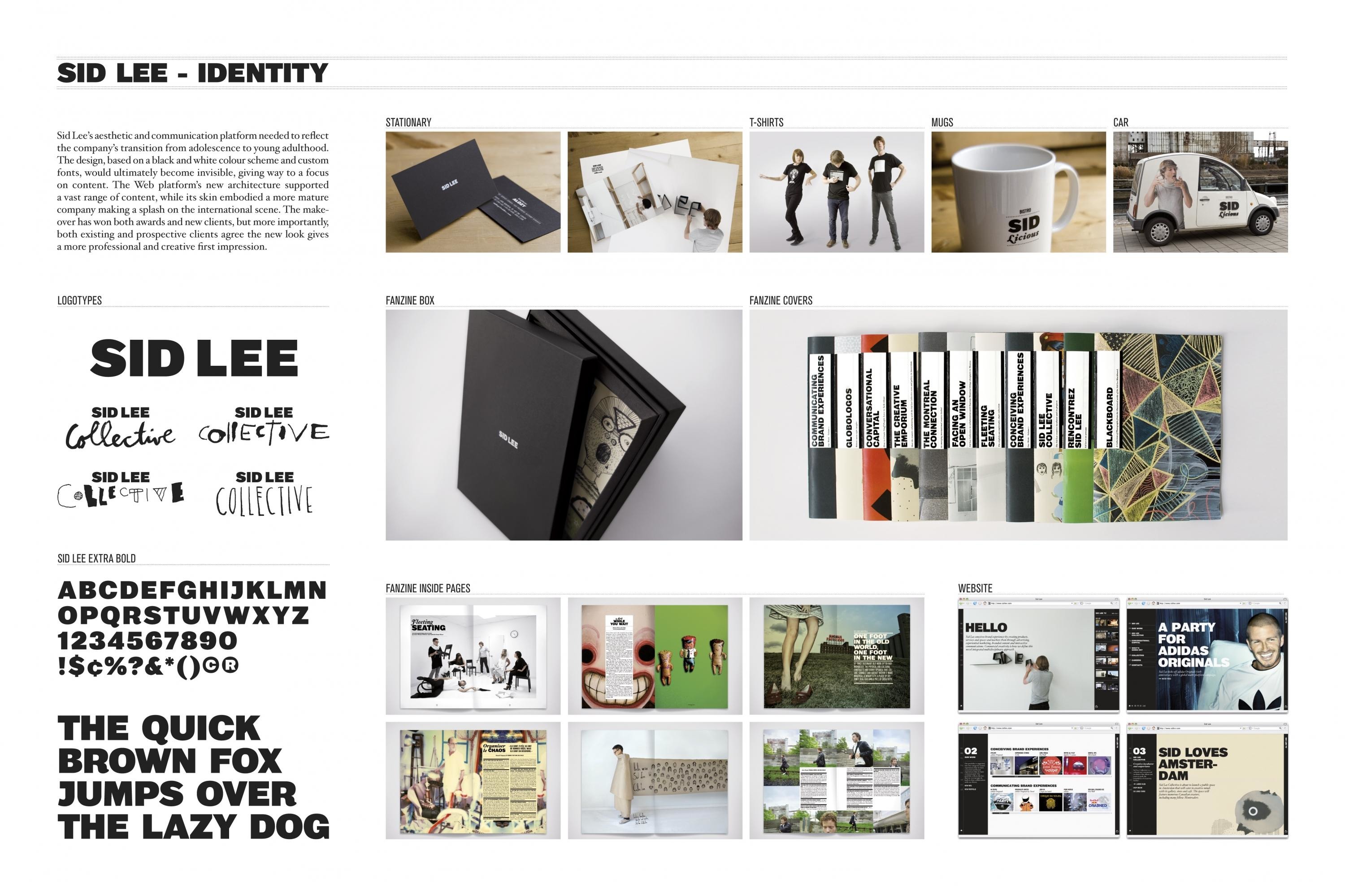
To transform the entire aesthetic and communication platform to reflect Sid Lee’s evolving personality.
ClientBriefOrObjective
To create a proprietary style for Sid Lee that would embody their transition from adolescence to young adulthood.
Effectiveness
The makeover has already won critical acclaim with Grand Prizes for branding and our new Fanzine template. Sid Lee has also seen an increase in business since the re-brand launch in September 2008. Most importantly, both existing and prospective clients agree the new look gives a more professional and creative first impression.
Execution
The primary strategy was to make it clear that the new look belonged only to Sid Lee. The approach was to design a look and feel that would ultimately become invisible, giving way to a focus on content. Further, to create aspects of the new design that would be transferable to every facet of Sid Lee’s skin – from pitch presentations to business cards.
More Entries from Self Promotion in Design
24 items


More Entries from SID LEE
24 items