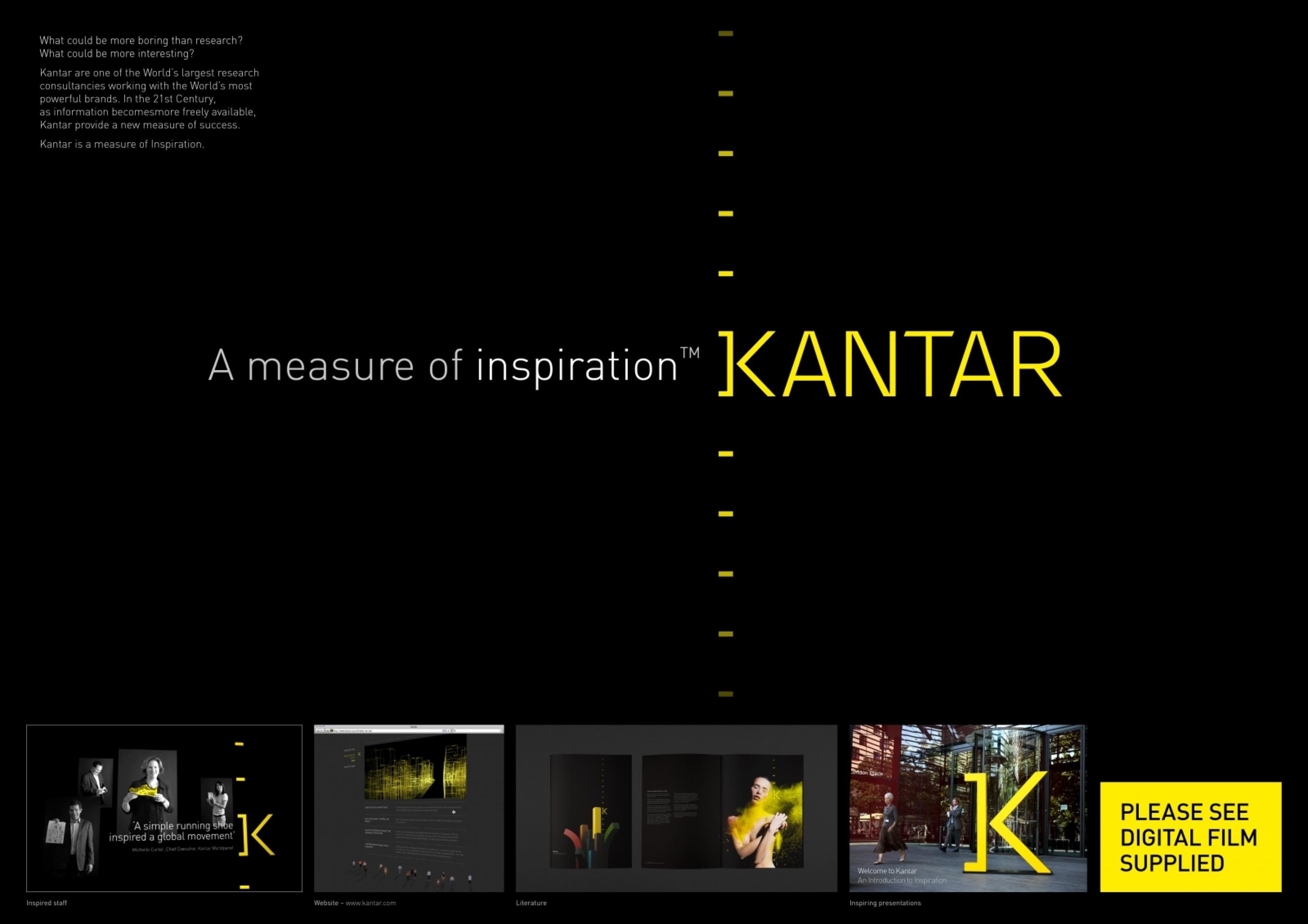
Design > Corporate or Brand Identity
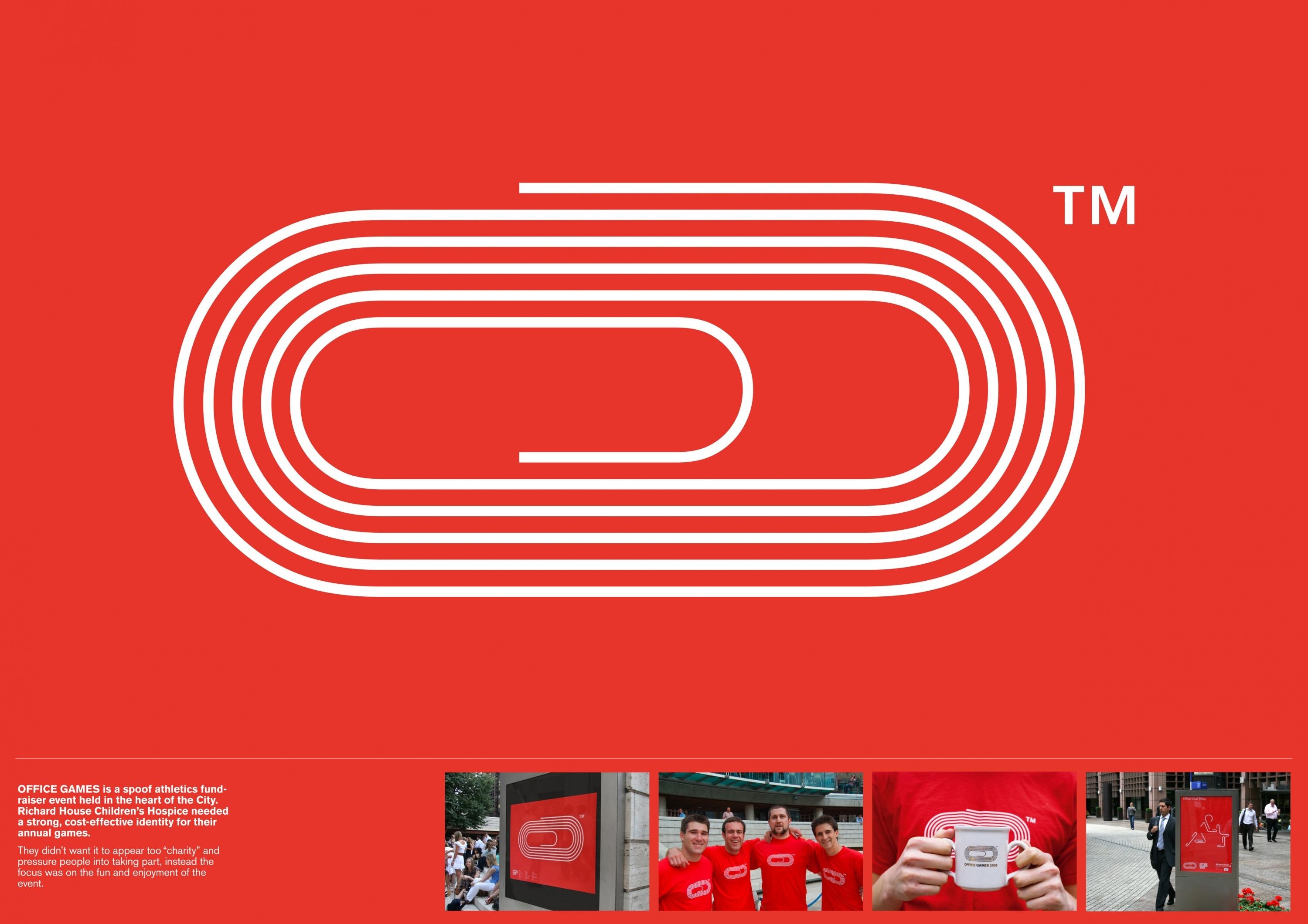
OFFICE GAMES
THE PARTNERS, London / RICHARD HOUSE / 2009
Awards:
Overview
Credits
Overview
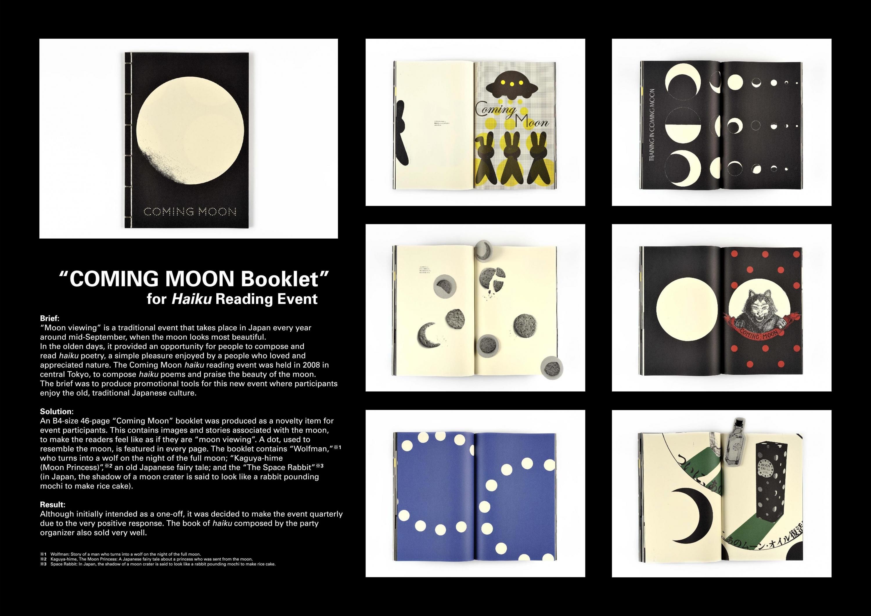
BriefExplanation
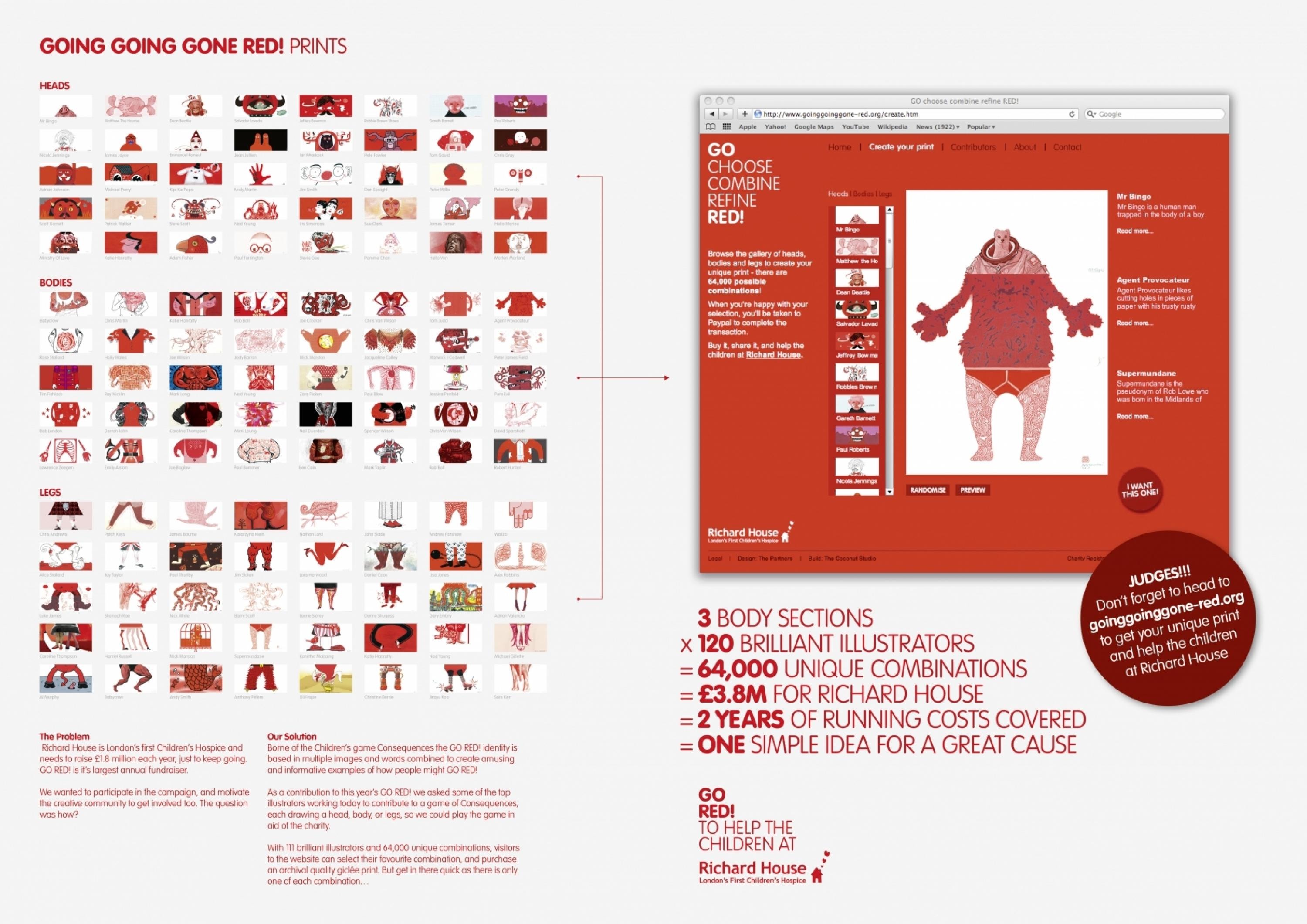
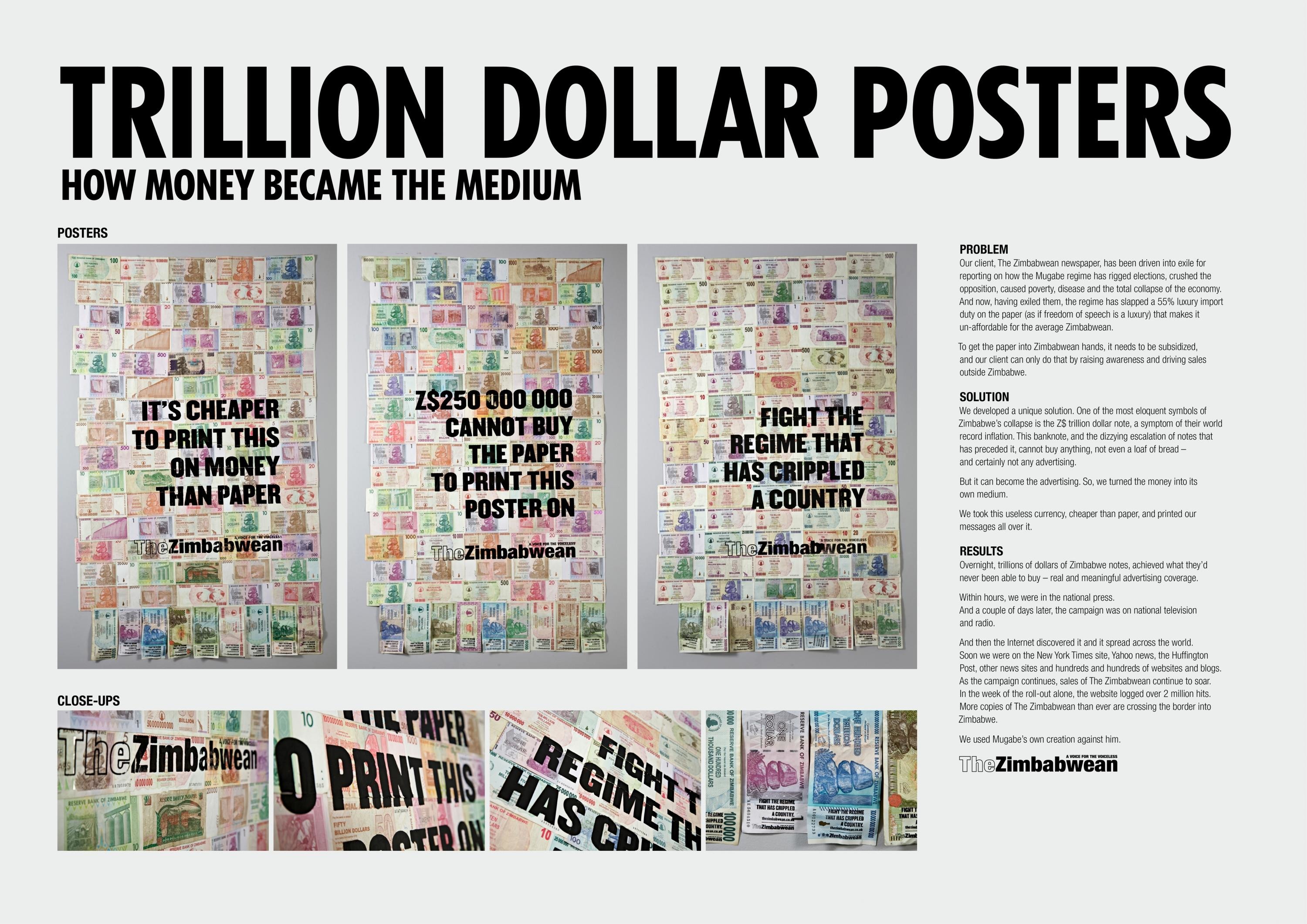
Richard House needed a logo and visual language that would excite people for the fundraisers pilot year and lay the foundations for a strong identity for future events.
ClientBriefOrObjective
They didn’t want it to appear too “charity-like” and overtly guilt people into taking part, they wanted the focus to be on the fun and enjoyment of the event.
Effectiveness
Teams from across the City took part in the Office Games 2008 at Broadgate Arena on July 25th. The sun shone, the audience applauded and the teams of 4 rose to the challenge of the unique events. A fantastic amount was raised for Richard House Children's Hospice.
Execution
The humble paperclip became the heart of the identity, creating the main running track logo and a set of icons depicting each sporting event. Marketing communications included banners, flyers, animations, posters and T-shirts.
Bold use of the core red gave us a cost effective way of achieving maximum impact.
More Entries from Corporate Identity Schemes - Small scale in Design
24 items


More Entries from THE PARTNERS
24 items