Design > Corporate or Brand Identity
BUICK STYLE GUIDE
LEO BURNETT CHICAGO, Chicago / GENERAL MOTORS / 2009
Awards:
Overview
Credits
Overview
BriefExplanation
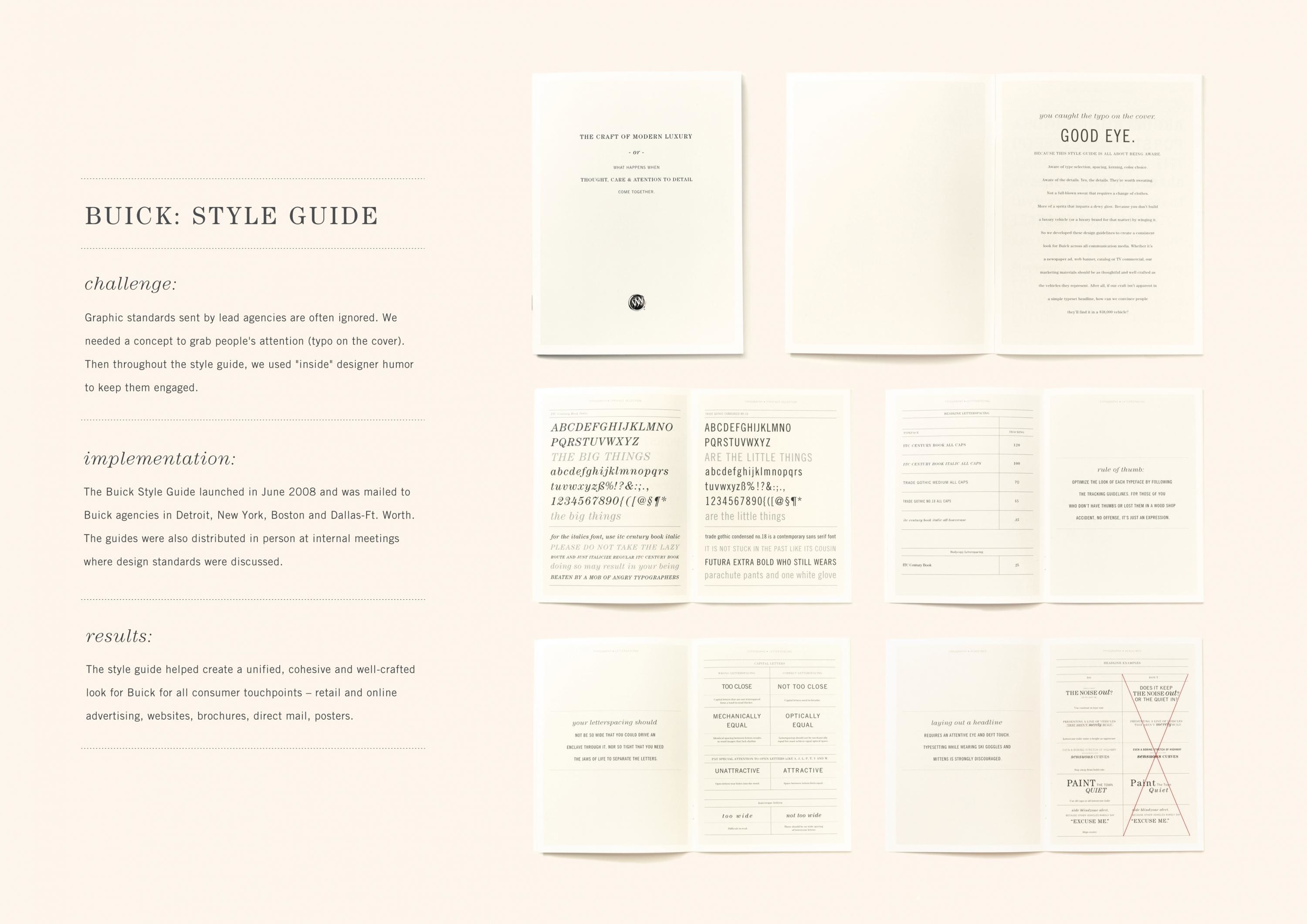
Before we won the account, the look of Buick's advertising and marketing materials was inconsistent, using a cacophony of different typefaces, design cues, colors, and photographic styles.
Our goal was to create a unified, cohesive and well-crafted look for Buick across all consumer touch points -- retail, online, print and television advertising, websites, brochures and catalogs, direct mail.
ClientBriefOrObjective
Graphic standards sent by lead agencies are often ignored. We needed a concept to grab people's attention, hence the typo on the cover. Throughout the style guide, we used "inside" designer humor to keep them engaged.
Effectiveness
The Buick Style Guide launched in June 2008 and mailed to Buick agencies in Detroit, New York, Boston and Dallas-Ft. Worth. The guides were distributed in person at several cross-agency design standard meetings. The look of Buick communication materials has become much more consistent, which has helped strengthen the brand in difficult economic times.
Execution
The style guide was inspired by the color palette and design cues of an upscale spa. The style guide uses two primary typefaces - one modern, one classic – to evoke a "refreshingly reminiscent" design style.
More Entries from Publications in Design
24 items


More Entries from LEO BURNETT CHICAGO
24 items