Design > Brand-building
HUMANITY & INCLUSION
COSSETTE, Montreal / HUMANITY & INCLUSION / 2018
Awards:
Overview
Credits
Overview
CampaignDescription
The new name:
Our international analysis revealed that the organization’s key stakeholders commonly refer to Handicap International as “HI”. Our solution: replace the definition of the acronym HI and inject new meaning and inspiration. Handicap International became Humanity & Inclusion. This new name reflected one of the organization’s core values: humanity. It also communicated one of its ambitions to include people with disabilities and vulnerabilities who are so often overlooked. It evoked the fact that HI cherishes difference and fights exclusion.
Execution
New logo and brand platform:
The new logo represents a powerful and universal symbol: the human hand.
The hand evokes our uniqueness but also helps us remember we are all human. The logo represents the “helping hand” that HI provides to those in needs. It also could be interpreted as a raised hand saying “stop!”
This helping-hand logo integrates the acronyms of the brand (HI) while transcending languages and cultures. To reflect HI's empathetic approach, characterised by respect for individuality and proximity with its beneficiaries, the brand platform uses rounded typo and bright and contrasting colours.
Outcome
Results
Since the name and platform have just been launched, all quantitative results are pending. But media coverage has been positive and the overall reaction is unanimous: the new name and platform were welcomed with open arms by the members of the organisation and the donors, adopted in all 60 countries where the organisation is helping. Humanity & Inclusion now has an identity that now conveys its values, its activities and overall mission.
The future looks as bright as Humanity & Inclusion’s new identity.
Synopsis
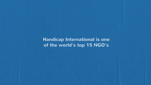
Handicap International is a leading NGO (among the top 15) based in France. It was founded 35 years ago and had for first mission to help camp refugees. The organization was facing a branding issue that undermined its credibility and fundraising activities: 1) the name Handicap International had lost social acceptability for the English-speaking world since the term handicap was replaced by “persons with disability” 2) the organization’s name no longer represented the full spectrum of its 6 fields of intervention. Our challenge: find a culturally appropriate name that would be adopted by more than 60 countries. The insight: our international analysis revealed that the organization’s key stakeholders commonly refer to Handicap International as “HI”. Our solution: replace the definition of the acronym HI and inject new meaning and inspiration. On January 24, 2018, the new name was revealed and deployed to the world. Handicap International became Humanity & Inclusion.
More Entries from Rebrand / Refresh of an Existing Brand in Design
24 items
More Entries from COSSETTE
24 items