Design > Graphic Design & Design Crafts
THE WHOLE PICTURE
BBH, London / THE GUARDIAN / 2012
Awards:
Overview
Credits
Overview
BriefExplanation
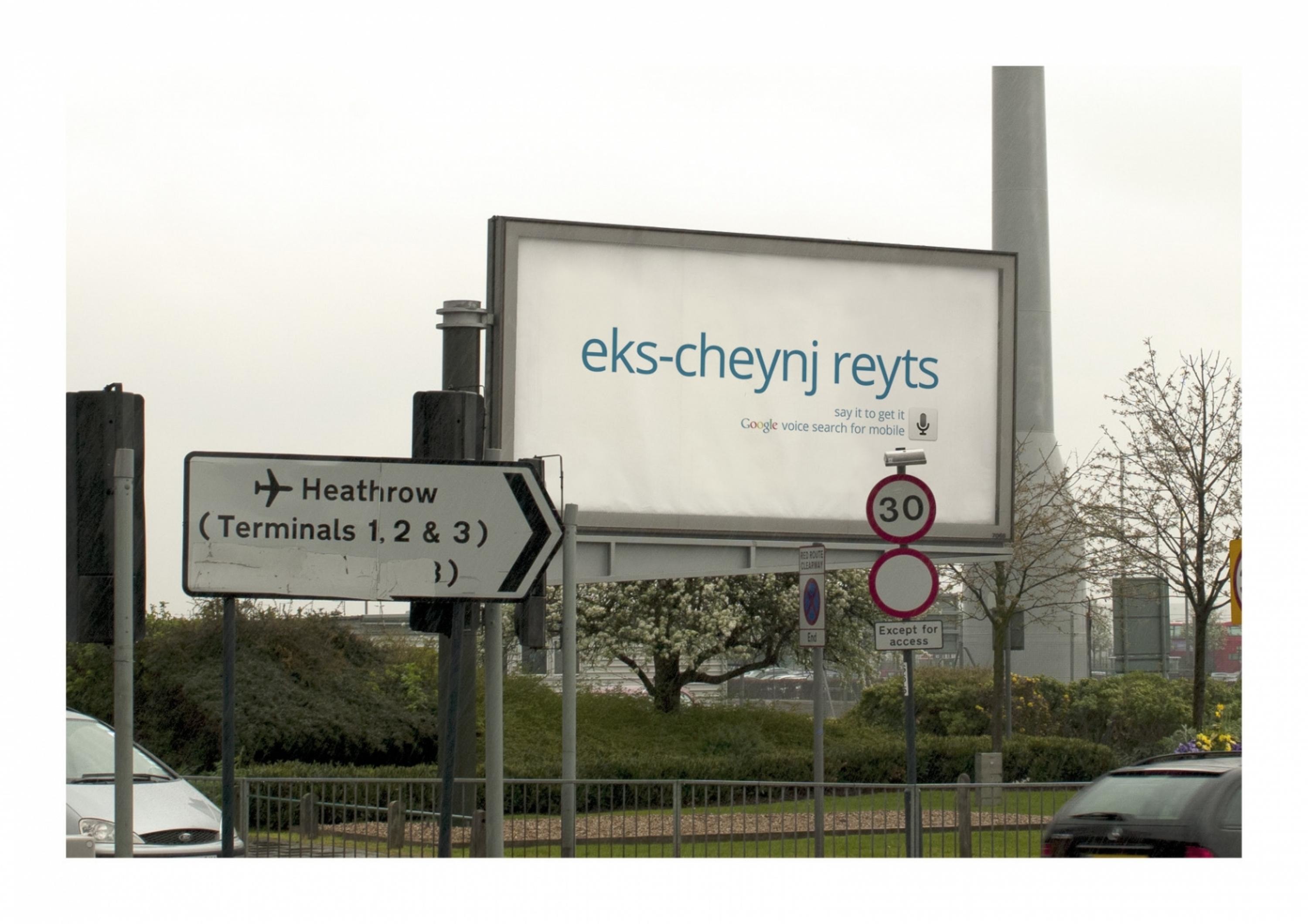
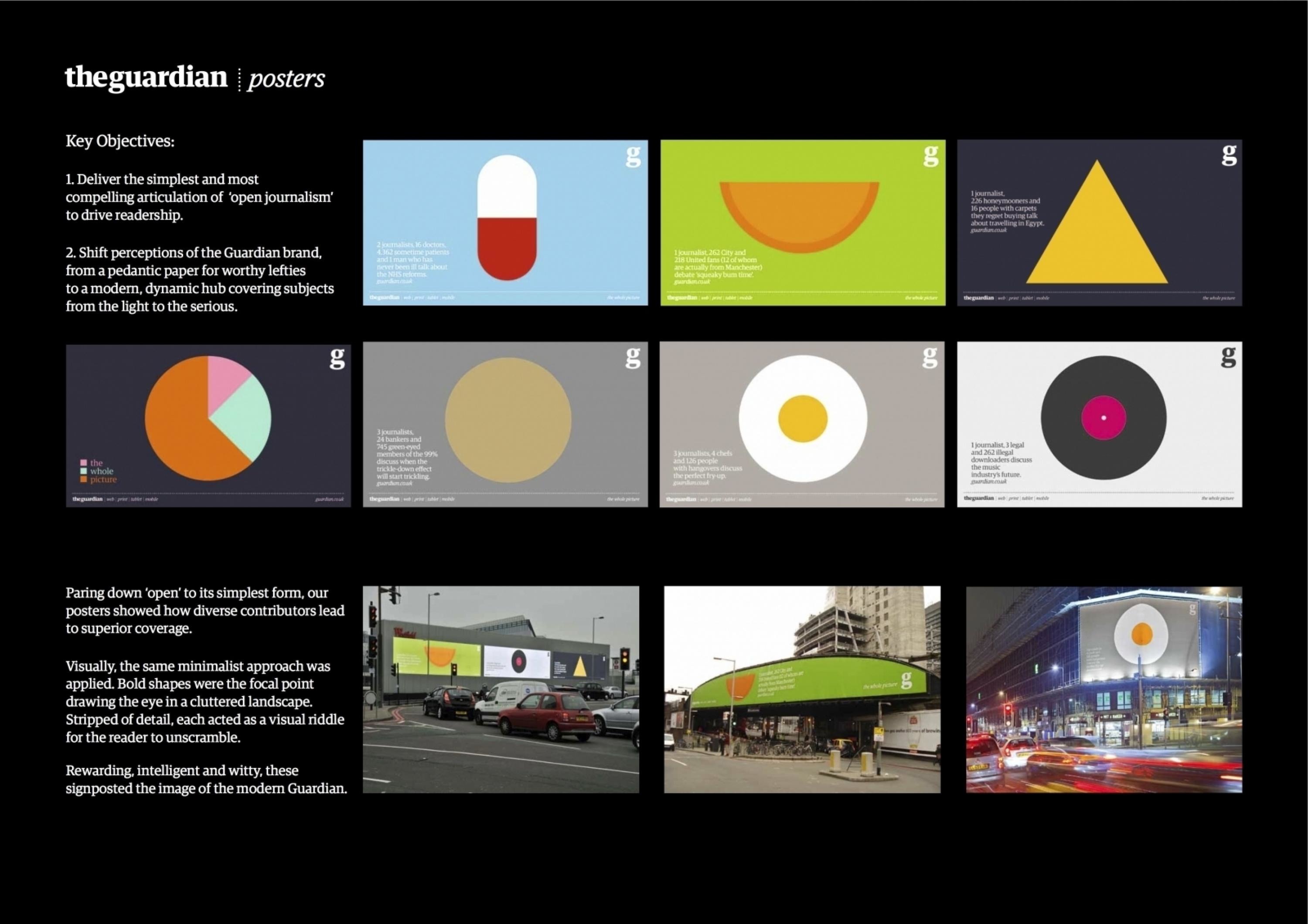
The Guardian had a huge ambition. With the newspaper industry crippled by loss of readers, advertisers and eroding public trust, it sought to introduce a radical model of ‘open journalism’.‘Open journalism’ marked the 10-year transformation of the Guardian from a traditional left-wing paper to a digital-first hub, enriched by multiple contributors to deliver the broadest perspective.Our task: Force re-appraisal of the Guardian brand by bringing its open philosophy to life for the audience of global progressives.
ClientBriefOrObjective
The challenge was to turn philosophy into practical benefit.We had to make the complex simple and the abstract concrete in a cluttered and fleeting space.There were 2 key objectives:1. Deliver the simplest and most compelling articulation of ‘open journalism’ to drive readership2. Shift perceptions of the Guardian brand, from a pedantic paper for worthy lefties to a modern, dynamic hub, covering subjects from the light to the serious
Effectiveness
The posters were part of an integrated campaign that made global headlines and amassed 941,232 hits on the microsite. (Source: Guardian) In commercial terms, there was a 19% spike in readers visiting the main Guardian site over the campaign period. (Source: Hitwise)Even isolating the effect of the posters, the work resonated with progressives and modernised the brand:- Almost a third of target progressives were more likely to associate the brand with being ‘modern’ and ‘humorous’. (Source: Guardian panel)- Fans have lauded them for being “cool and clever”, “beautiful in its simplicity”, with one asking, “are they available to buy?” (Source: online blog and twitter posts)
Execution
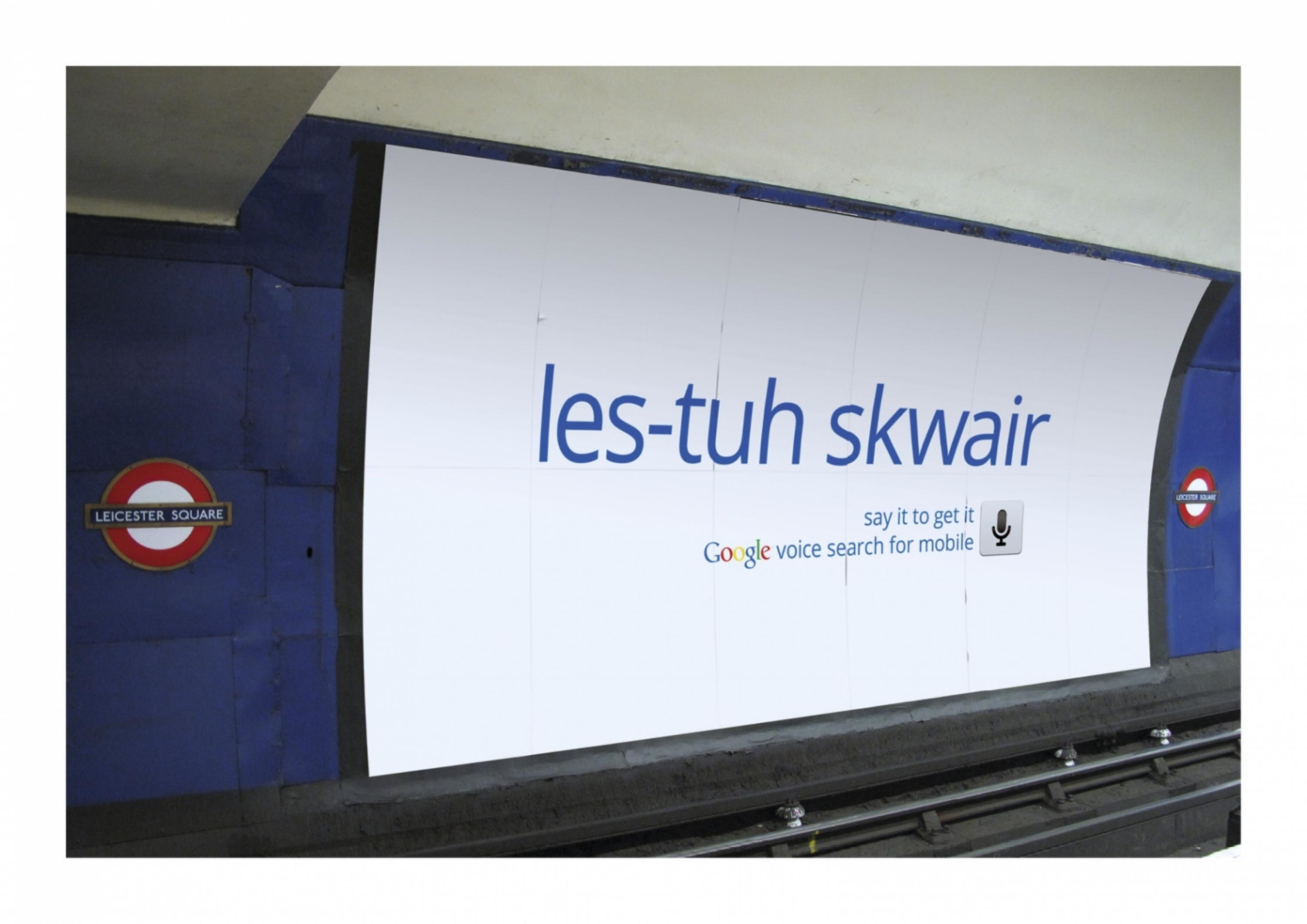
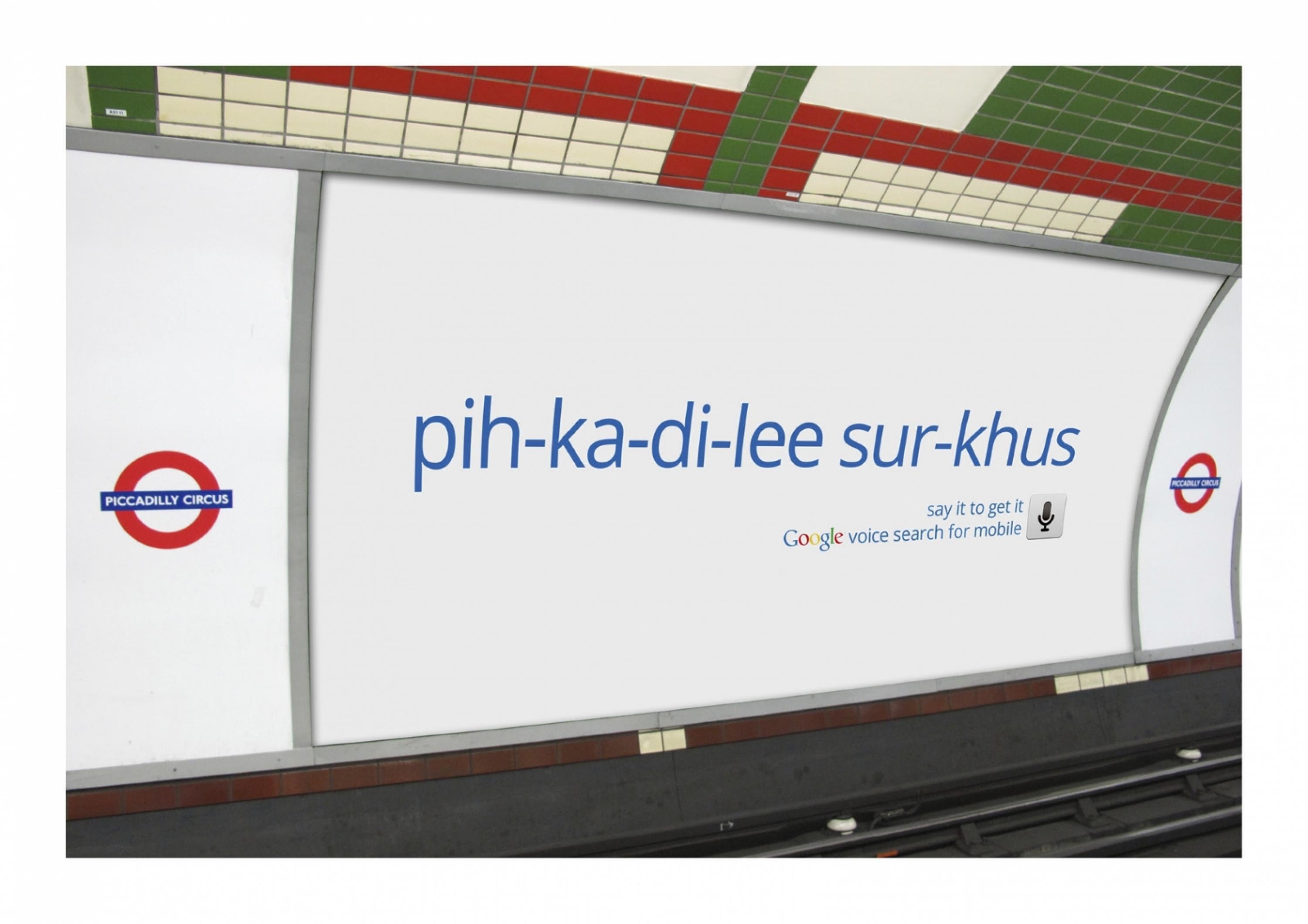
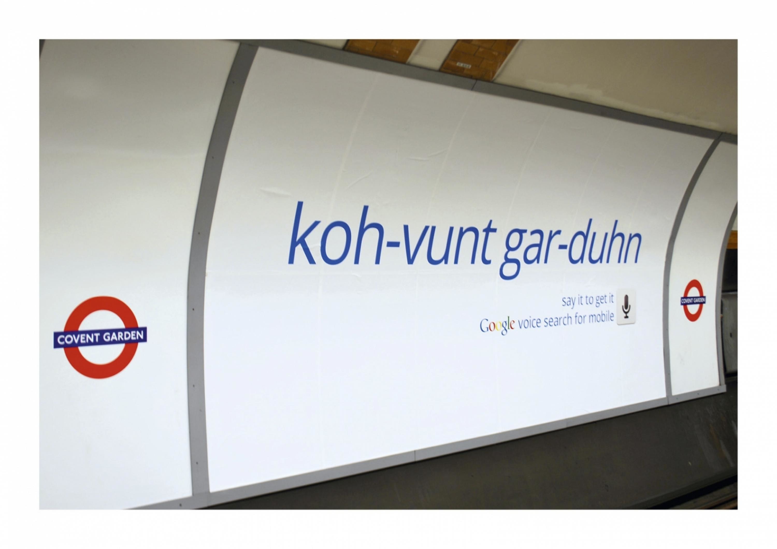
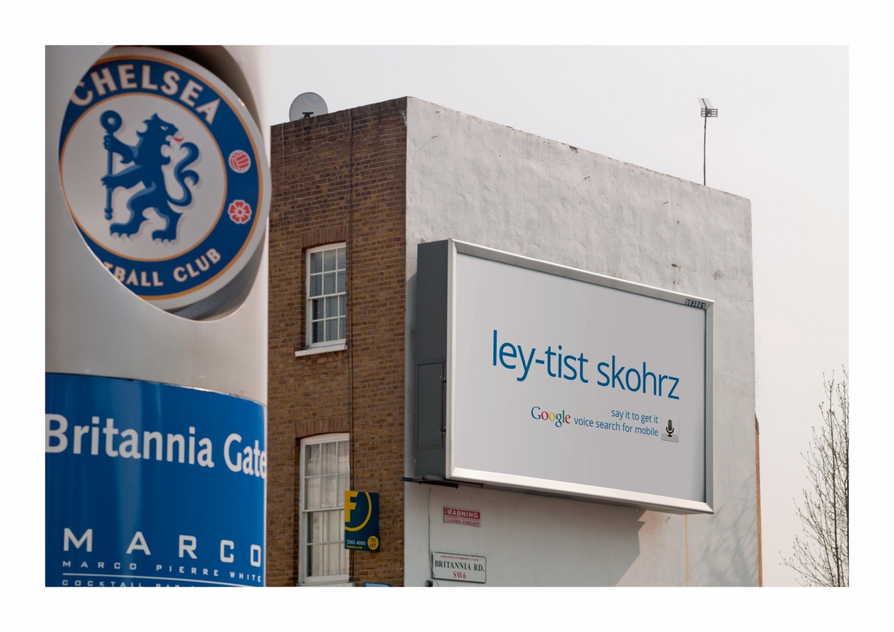
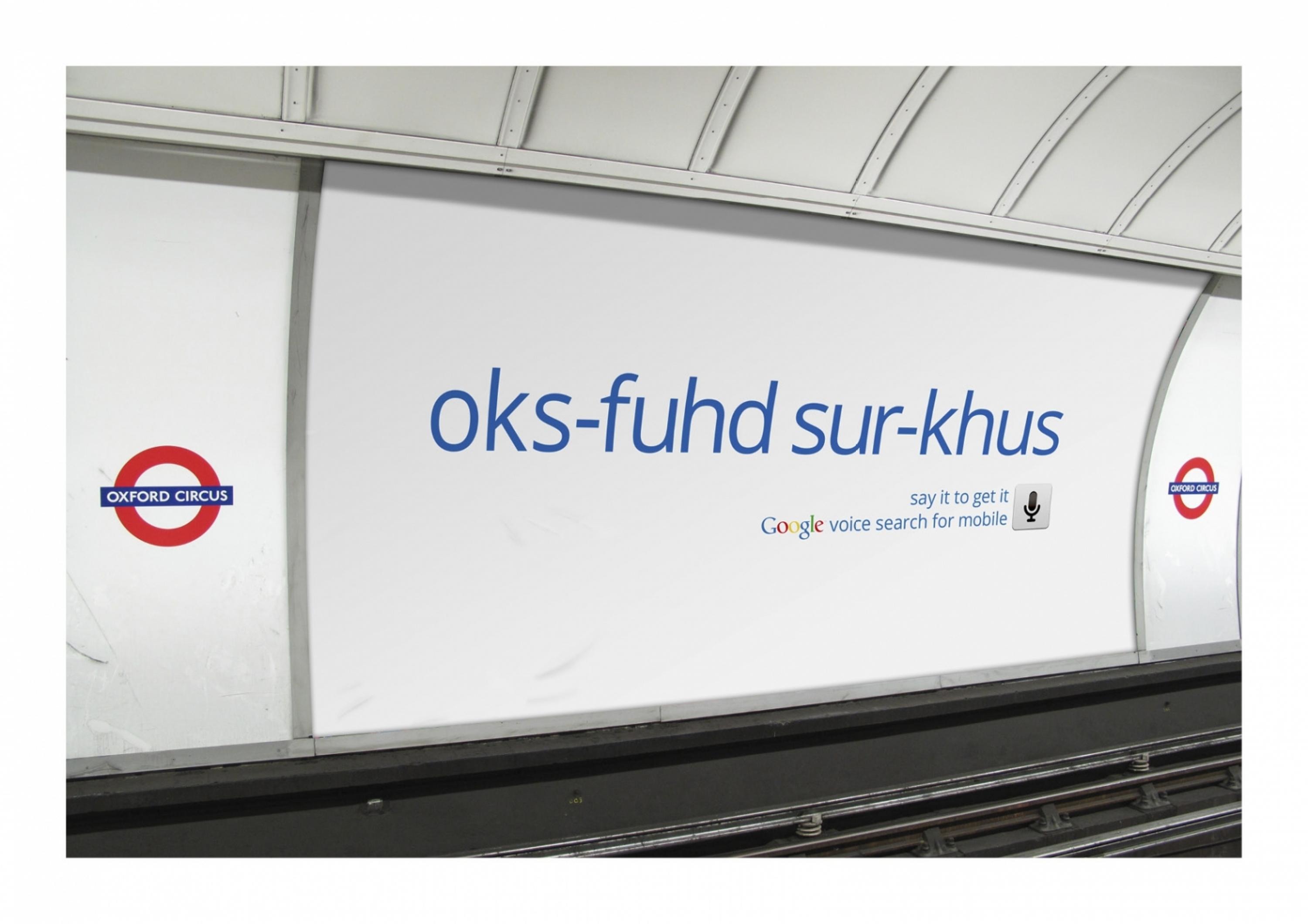
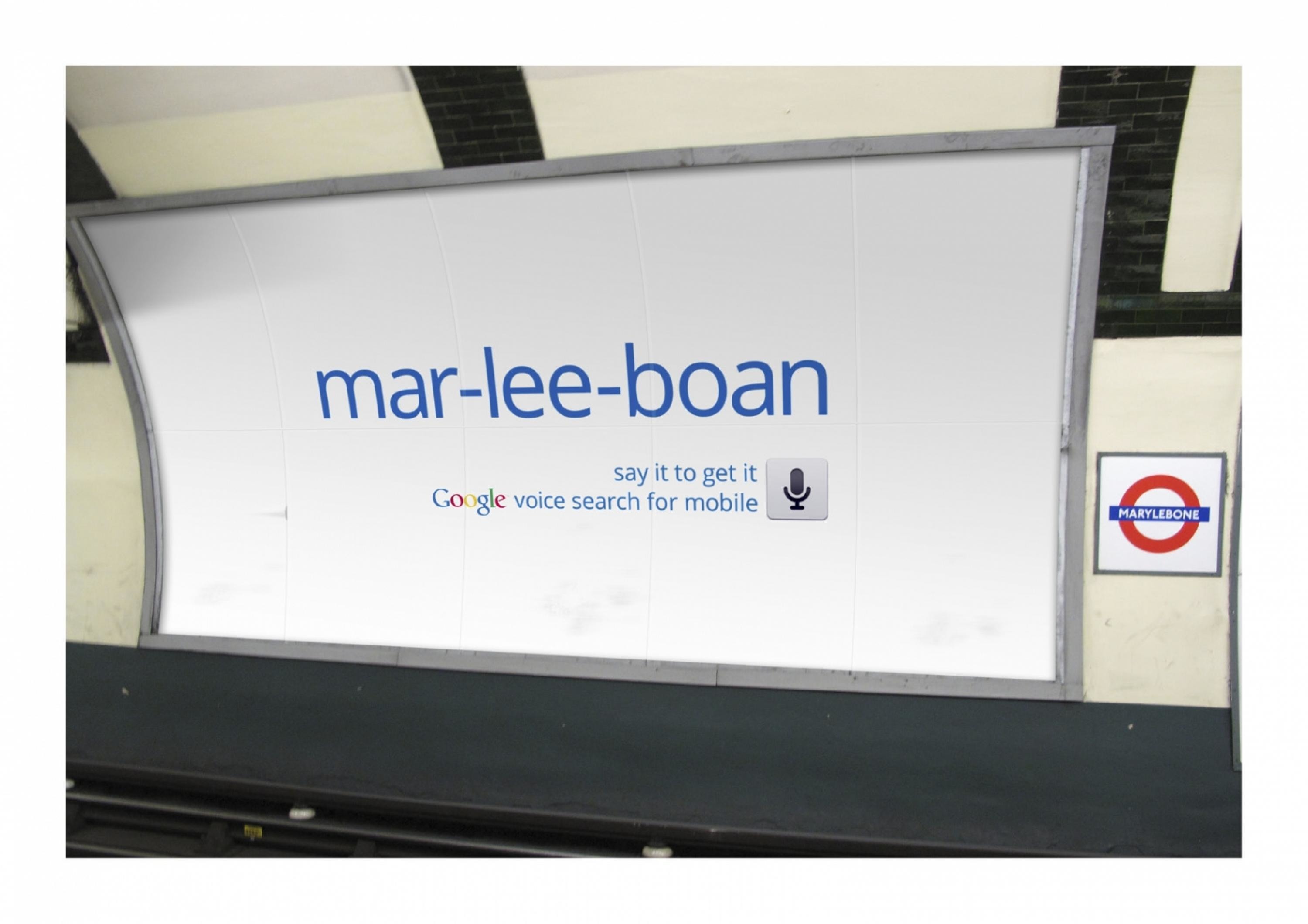
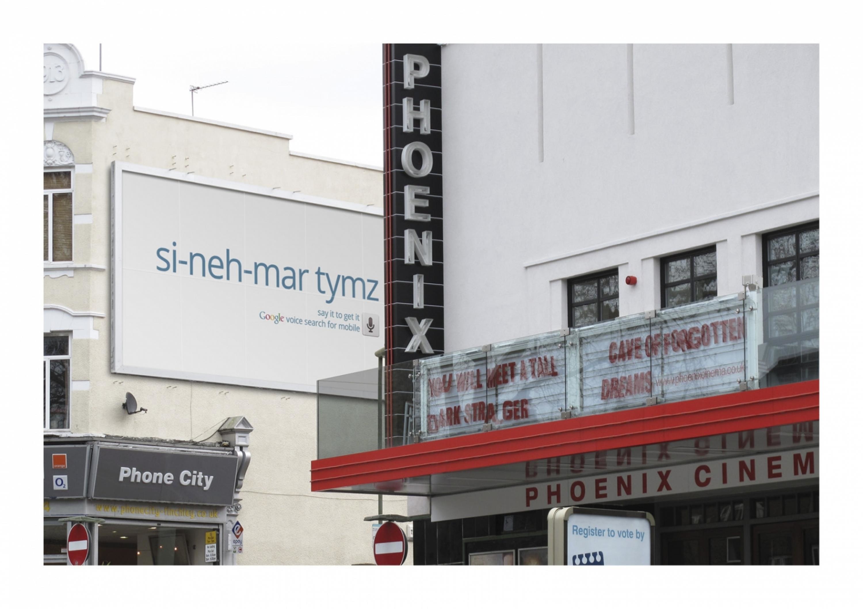
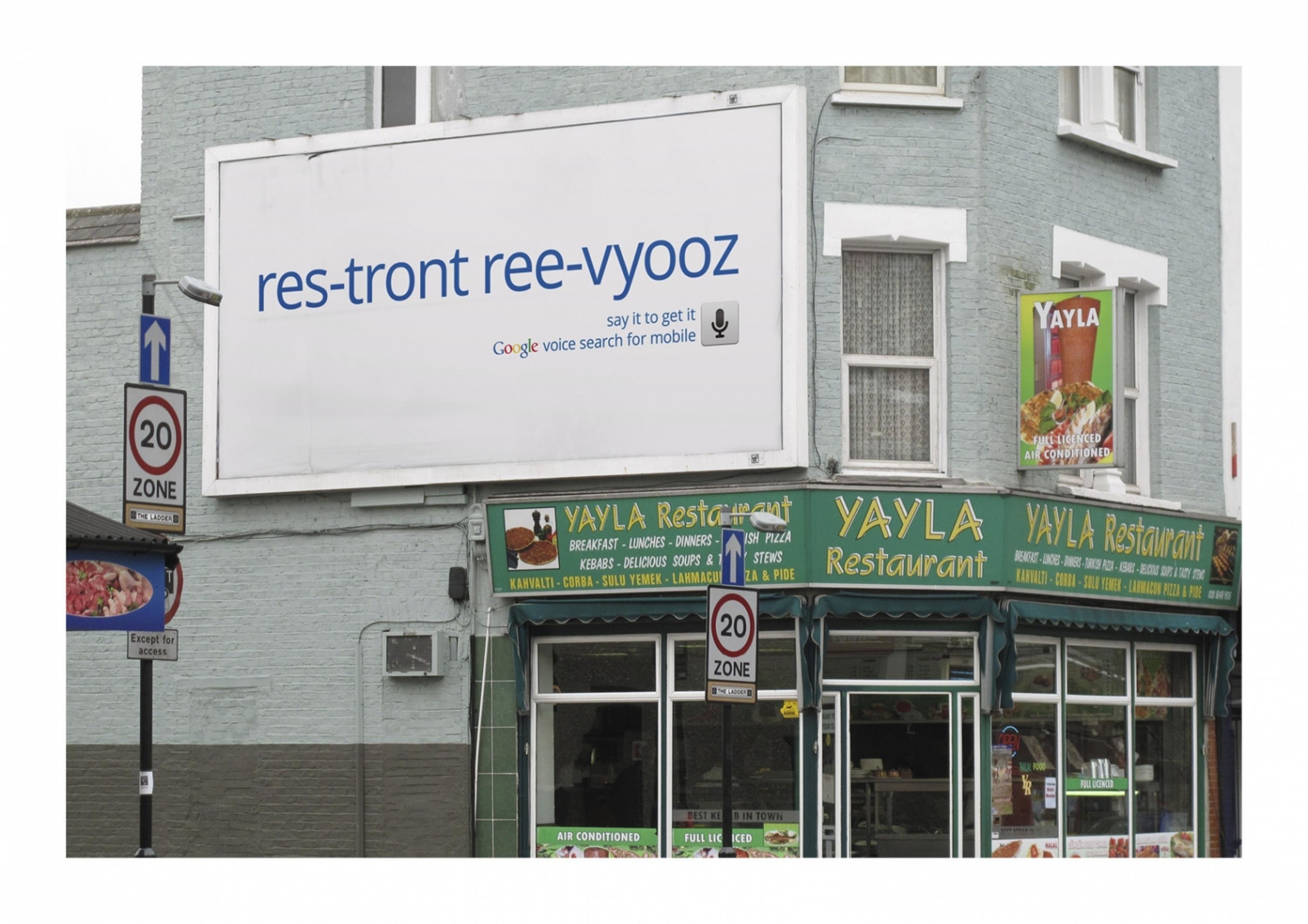
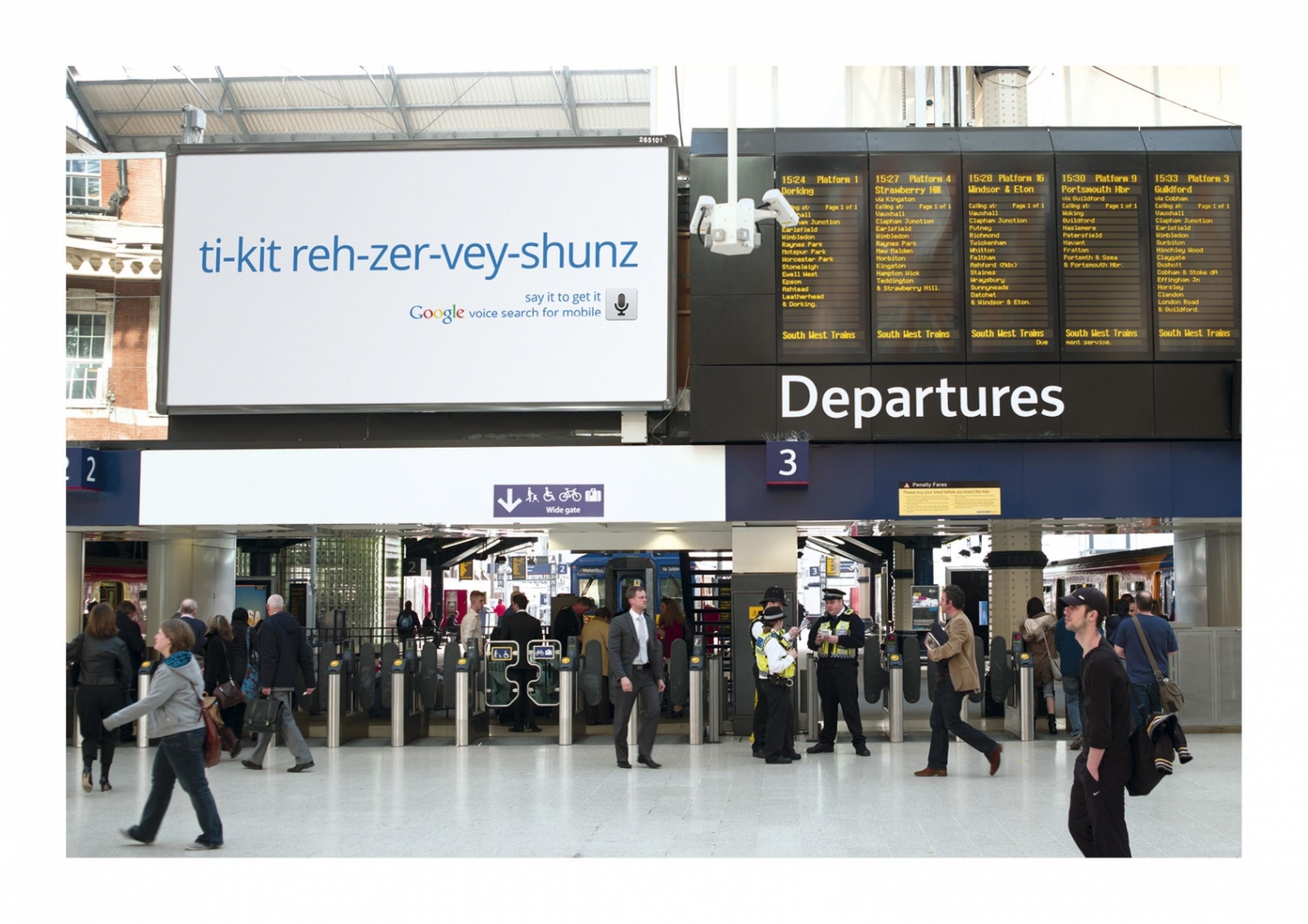
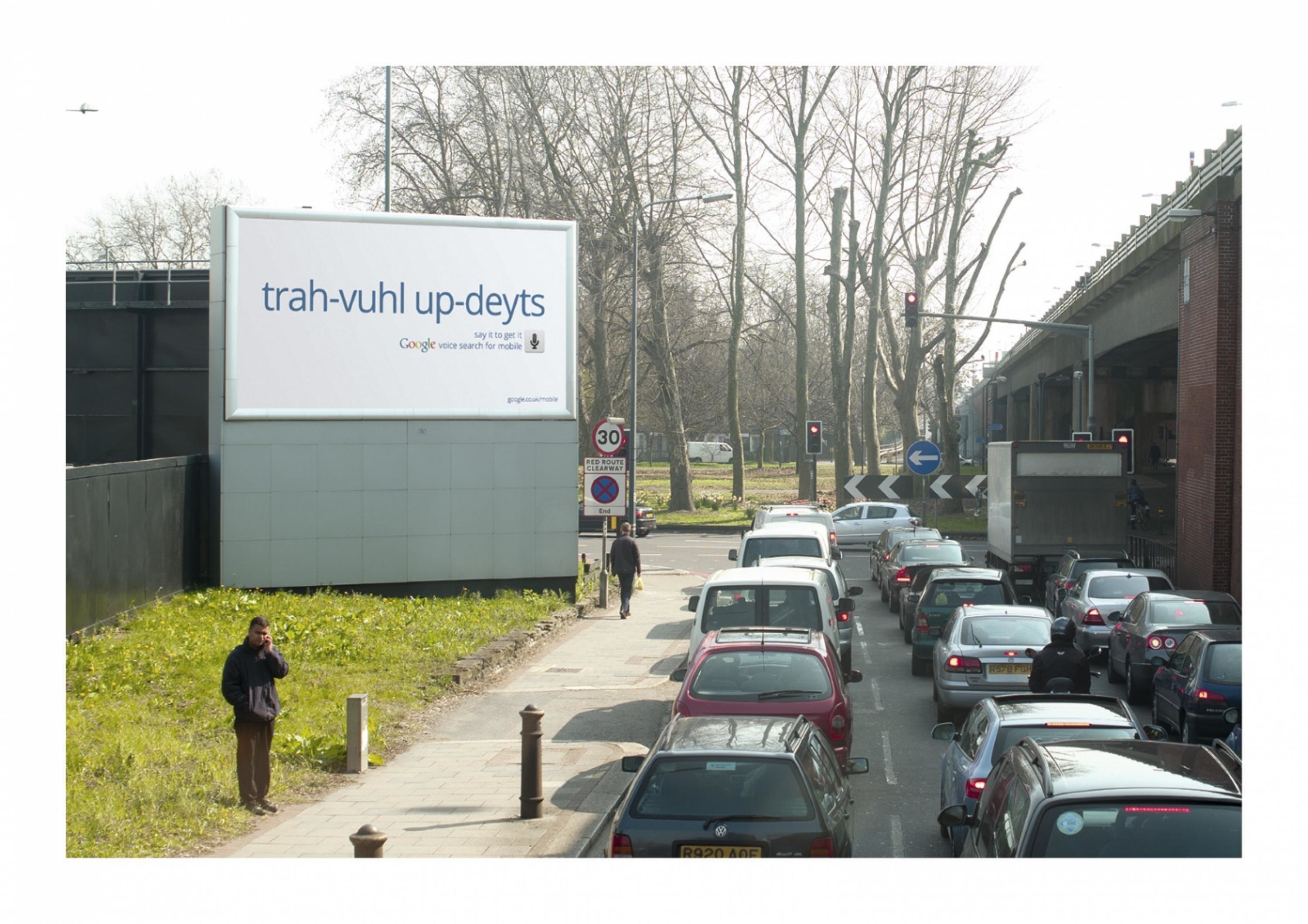
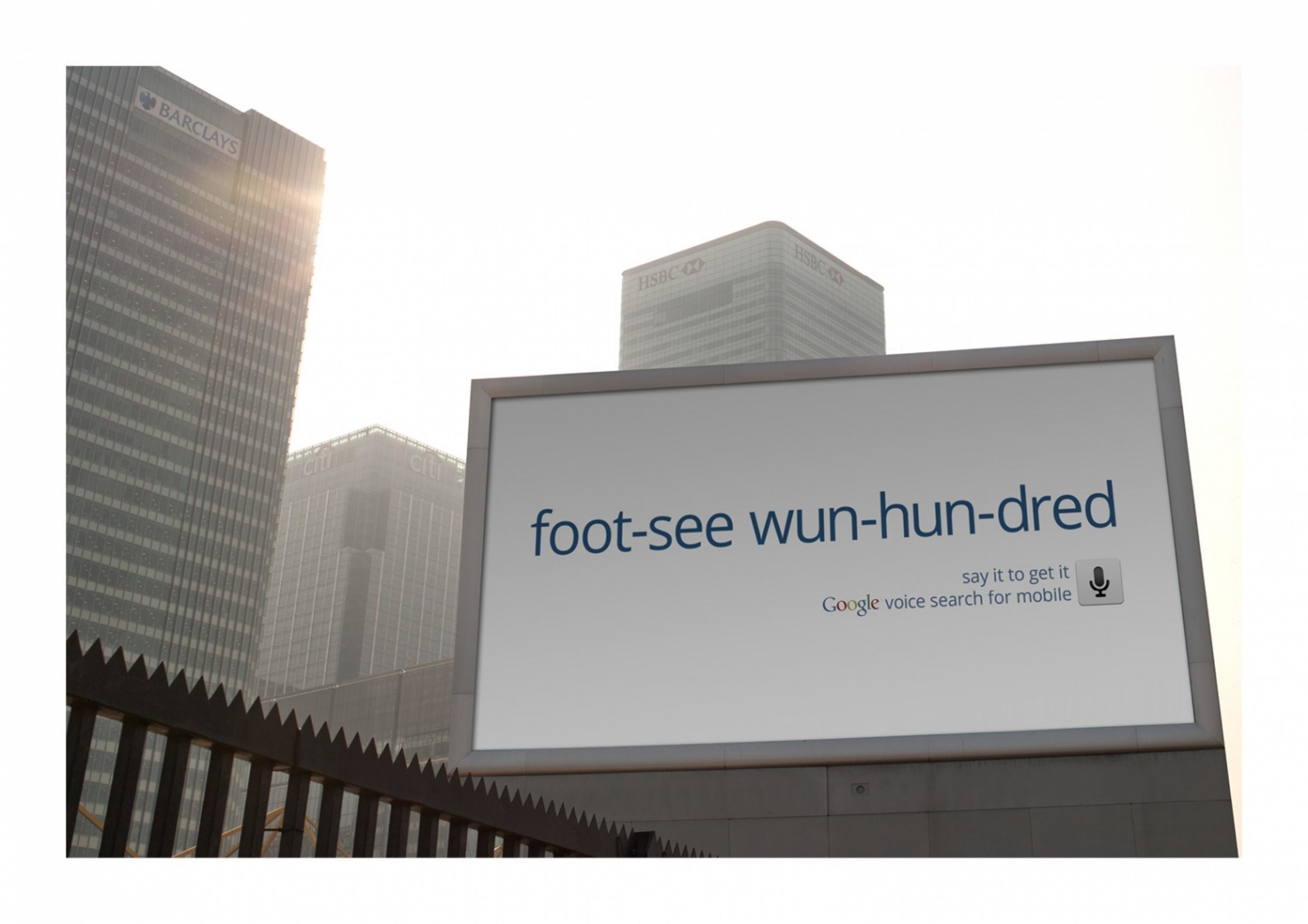
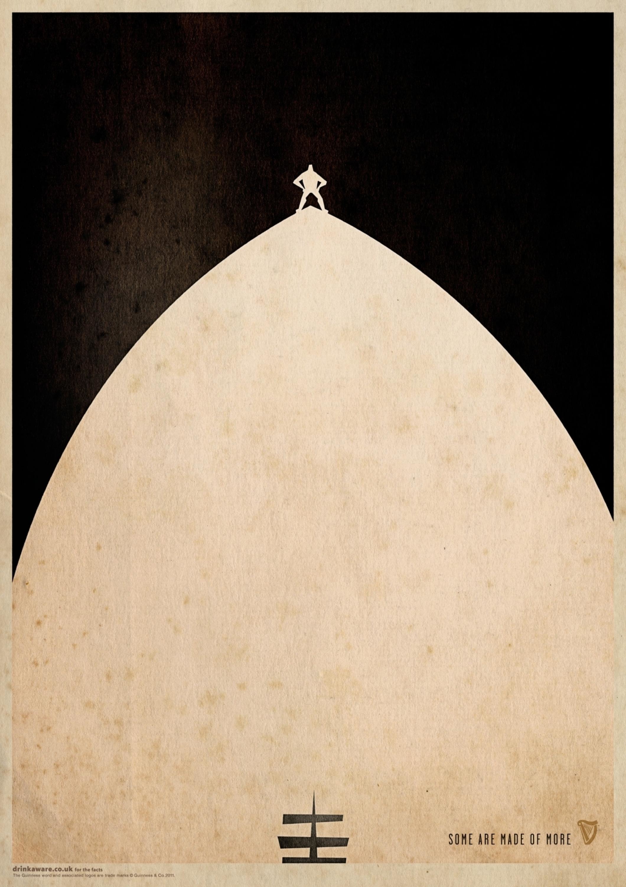
A driver has as valid an opinion on fry-ups as a food writer. A die-hard sports fan could have trivia that adds to a reporter’s story. That is the ‘open’ message distilled.Paring down ‘open’ to its simplest form, our posters showed how diverse contributors lead to superior coverage.Visually, the same minimalist approach was applied. Bold shapes were the focal point drawing the eye in a cluttered landscape. Stripped of detail, each acted as a visual riddle for the reader to unscramble.Rewarding, intelligent and witty, these signposted the image of the modern Guardian.
More Entries from Posters in Design
24 items


More Entries from BBH
24 items