Design > Corporate or Brand Identity
TIFF '08
UNION, Toronto / TORONTO INTERNATIONAL FILM FESTIVVAL / 2009
Overview
Credits
Overview
BriefExplanation
The Toronto International Film Festival was losing its core customer. The young hip urbanites who once flocked to the festival were staying away. We needed to change that.
ClientBriefOrObjective
The Festival had become a victim of it’s own success. Over the years it had become wildly popular attracting A-List celebrities and blockbuster galas. However, in the eyes of the young urban dweller it had become more flash than substance; more about Brad Pitt sightings than film. In short it was losing its credibility.
Our challenge became clear. We had to reestablish the artistic integrity of the festival. We had to bring it back to its roots.
Effectiveness
The campaign was a huge success. Anecdotally the client said, “it was close to perfect” and it showed in the business results.We doubled the individual ticket buyer goals and grew the under 35 customer base by 10%.
Execution
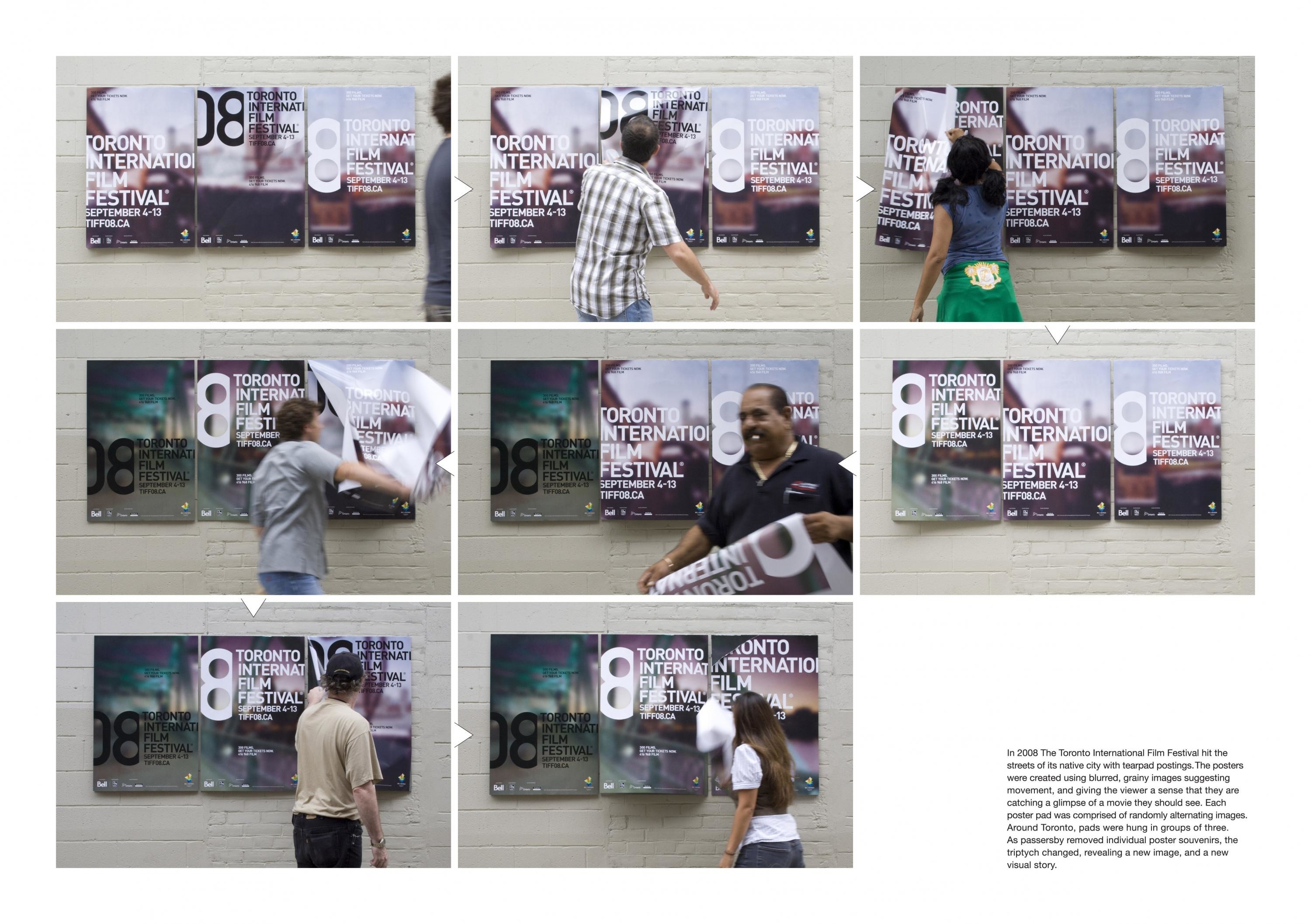
So we hit the streets.
Tearpad posters were created using blurred, grainy images suggesting movement, and giving the viewer a sense that they are catching a glimpse of a movie they should see. The effect also helped to re-establish the gritty, unpolished, artistic nature of the festival.
Each poster pad was comprised of randomly alternating images. Around Toronto, pads were hung in groups of three. As passersby removed individual poster souvenirs, the triptych changed, revealing a new image, and a new visual story.
More Entries from Posters in Design
24 items


More Entries from UNION
24 items