Design > Graphic Design & Design Crafts
BASISBIBEL
GOBASIL, Hamburg / GERMAN BIBLE SOCIETY / 2011
Awards:
Overview
Credits
Overview
BriefExplanation
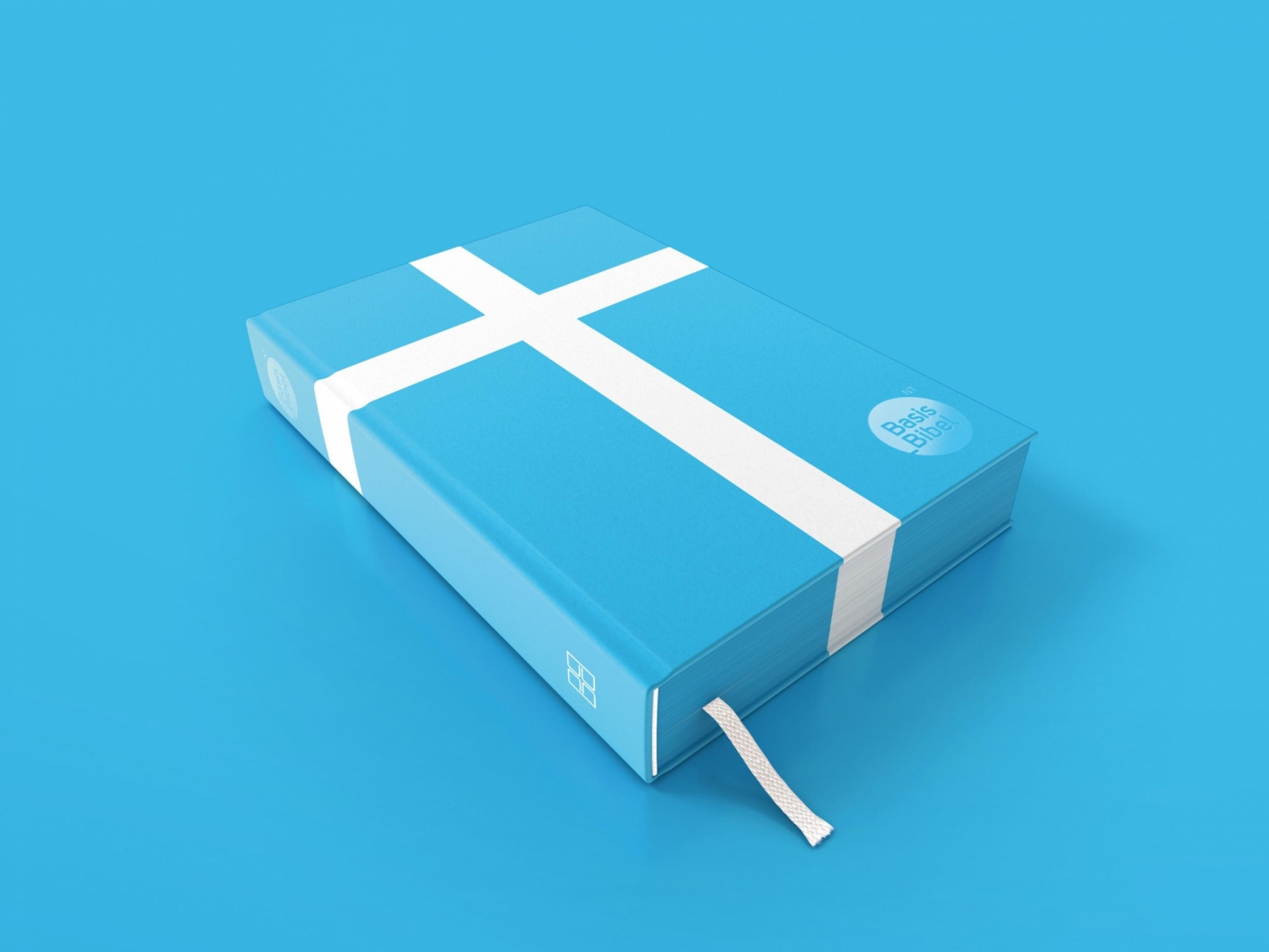
The task by our client was to develop a product design for a new German translation of the new testament called "BasisBibel NT". The DGB is also rights holder and publisher of the first and revolutionary Bible translation of Martin Luther from Greek and Hebrew to the German language in 1522 and following translations. The all new "BasisBibel NT" uses a very clear, modern language and is still very close to the original text. The textual structure and typography is optimised for better reading comprehension. In addition to that, the BasisBibel is cross-media optimised.
ClientBriefOrObjective
Designing a Bible cover that would attract young people (e.g. pupils), as well as twentysomethings and adults is a challenge in itself. The design had to stand out among different new German Bible translations entering the market in the same year, so it was even more important to communicate the style of the language, and the particular benefits of the translation. In addition to that, the client had tried to place and sell parts of the New Testament (single books and the Synoptic Gospels) on the German book market for several years, with the same name but different designs and concepts, without success.
Effectiveness
Since the implementation on the Frankfurt Book Fair in October 2010, the DBG sold circa 20,000 copies from a total number of 26,000 copies. After 5 months the purple edition was sold out. These were sensational results for a partial issue of the Bible, the New Testament. Also very interesting: the other colors (green, petrol, blue) sell in the same range, and orange was available after the event. In addition, there is a magnificent increase in media coverage about the innovative book design, the campaign motives, and the translation itself that is very positive without exception.
Execution
We were looking for a design solution that would be as laconic and straightforward as the style of the translation, the language itself. The overall symbol for the Bible and particularly for the New Testament is the Cross. The idea was to reduce the book design to this simple and strong icon – a white cross on a coloured background. The innovation would be that the cross would encompass the whole body of the book, and required a partial coloured edge. It came out that one bookbinding business could realise the technical challenge with the typical India paper in brilliant quality.
More Entries from Books in Design
24 items
More Entries from GOBASIL
1 items

