Design > Graphic Design & Design Crafts
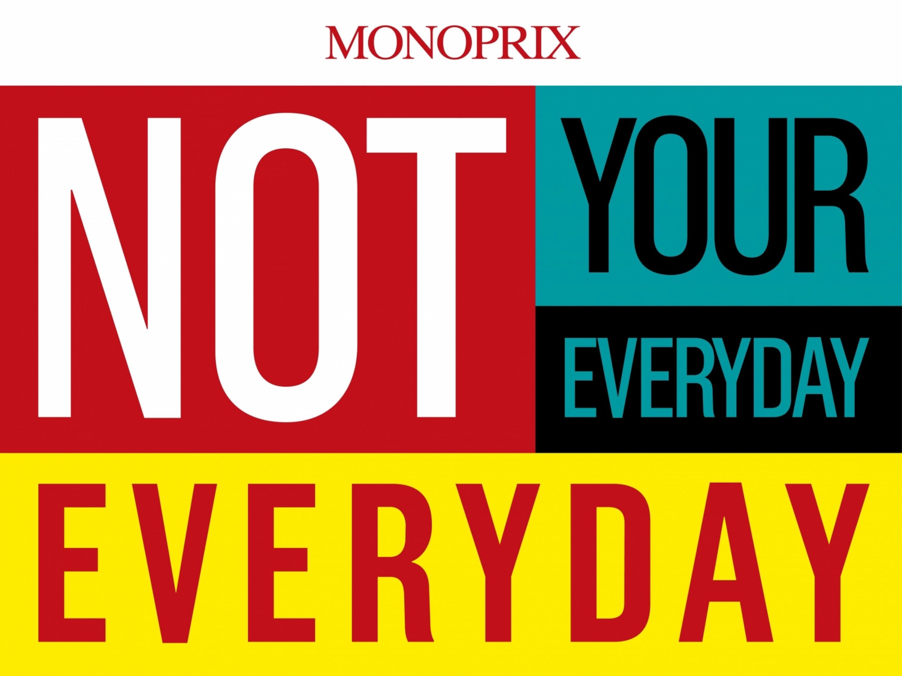
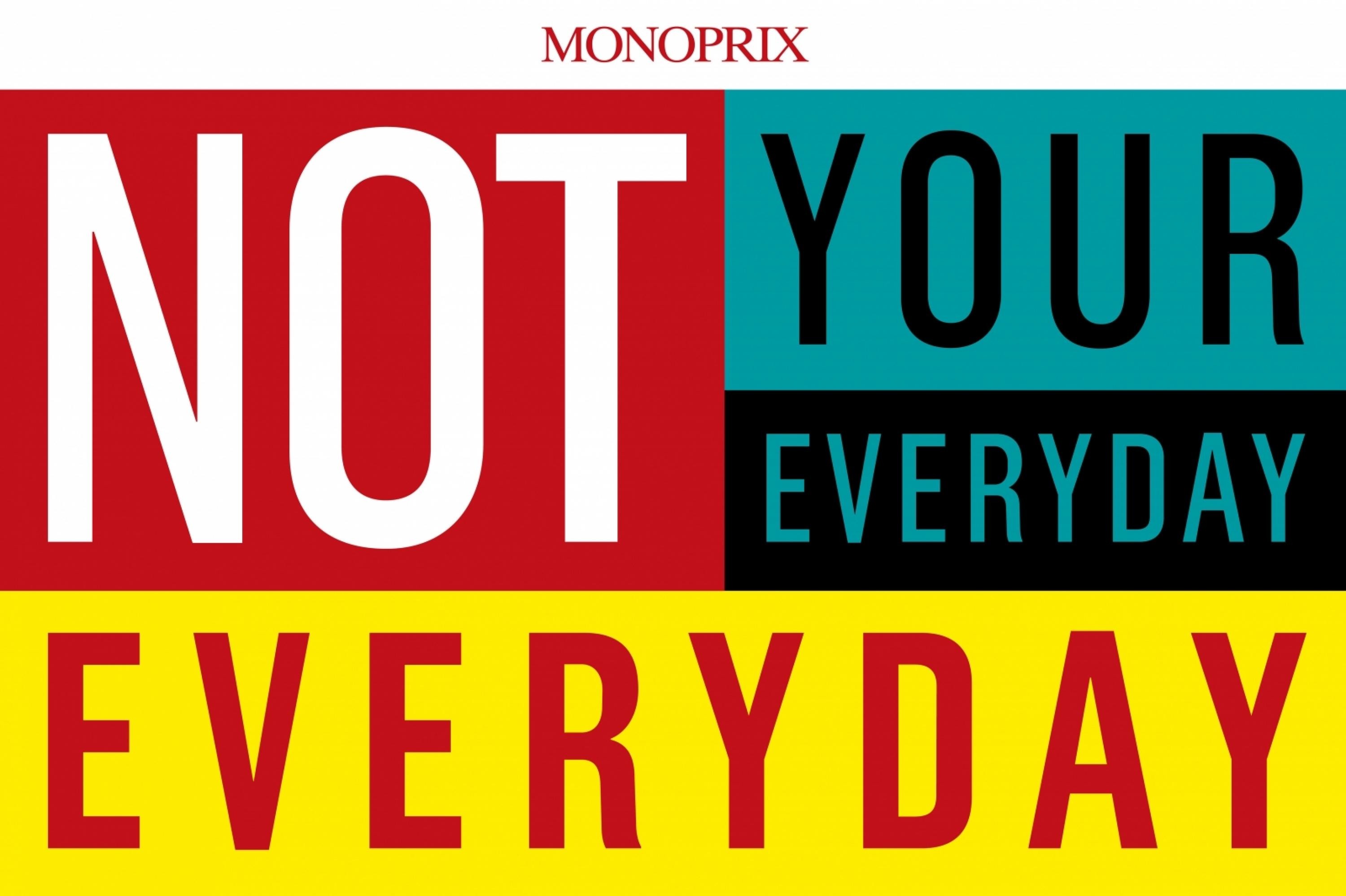
NOT YOUR EVERYDAY EVERYDAY
HAVAS CITY, Paris / MONOPRIX / 2011
Awards:

Overview
Credits
Overview
BriefExplanation
How to build the most popular premium retailer brand?
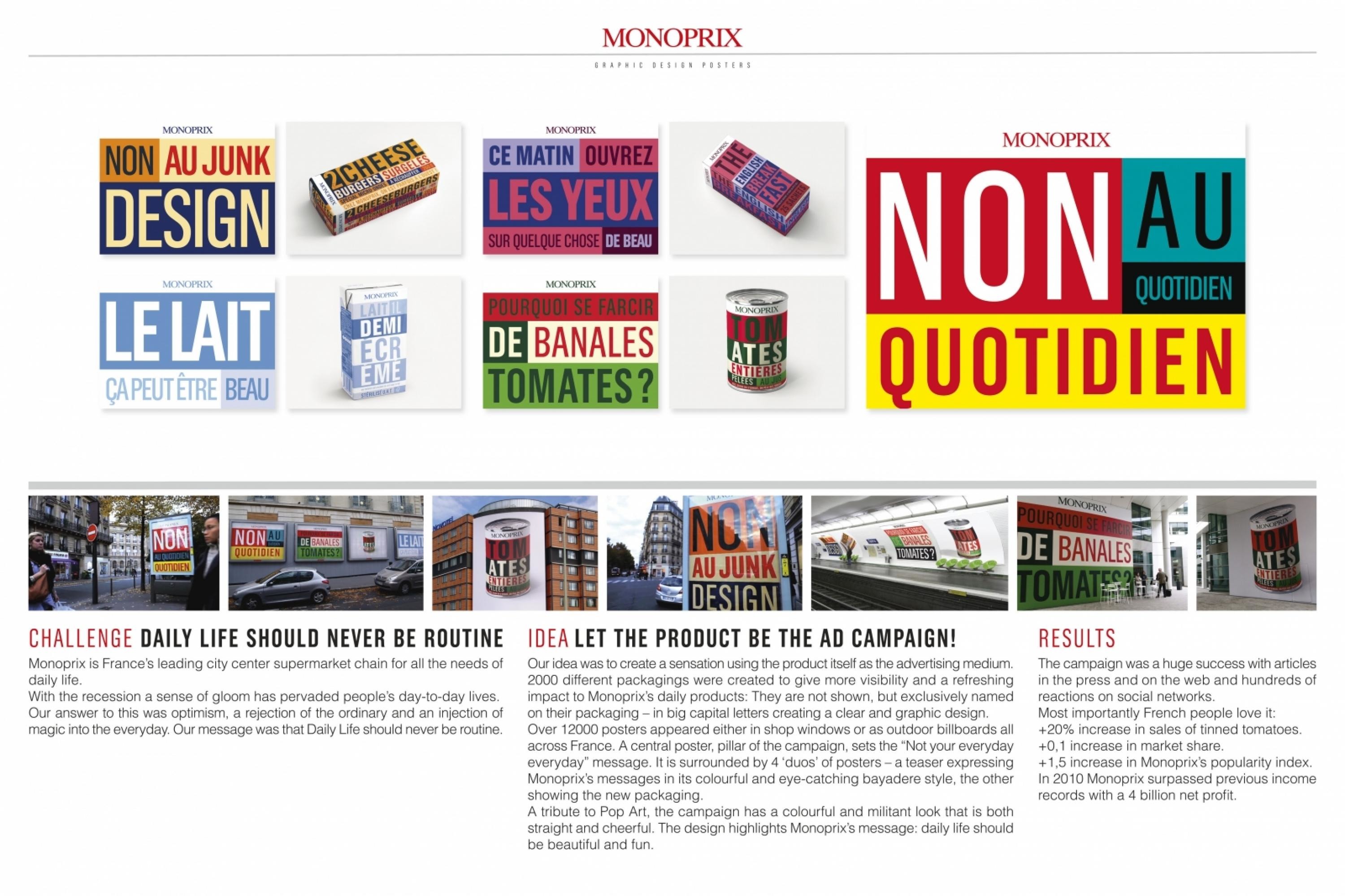
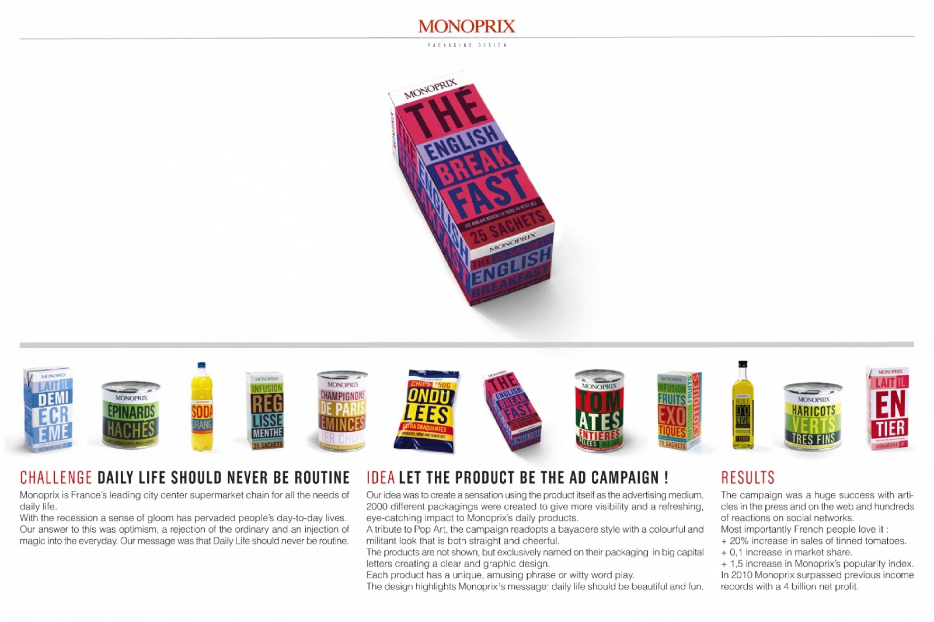
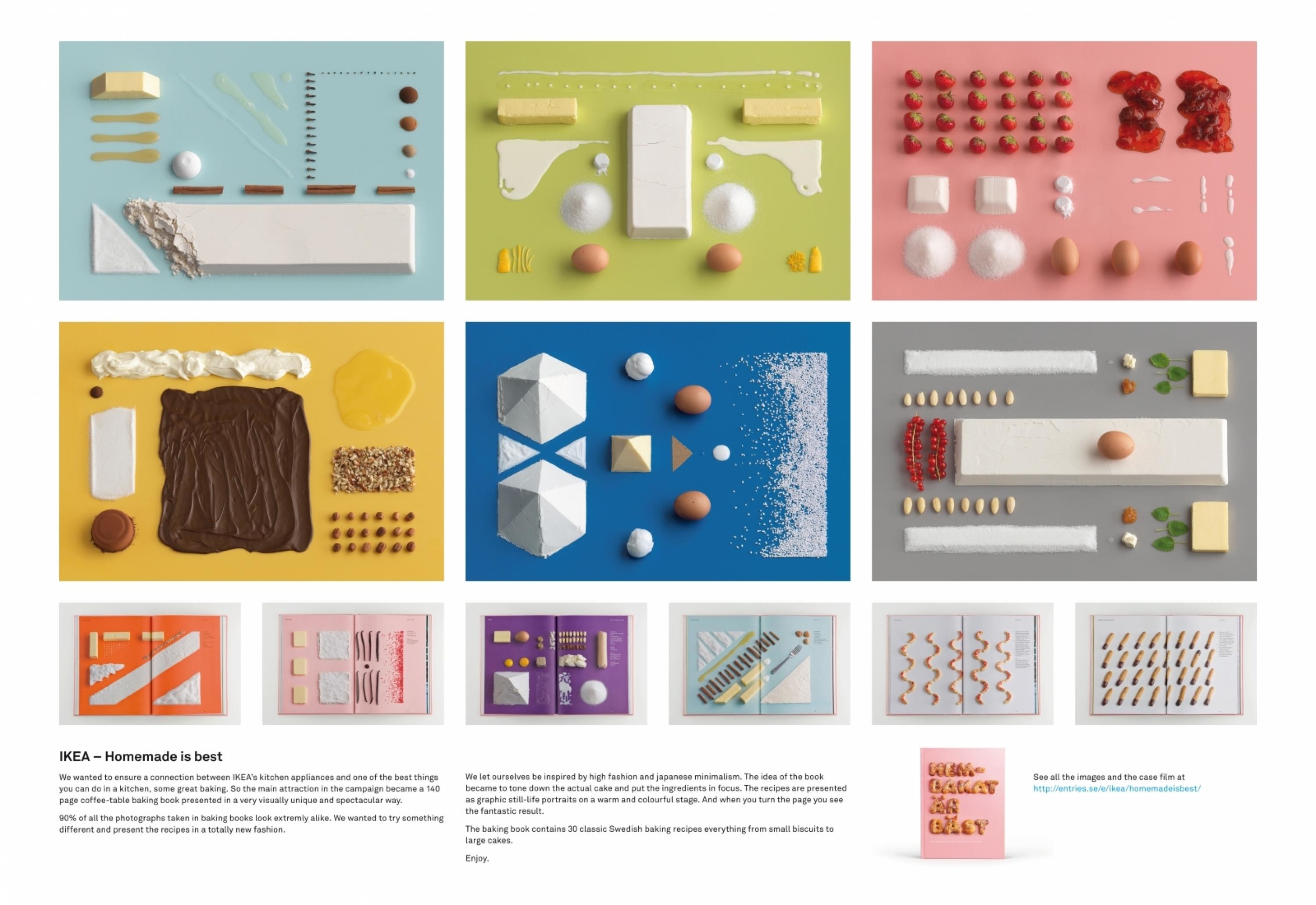
Monoprix is France’s leading city centre supermarket chain for all the needs of daily life. It proposes both food convenience and a department store shopping experience. The brand has always communicated with a mix of humour, optimism and imagination.Not only had a sense of gloom pervaded people’s day-to day-lives with the recession; but Monoprix started to be perceived as a retailer with high value, great experience, but just for special moments and treats. The brand struggled to keep its core targets: urban families.
ClientBriefOrObjective
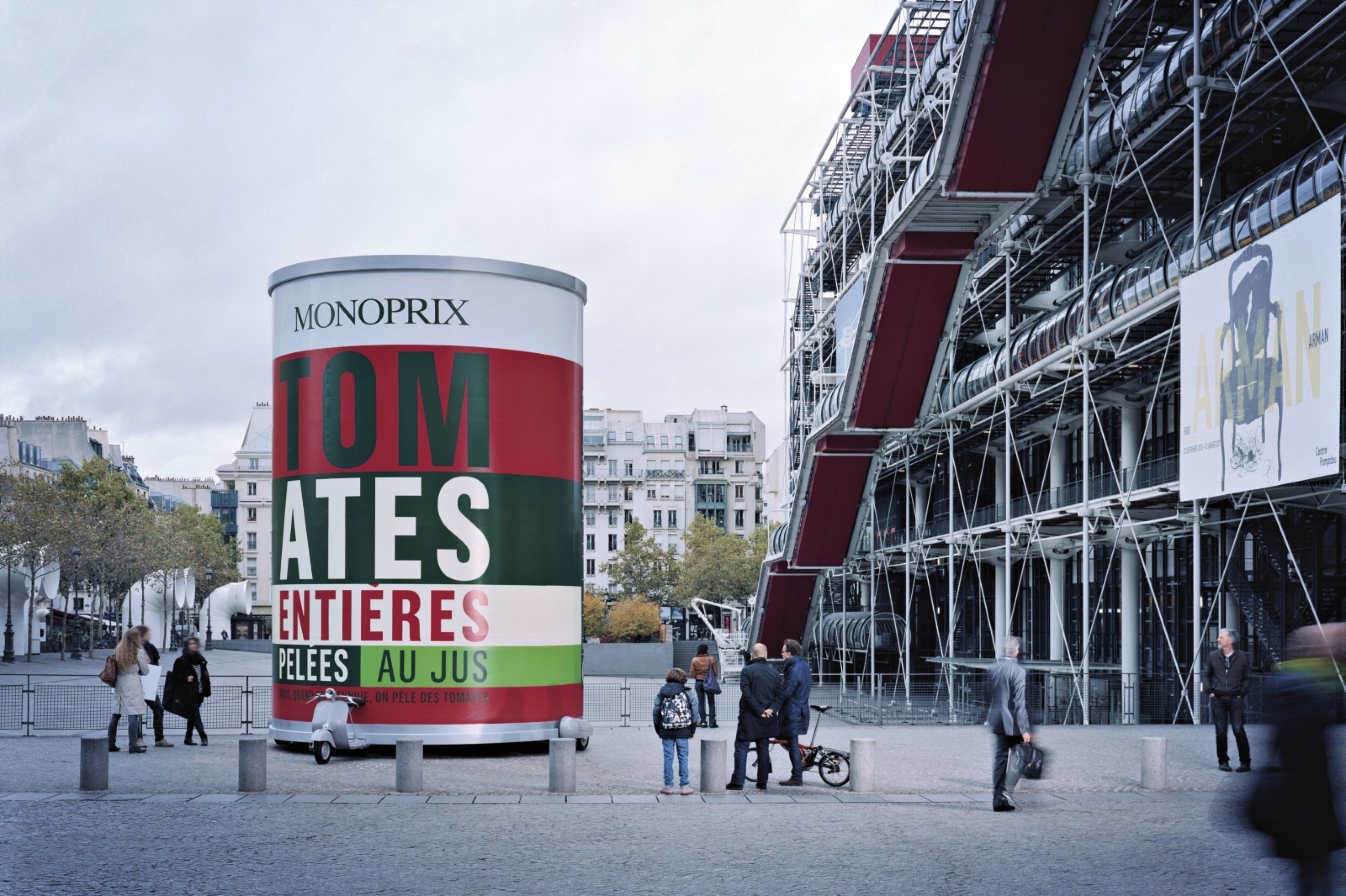
Our idea: using the product itself as the advertising medium.
We wanted to incorporate Monoprix’s business model, which is a value for money one. Our objective was to give more visibility to the most affordable products, without breaking the brand value.
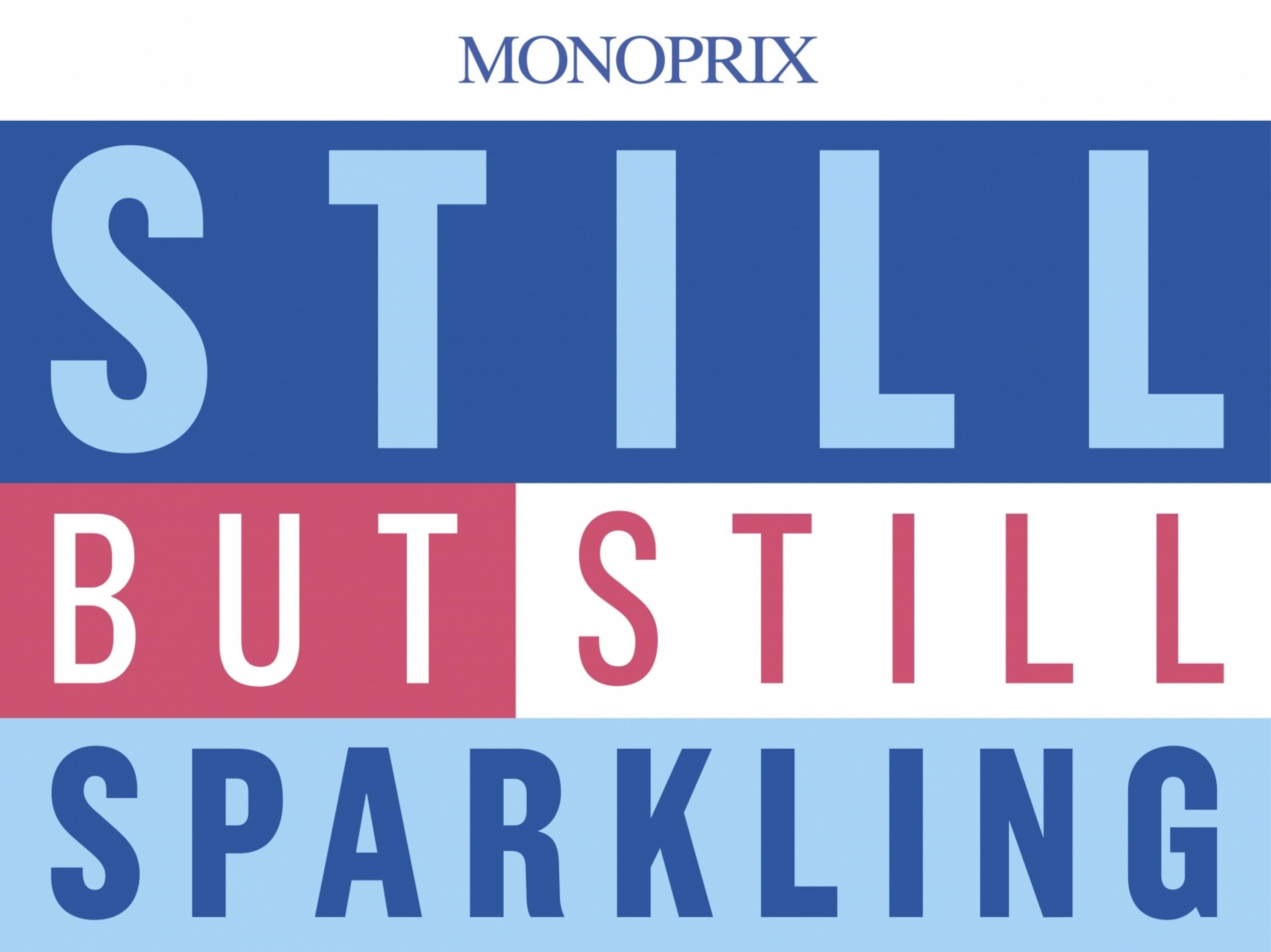
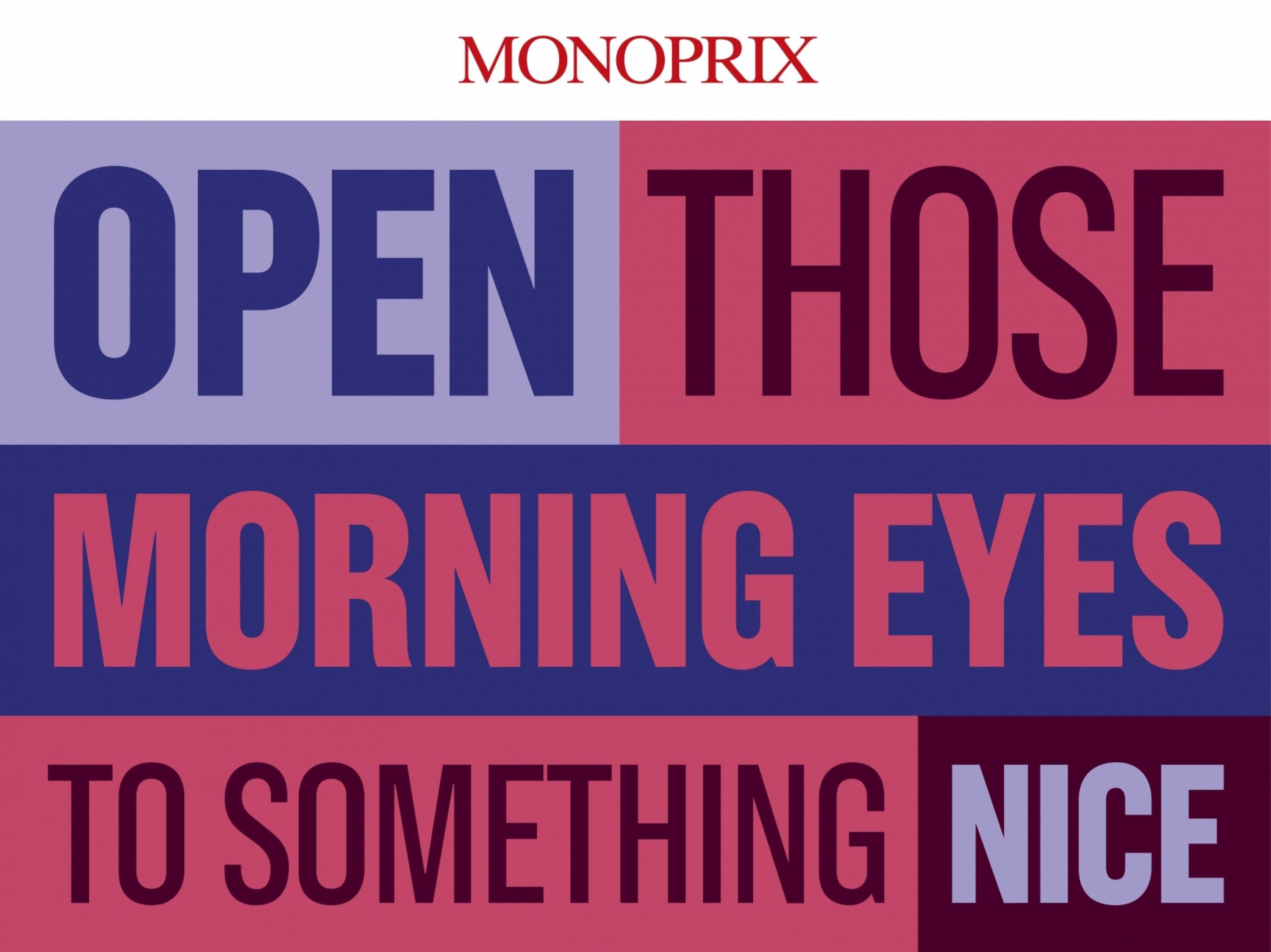
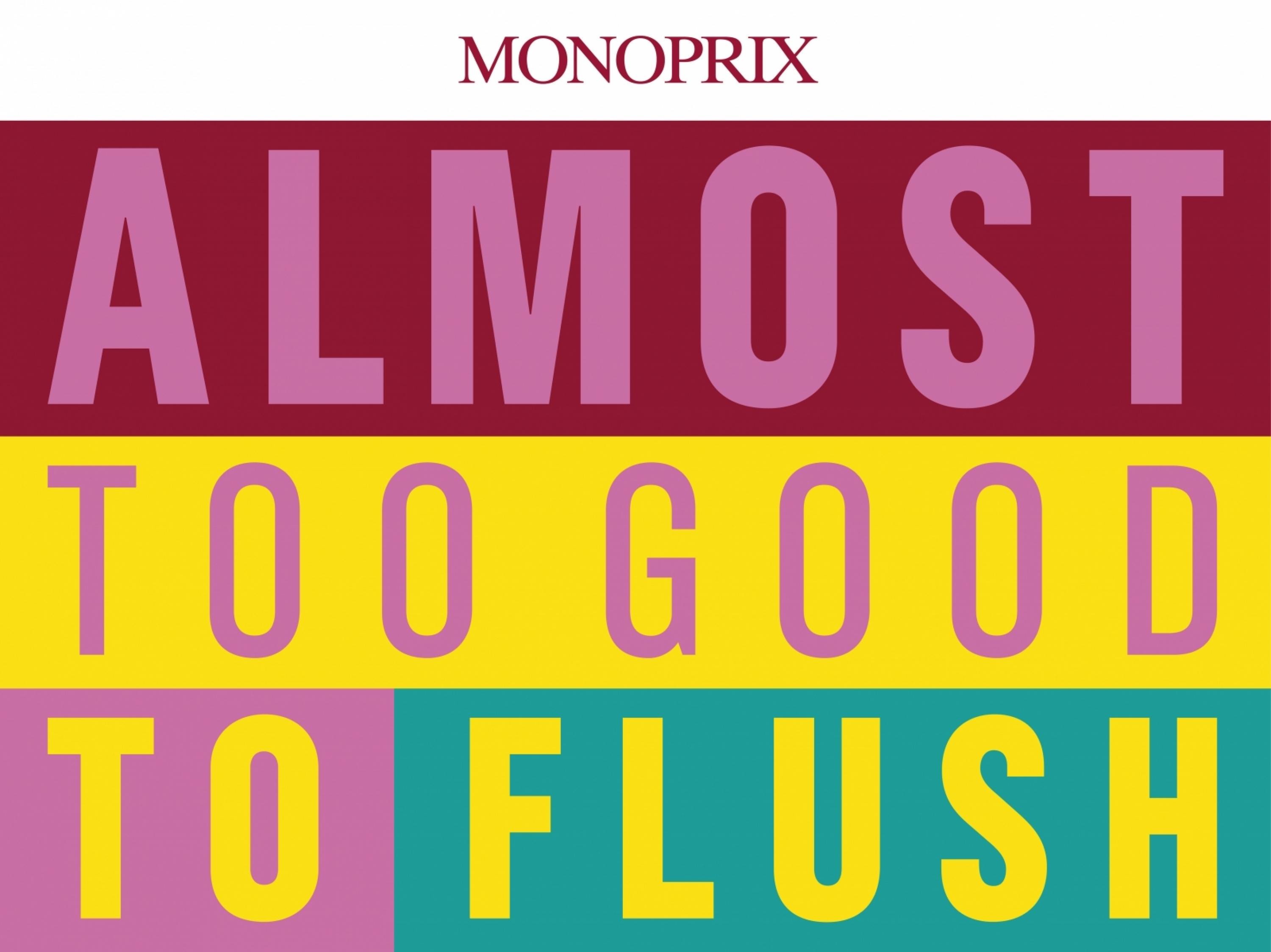
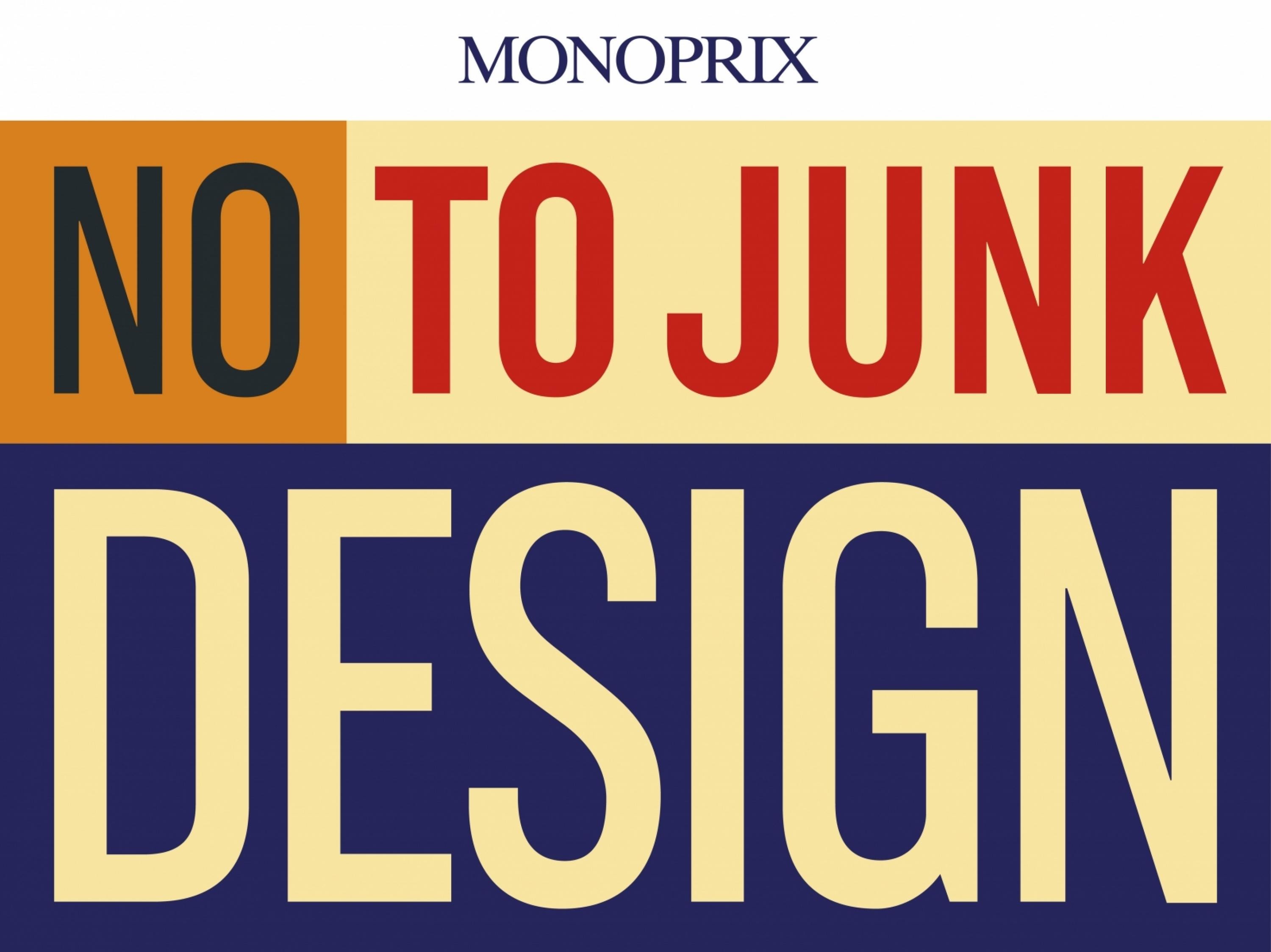
2000 different packagings were created to give a refreshing, eye-catching impact to Monoprix’s daily products. We wanted to make them the preferred choice for their shoppers, each of them had to trigger desire and to convey affordability. Furthermore, we wanted to create a sensation, a rejection of the ordinary and an injection of magic into the everyday.
Effectiveness
The campaign was a huge success with articles in the press and on the web and hundreds of reactions on social networks.Most importantly French people love it:+ 20% increase in sales of tinned tomatoes+ 0.1 increase in market share+ 1.5 increase in Monoprix’s popularity indexIn 2010 Monoprix surpassed previous income records with a 4 billion net profit.
Execution
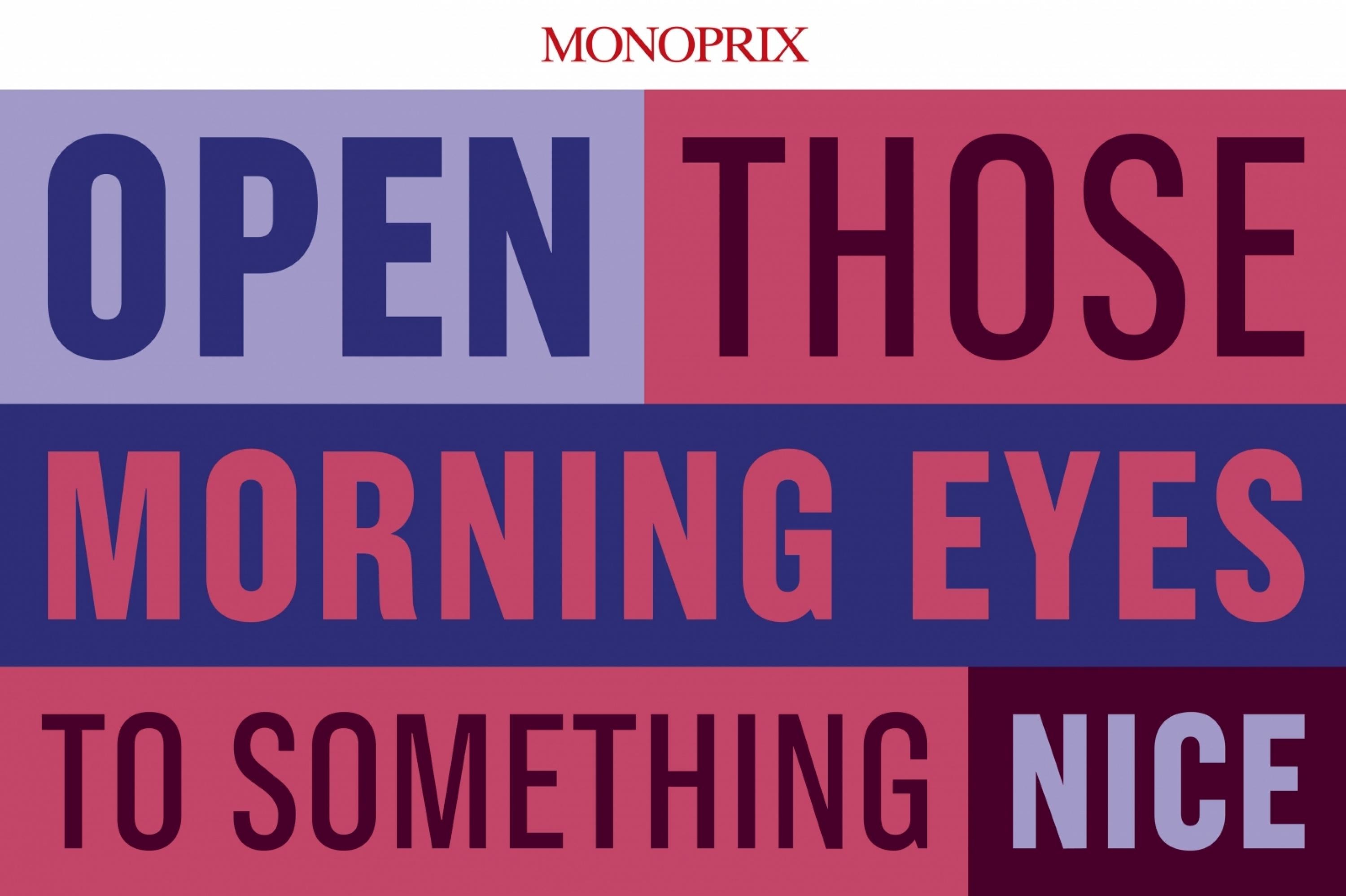
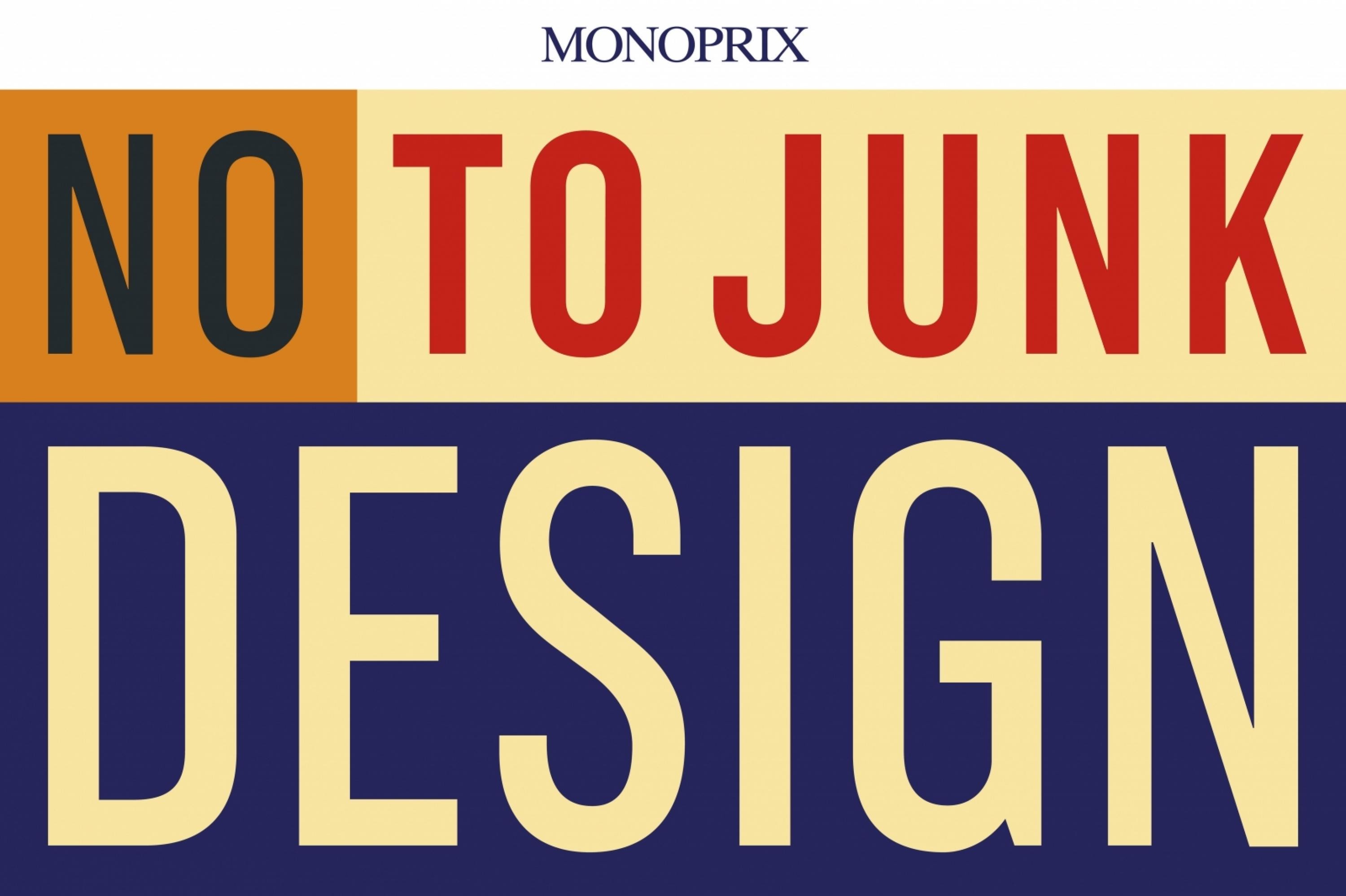
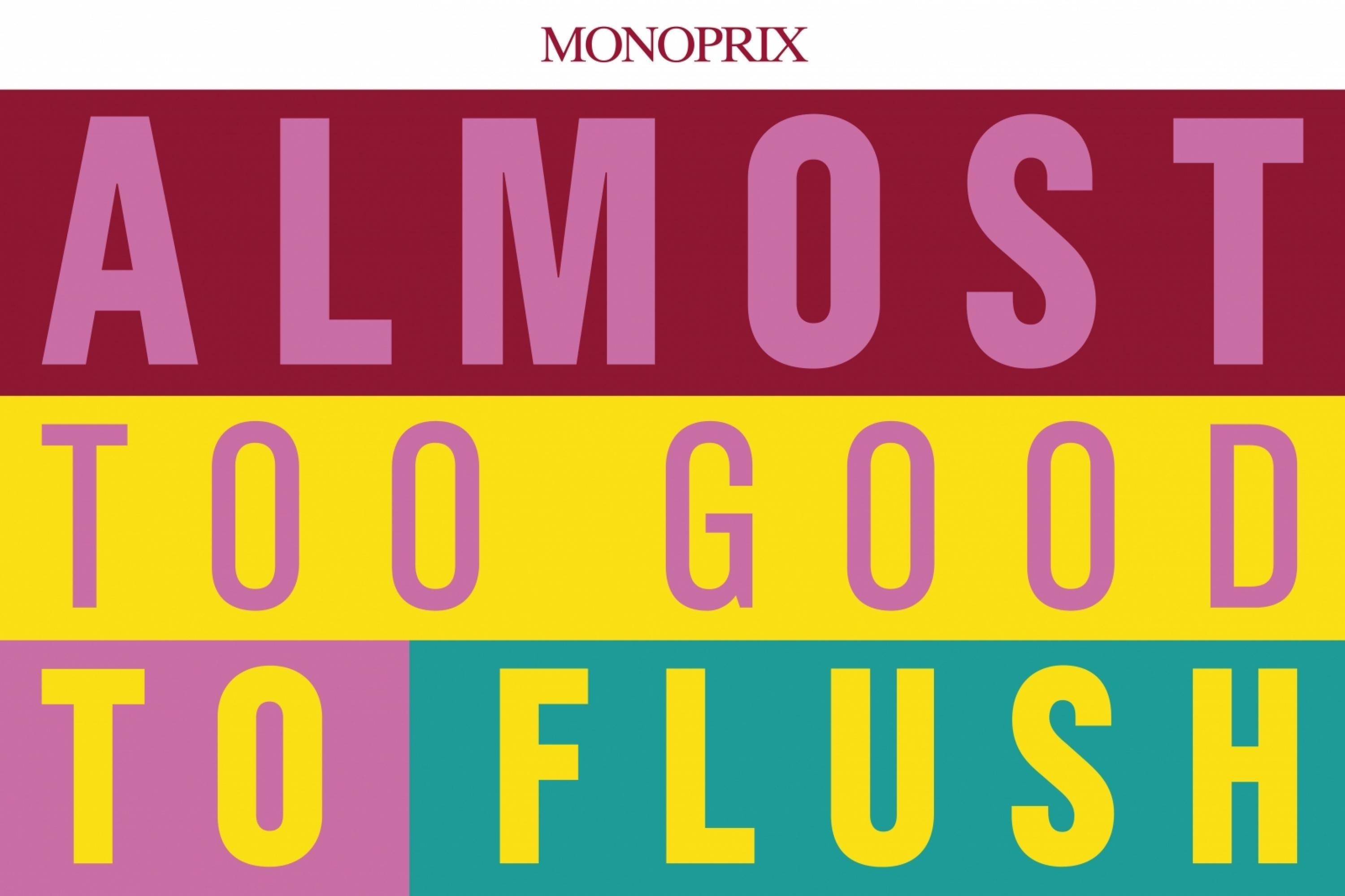
Paying tribute to Pop Art and readopting the bayadere style of the brand’s communication, we chose a colourful and militant look, both straight and cheerful. The products are not shown, but exclusively named on their packaging, in big capital letters creating a clear and graphic design. Each of them has a unique, amusing phrase or witty word play. Every product is an ambassador of the brand’s message: daily life should never be routine, but beautiful and fun.
More Entries from Advertising Typography in Design
24 items


More Entries from HAVAS CITY
24 items