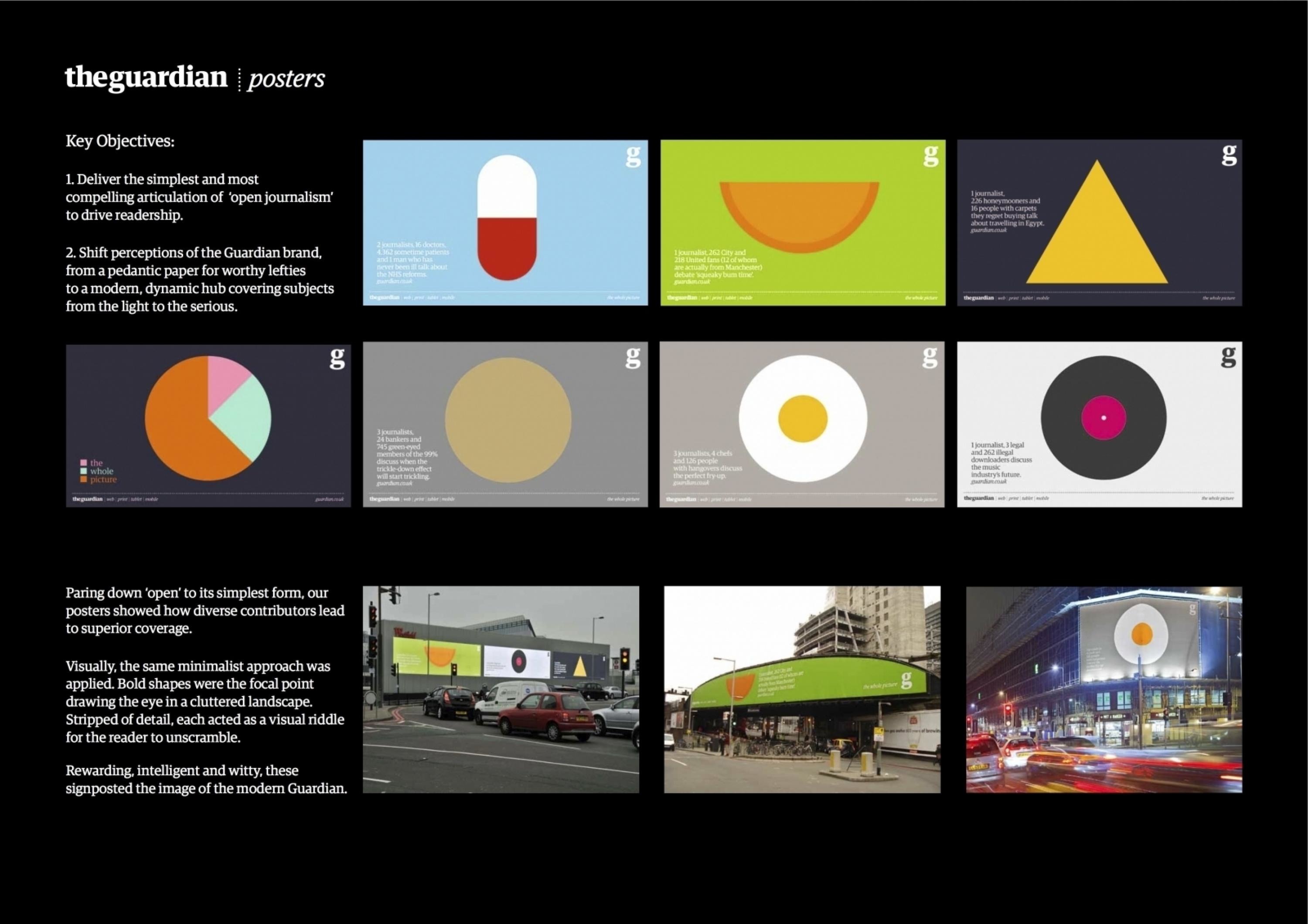
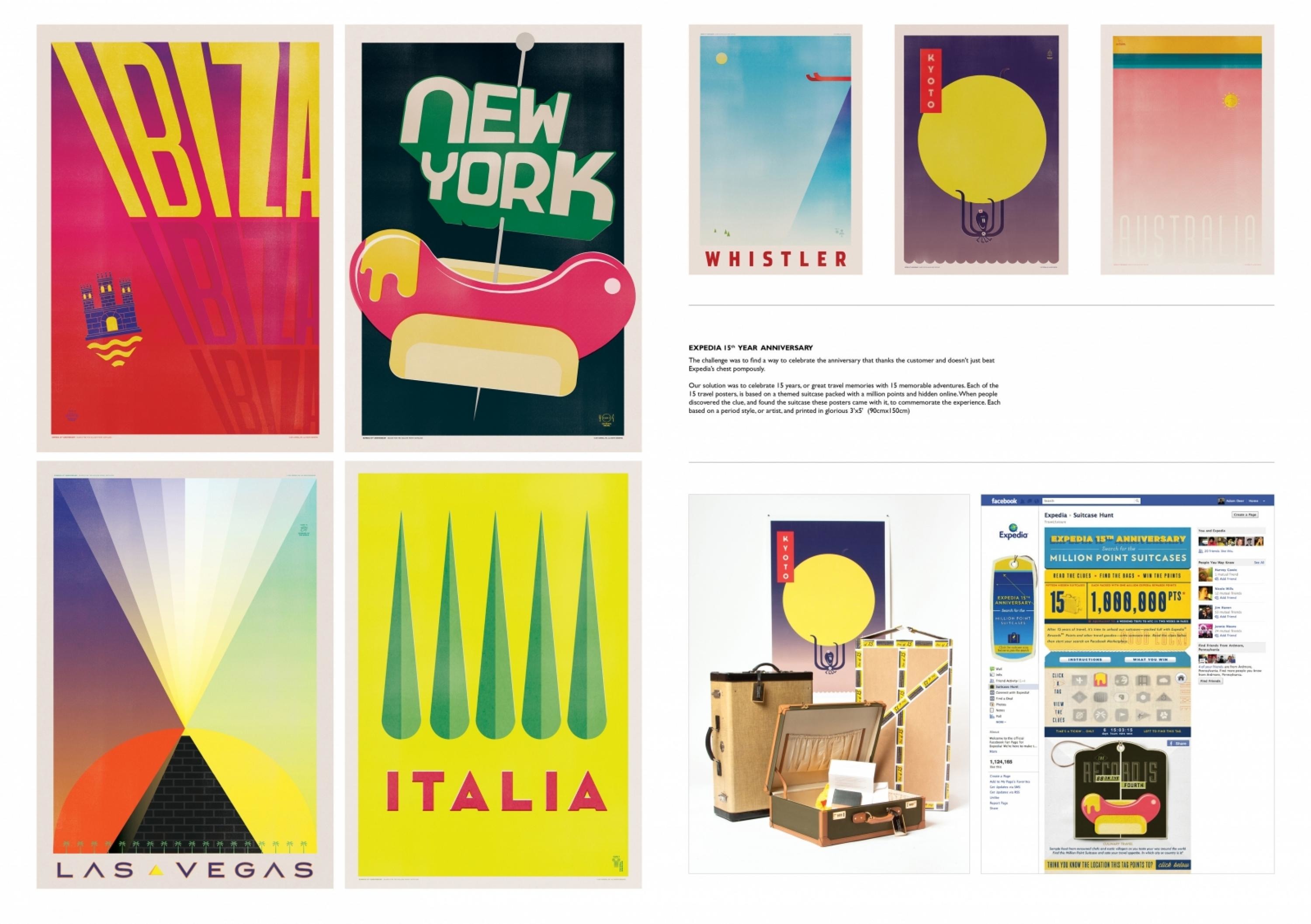
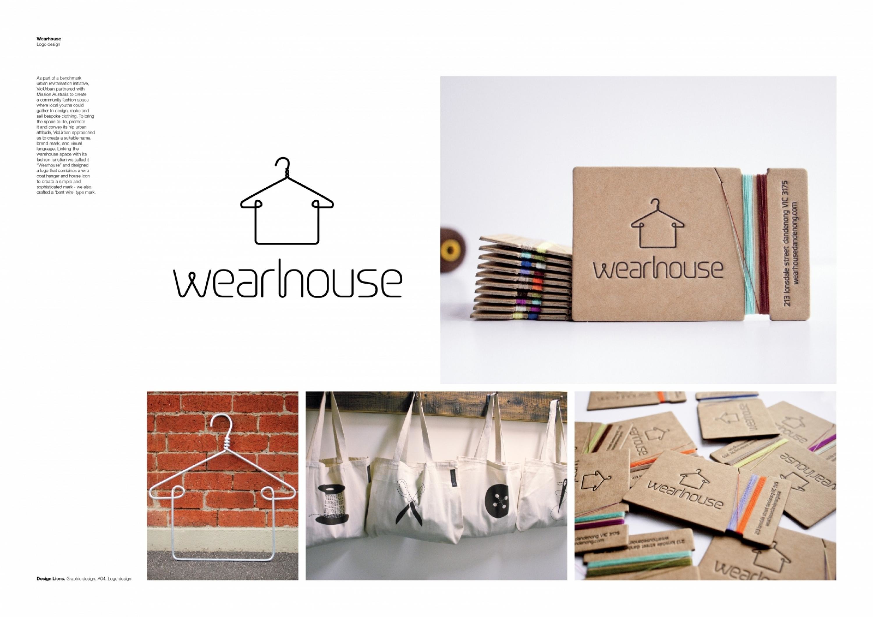
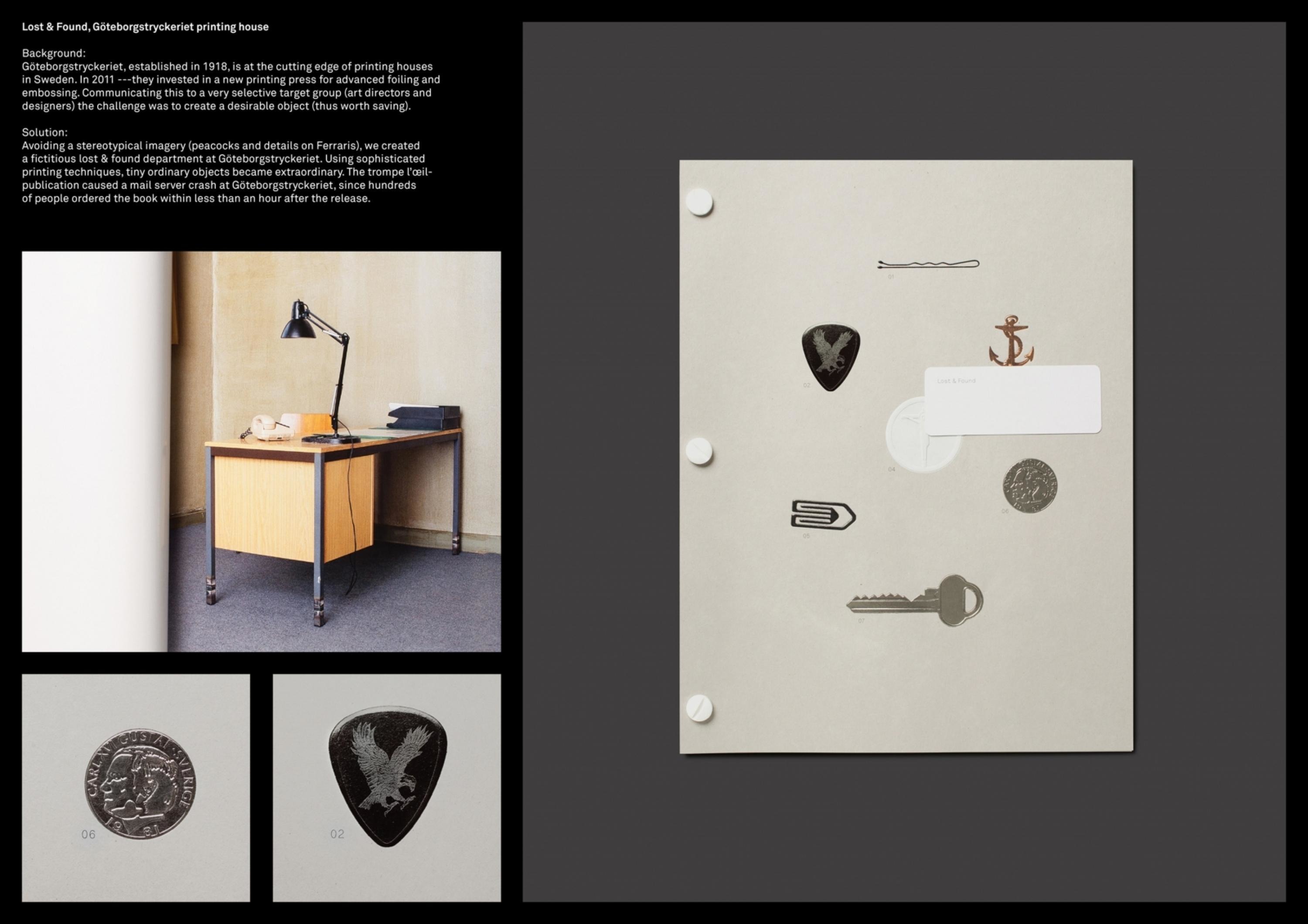
Design > Graphic Design & Design Crafts
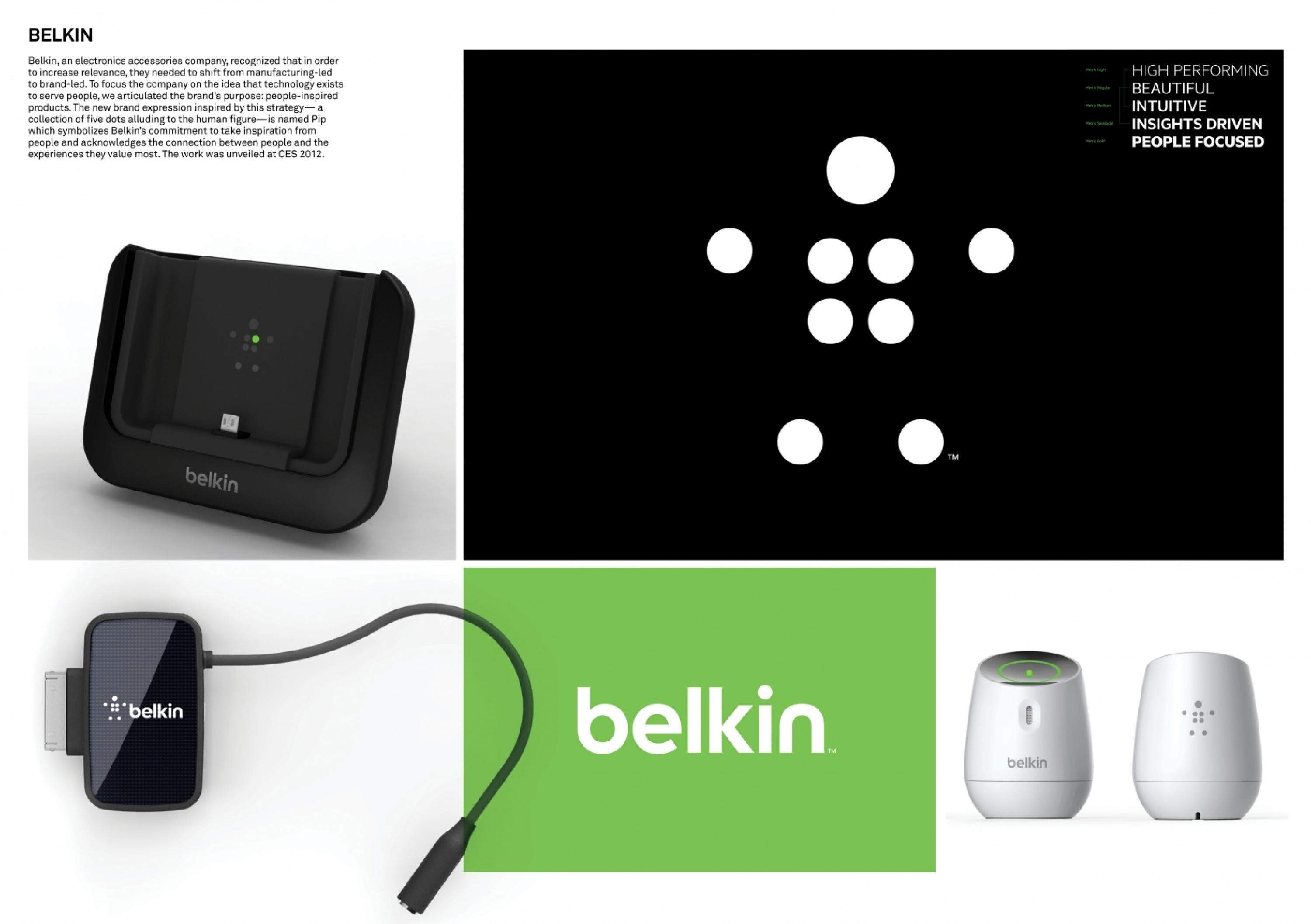
BELKIN LOGO DESIGN
WOLFF OLINS, New York / BELKIN INTERNATIONAL / 2012
Overview
Credits
Overview
BriefExplanation
Belkin, a consumer electronics accessories company, had successfully managed its business by responding directly to channel partners and introducing new product lines (venturing outside of a traditional cable business and expanding into routers, mobile accessories and home automation management systems). However, they recognised that in order to increase relevance with retailers and consumers, they needed to shift their focus from manufacturing-led to brand-led. Belkin needed help to define their brand purpose and create a new brand expression and identity to carry the brand into the 21st century.
ClientBriefOrObjective
After conducting extensive interviews with the leadership team and influencers throughout the company, we designed an ethnographic research study to better understand the role of technology in people’s lives. Armed with a solid understanding of Belkin’s ambition and consumers’ relationship and expectations of technology, we then identified an opportunity for Belkin to leverage their insights-driven product development approach, and become the most humanised in their category. Although the product offering is diverse, the entire portfolio consists of products that help us stay seamlessly connected to the people, activities and things we love.
Effectiveness
The identity was unveiled at CES 2012, where Belkin debuted new products across the portfolio—each featuring the company’s identity, and developed based on an understanding of how technology can make people’s lives easier and more fulfilling. The rebranding coincided with founder Chet Pipkin returning to Belkin as CEO and president. "Belkin has come a long way since the days I was building computer cables in my parent's garage", said Pipkin. "I'm excited to be back leading the charge of a revitalised Belkin, one that is synonymous for quality, innovation, and, most of all, products inspired by the potential of people".
Execution
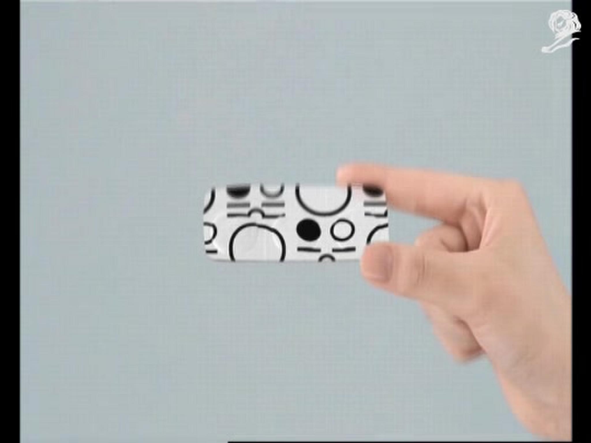
To focus the organisation on the philosophy that technology exists to serve people (and never the other way around), we worked together to articulate the brand’s purpose: to deliver innovative product solutions that enable people to realise their potential through the application of technology – boiled down to ‘people-inspired products’. The brand expression inspired by this strategy—a collection of dots alluding to the human figure—has been affectionately named Pip. As Belkin chief brand officer, Ernesto Quinteros, said, “The new logo symbolises our commitment to take inspiration from people and acknowledges the connection between people and the experiences they value most’.
More Entries from Logo Design in Design
24 items


More Entries from WOLFF OLINS
24 items