Design > Brand-building
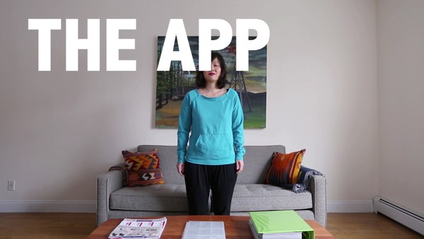
BUILDING A BRAND IDENTITY FOR THE WORLD'S LARGEST COMMUNITY
FACEBOOK, Menlo Park / FACEBOOK / 2021

Overview
Credits
Overview
Background
Years of growth and change had rendered the Facebook app’s visual identity inconsistent and unable to reflect the brand's evolution. Without a visual style to convey the brand’s distinct personality and vision grounded in community, Facebook was in danger of playing second fiddle to other competitors.
The brief called for a new visual identity, one that captures the essence of the product and reflects the brand’s belief that people can do more together than alone.
The identity needed to help evolve the brand’s position as a platform for community powered action. It needed to take back Facebook’s branding that has become so ubiquitous elsewhere, be scalable enough to cover the vast range of tones and topics covered by the Facebook app and sub-brands (Marketplace, Watch, Dating, etc), differentiate from the recently launched Facebook company brand, and ensure all our marketing is distinctive and ownable.
Describe the creative idea
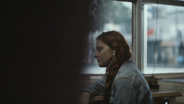
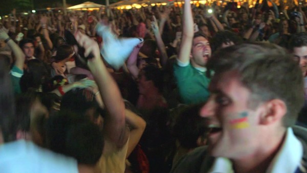
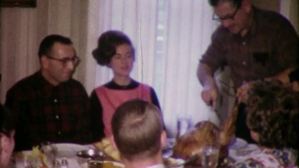
At its greatest, the audience is the entire existing, future and past user base. To focus we sought to target those who are more engaged in the platform – people who are creating a culture of community by purposefully leveraging Facebook to meet others, expand their interests and get more out of life.
The creative idea hinges on the metaphor of a canvas: an interplay between two layers, reflecting both the product and the people who use it. A structured base layer brings clarity and consistency by reclaiming iconic Facebook assets such as the logo, Facebook Sans typeface and the globally recognized blue. The second layer incorporates a flexible toolkit of expressive elements where motion, photography and illustration come together alongside rich human narratives that collectively bring the brand to life. The work unifies and elevates core brand assets while creating a distinctive new visual expression for the brand.
Describe the execution
The role of our system was not to impose strict rules that limit creativity, but to marry enduring and iconic design elements with more expressive tools. As a result, our identity combines a consistent foundation with limitless ways to communicate across the enormous scale of the Facebook brand.
Given the challenge of maintaining both cohesion and flexibility, we took a methodical approach to each design element. For example, our motion approach is inspired by human expression, and incorporates movements that capture the interaction between the human hand and digital content. Our typography system uses animation and unexpected shifts in alignment and style to add personality across a spectrum from serious to playful. And for color we’re complementing our famous blue with a new paperwhite to add warmth to the empty spaces.
The design system supports the full range of marketing touchpoints, including broadcast, OOH, in-product, digital, social and events.
List the results
The identity is still in the early stages of deployment, but initial research has already validated its strength: campaign testing indicates a 6% increase in advertising breakthrough and a 9% increase in brand linkage compared to our previous visual style, thus closing the gap with our biggest barriers to successful marketing communications.
Internally, the new identity has helped clear space between the Facebook company and Facebook app, and received a rating of 89% positive or very positive in a survey of our creative teams and agency partners. As a result, we are making great strides toward our KPIs of brand cohesion and scalability – the design system has already flexed to support everything from our core integrated More Together campaign to cultural moments like Black History Month, and from lighthearted social content to serious topics such as condemning anti-AAPI hate.
More Entries from Rebrand / Refresh of an Existing Brand in Design
24 items
More Entries from FACEBOOK
24 items