Design > Graphic Design & Design Crafts
SALT LOGO
GREY SAN FRANCISCO, San Francisco / SALT INSTITUTE / 2012
Overview
Credits
Overview
BriefExplanation
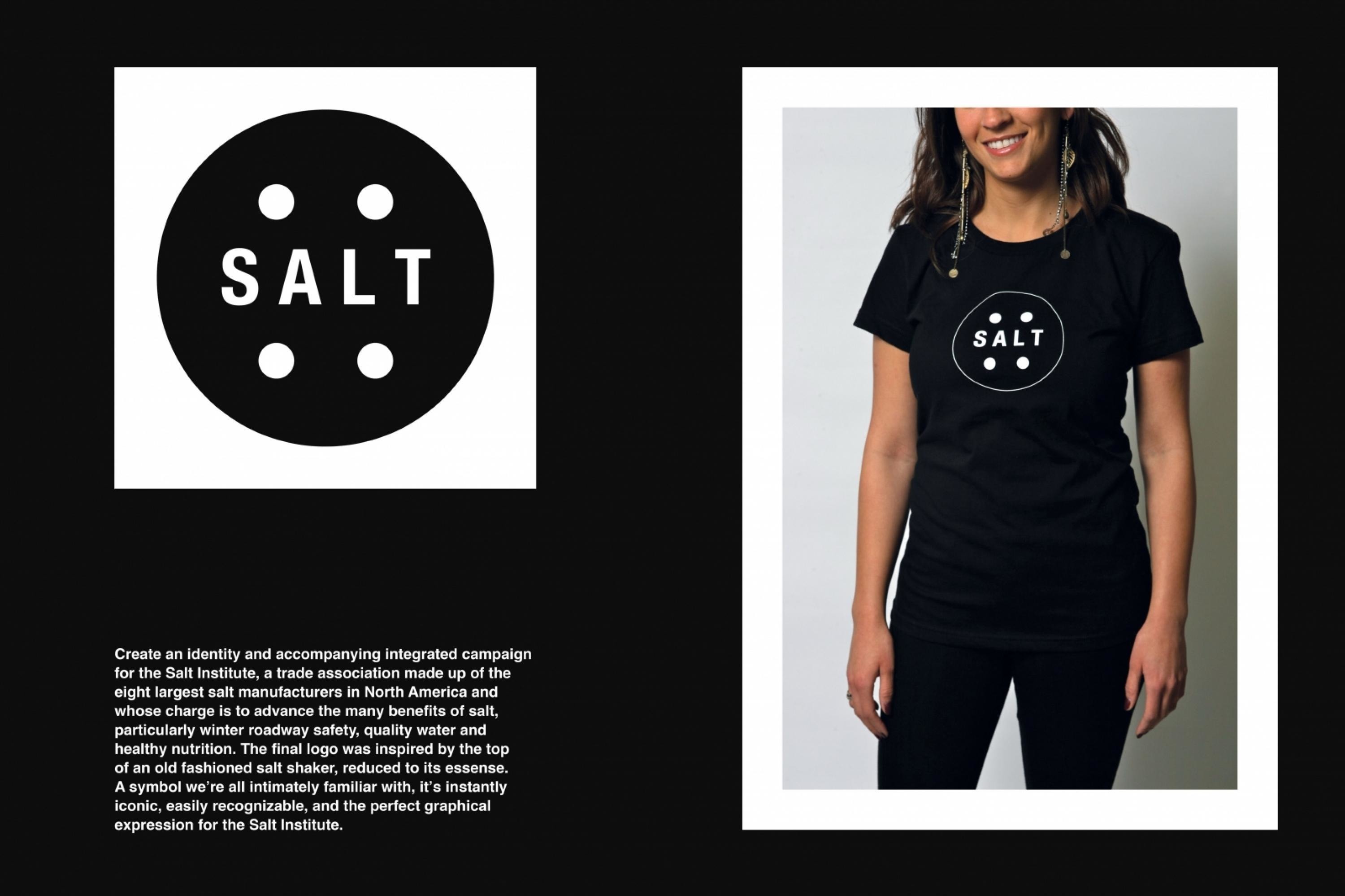
Create an identity and accompanying integrated campaign for the Salt Institute, a trade association made up of the 8 largest salt manufacturers in North America and whose charge is to advance the many benefits of salt: in particular, winter roadway safety, quality water and healthy nutrition. The ultimate goal was to have a logo as iconic as the one for Milk.
ClientBriefOrObjective
The key challenge was creating a logo upon which 8 very vocal CEOs and presidents could agree. Our key objective, simplicity, helped solve that challenge. We wanted to create a mark that was so simple, so graphic and so iconic there could be no argument. One would see the logo and think, “Of course. What else could it have been?” Of course, it was imperative that the final logo reproduce well at any size, in black and white, in colour and at any resolution.
Effectiveness
The campaign is in pre-production, so there is no data.
Execution
The top of an old-fashioned saltshaker, reduced to its essence, inspired the final logo. A symbol with which we’re all innately familiar. It’s instantly iconic, easily recognizable, and the perfect graphical expression for the Salt Institute.
More Entries from Logo Design in Design
24 items


More Entries from GREY SAN FRANCISCO
24 items