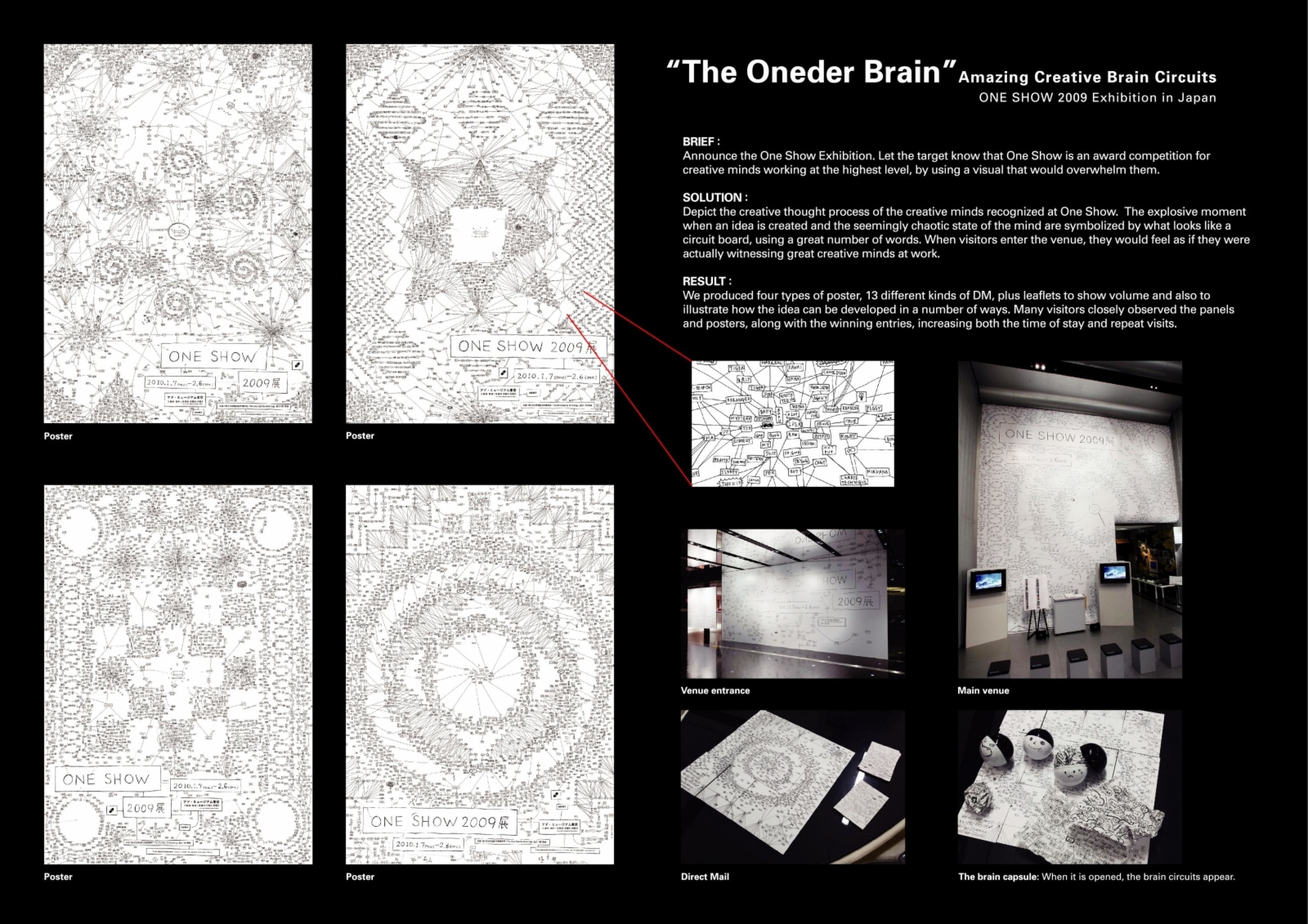
Design > Corporate or Brand Identity
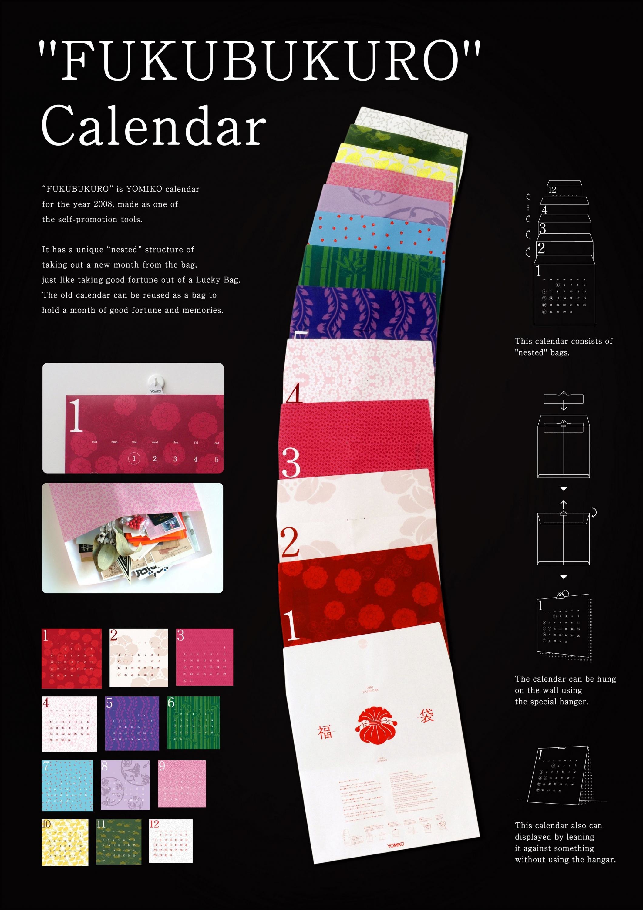
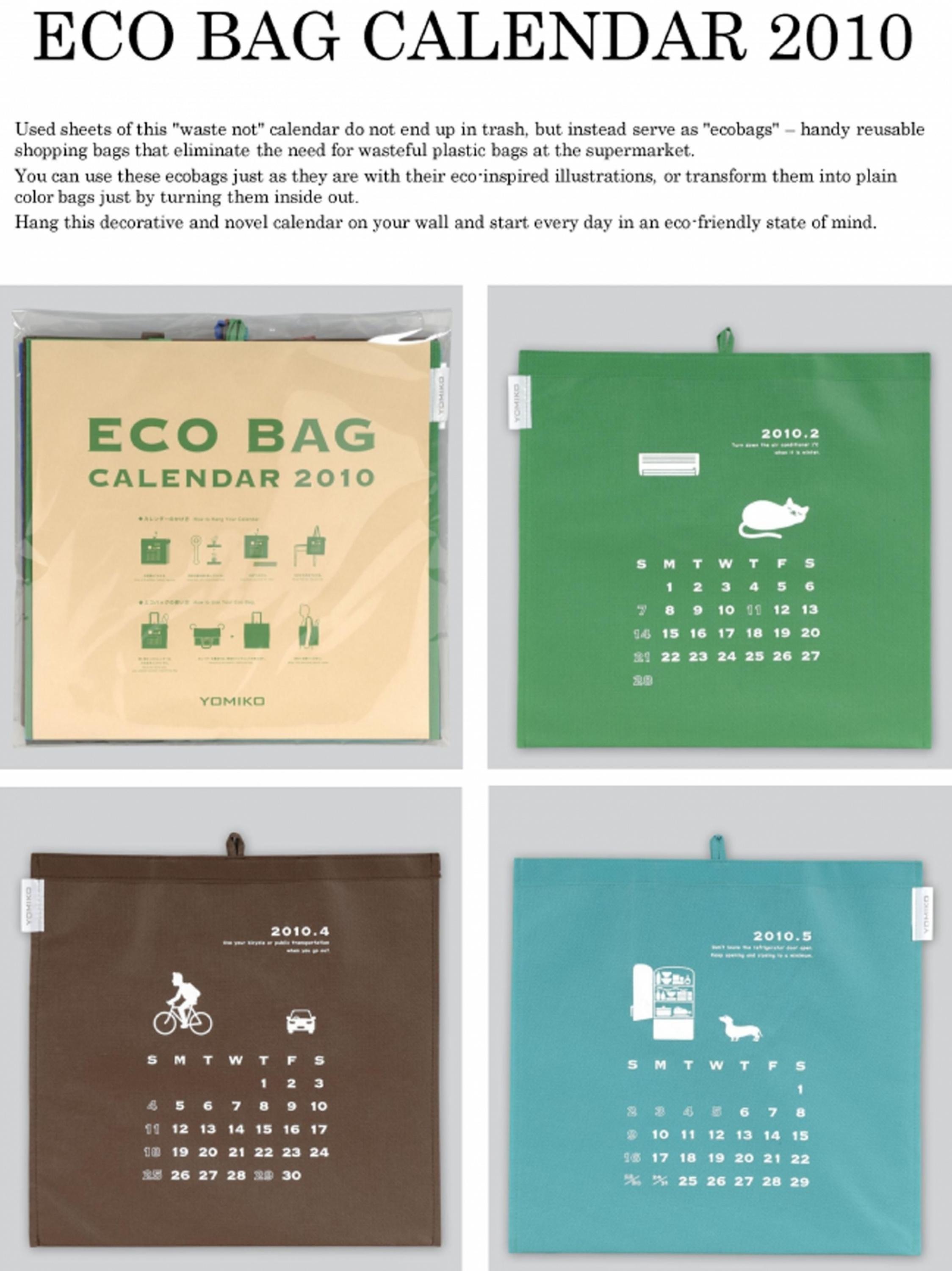
ECO BAG CALENDAR 2010
YOMIKO ADVERTISING, Tokyo / YOMIKO ADVERTISING / 2010
Overview
Credits
Overview
BriefExplanation
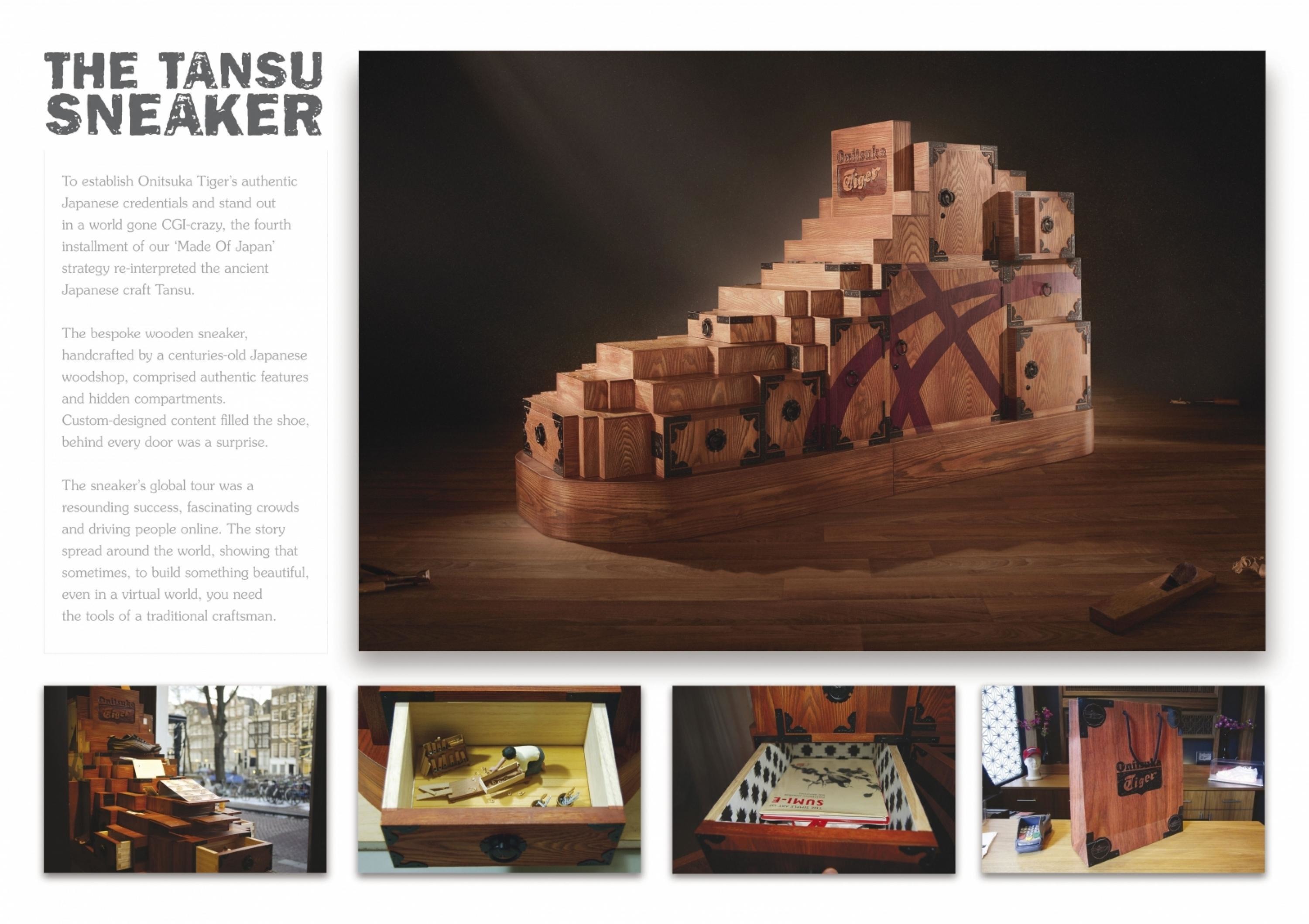
To design an advertising agency’s calendar that can be strongly remembered by all people, especially clients.
The design of the product must reflect current topics such as ecology.
ClientBriefOrObjective
The design of the calendar must be related to recent ecology problems.The calendar must be reusable and not disposable.An out of the box design, that is far from a stereotype calendar.
Effectiveness
Large numbers of calendar were ordered by our usual clients and their family.Stronger bonding with our usual clients.The calendar hanged at our usual clients buildings, brought new business chances and new clients to the advertising agency.Won a prize at one of the biggest calendar designing competition in Japan.
Execution
We tried to make a visual impact that will be remembered by everyone, and came up with a fun idea of “bags that are calendar, hanged on the wall for a whole year.”This calendar is also 100% reusable as bags and will be carried everywhere (which will be a nice advertisement for us.)
More Entries from Calendars in Design
24 items


More Entries from YOMIKO ADVERTISING
24 items